
User login

What is OpenID?
  • Log in using OpenID
  • Cancel OpenID login
  • Create new account
  • Request new password
Register
  • Home
  • Browse
    • 2D Art
    • 3D Art
    • Concept Art
    • Textures
    • Music
    • Sound Effects
    • Documents
    • Featured Tutorials
  • Submit Art
  • Collect
    • My Collections
    • Art Collections
  • Forums
  • FAQ
  • Leaderboards
    • All Time
      • Total Points
      • Comments
      • Favorites (All)
      • Favorites (2D)
      • Favorites (3D)
      • Favorites (Concept Art)
      • Favorites (Music)
      • Favorites (Sound)
      • Favorites (Textures)
    • Weekly
      • Total Points
      • Comments
      • Favorites (All)
      • Favorites (2D)
      • Favorites (3D)
      • Favorites (Concept Art)
      • Favorites (Music)
      • Favorites (Sound)
      • Favorites (Textures)
  • ❤ Donate

Font: KenVector Future 2 modified

Author: 
MedicineStorm
Thursday, April 5, 2018 - 18:02
Flattr this item
Support MedicineStorm on Patreon
Collaborators: 
Kenney
Art Type: 
Document
Tags: 
font
FONTS
vector
alphabet
future
ttf
truetype
typeface
symbols
Vector Art
User Interface
gui
ui
License(s): 
CC0
Collections: 
  • CF Inspiration
  • Dook Assets
  • Fonts
  • Medicine's spacey backgrounds & stuff for Celestial Vex
  • Pool: Fonts (GDN)
  • QnD001 Assets
  • To Remix
  • UI
  • UI
  • UI Elements
  • Wolf
Favorites: 
15
Share Icons: 
Preview: 
Preview
Preview

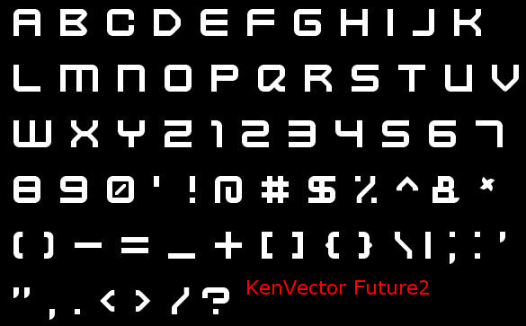
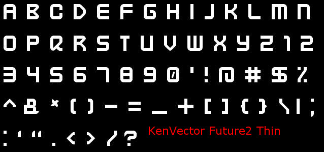
A derivative of Kenney's "KenVector Future" TrueTypeFont: https://opengameart.org/content/kenney-fonts

The style of the original was ideal for my game Celestite. However, players were reporting difficulty reading it at small sizes (anything lower than ~14pt font). Words like "BLOCK", "RAD", and "VACCUUM" ended up looking like "8LDCH", "ARO", and "URCCVVM". This was due to the following sets of letters all looking indistinguishable:

  • "X", "H", "K"
  • "0", "O", "D", "Q"
  • "8", "B"
  • "A", "R"
  • "U", "V"
  • "|", "/", "\"
  • "[", "("
  • "]", ")"

As well as the following characters being independently difficult to recognize:

  • "<", ">", "^", "%"

Font comparison

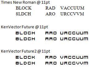
I changed the above-listed glyphs to all appear more unique at small sizes. Almost all of the original upper- and lower-case characters were identical, so I also squished the lowercase characters to be shorter. Just enough to disntinguish between case if needed. I only plan on using the captials anyway, but at least there's a difference between the cases now if it's ever needed. I tried to preserve as much of the style and feel that Kenney put into the original font.

These modifications make each character more distinguishable, but I think they also lost some of the charm along with it, unfortunately.

Copyright/Attribution Notice: 
Modified by MedicineStorm. Credit "Kenney.nl" or "www.kenney.nl", this is not mandatory.
File(s): 
KenVector Future 2.zip KenVector Future 2.zip 12.9 Kb [1178 download(s)]
  • Log in or register to post comments

Comments

mold
joined 11 years 2 months ago
04/05/2018 - 21:58
mold's picture

I gave it a try just to test birdfont. I'd suggest xolonium or teko but noticed they also had similar problems at small point sizes

Attachments: 
  • Log in or register to post comments
MedicineStorm
joined 12 years 8 months ago
04/06/2018 - 23:18
MedicineStorm's picture

Interesting. I like the style. :)

  • Log in or register to post comments
glitchart
joined 3 years 2 months ago
12/12/2024 - 02:04

I love it, I think it fits well on my current work on "Thrust ii reloaded" (originally created by Pgimeno). I added it to the game and credit you and kenney: https://codeberg.org/glitchapp/thrust-ii-reloaded

  • Log in or register to post comments