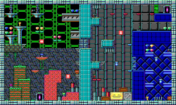
Mines of Sharega
Author:
Tuesday, August 23, 2016 - 16:38
Art Type:
Tags:
License(s):
Collections:
- 2D - Platformer/Sidescroller Tiles
- 2d sci-fi platformer - scouting
- 2D::Tile::Sidescroll
- A Pool: Unsorted (GDN)
- Antur Resources
- b Sidescroll Shooter
- BEYOND EXPECTATIONS - NETSFEAR
- BinxQuest
- BlueDreams
- CC0/OGA-BY Pixel Art
- CF Inspiration
- CFJam2023
- Color Graphics Adapter
- Cute Platformer
- gb conversion
- Metroid Vania Shoot
- MIDNIGHT GUN
- NOT CC0 Tiles & Tilesets
- Oddball Gamez NES Style
- Pixel Art - JRPG
- PlataGO - SciFi
- PLATAGO! Sir Blastalot Asset Pack
- Ragnar's CC0 Bag of Holding
- Shootron
- Space Avatar: Codex
- Super Guido Bro - scouting
- THEME: sci-fi / space
- Things I want to jam with
Favorites:
56
EGA tiles inspired by Apogee's Crystal Caves.
Full mockup here, not included as contains level layout from Crystal Caves.
File(s):


Comments
Very nice! Though it makes me think more of Commander Keen.
EGA is an ugly, ugly palette, but you've done such a good job of color use that it looks actually good. I've never seen EGA look even close to good. Not only did you make each tile look good, but it looks really great together, nothing competing for attention. The chains are my favorite.
Excellent design, love
I have to say, I thought your comments on EGA color was pretty harsh. I guess you didn't like any of the Keen games, or any of the mid generation Siara games? Oh well. Each to there own I suppose.
Sharm's perfectly correct. EGA is a horrible palette. It is programmatically defined (RGBI), rather than artistically (with the sole exception of the tweaked brown).
The quality of the hardware-enforced palette is no reflection on the quality of the games that use it.
Sorry Disthron, missed your comment until now. I loved Keen and quite a few Sierra games, but their gameplay and their visuals did not match up at all. Even as a kid the horrible colors bugged me and I wanted to fix it. I've never understood why it was a thing, since it came into use after displays were using so many more colors. It felt like going backwards, but even then the other limited palettes that had already fallen out of use were still better. I stand by my statement, this is the first time I've seen the palette look good. I mean, the Sierra games did a really great job with it, but you can still tell that they were fighting the palette.
Amazing art reminds me of commandor keen :)
It's ok. I only just found your message, too! I guess if you came from something like the Amiga or the Atari ST then it would be like going backward. Though after doing a quick search it seems they all came out around the same time. But those were console style all in one computers, like Macs today. The custom built PCs that we have today come from the IBM lineage. Which took ages to finally get decent graphical hardware.
I guess I just have a lot of nostalgia for this color pallet. Also, I think it takes a lot of skill to get it to look good.
Yup, my family were Atari people until PC's had decent graphics and Windows was a thing. The Atari's weren't really the same as a console, the ST had a GUI and even on the older cartridge Ataris you could write your own code and save them onto floppies with a peripheral. My dad used to write us games or hack existing ones to say silly stuff. Maybe the internals couldn't be swapped out as much, but all the periphrals could and they were open to competition. Just like you wouldn't say todays Macs are the same as a console I suppose. Although upgrading the core components was less of a big deal back then, the changes were less frequent and less impressive so upgrading didn't need to happen as often.
Still, I distictly remember some of those EGA games coming out brand new, even after we had a PC, with no option to set it to a proper SVGA color profile. You'd have to switch the entire display to the smaller, lower color resolution to get the games to run at all. My cousin was able to go around playing games with higher color count with a gameing console that fit in his backpack (he had a Lynx). Why couldn't they make all the brand new games with all the colors? I get it now, I'm an adult and I get how hardware limitations and compatability work, but it just felt very backwards to me back then. The ST had better colors and we hadn't used that computer in years.
I'm with you, making a bad palette look good takes lots of skill, Keen was awesome, and I have nostalgia too. But it's still a terrible palette.
Oh my god, what a throw back. It does truly bring back memories of Crystal Caves, Duke Nukem (before they turned him into an egomaniac), Bio Menace, and other great games of that time.
...I miss those days... so much.
By "console" I just meant that they were an all in one unit, that was created by one company. Like those macs where the computer is built into the screen. Unlike PC's today where you can assemble one from a bunch of disparate parts made by many different companies. I realize the Atari computers were proper computers. ^_^
I'm currently making a game with this color pallet. Mostly out of nostalgia. One of the younger artists has become fascinated by how people back in the day used to combine colors to trick the eye into seeing a color that isn't there.
I used the mushrooms as background props in my 2D PVP platformer with grpapling hooks, Grapplers: Relic Rivals, and added you to the credits of the game. They were used in multiple levels, but they really helped in my "rainbow msuhroom forest" level. Thank you so much for making this!
Steam: https://store.steampowered.com/app/2906890/Grapplers_Relic_Rivals/