Top sci-fi CGA tileset
Author:
Friday, May 22, 2015 - 06:36
Art Type:
License(s):
Collections:
- 16x16 tiles
- 2D - Top View
- Assets for making DOS games or games like in DOS in the early 90's
- Asteria
- Cave Explorer Sci Fi Project
- cc-by-3 possible game kits and gfx
- CF Inspiration
- Collected
- Color Graphics Adapter
- Good Extpandable Tilesets /Art packs
- Large Collections
- Lost in the void potential assets
- Mask of Mü - scouting
- NOT CC0 Tiles & Tilesets
- Pixel Art - JRPG
- Resources
- Robot Dungeon Sci-Fi
- robots
- Sci-Fi
- Sci-Fi Inspiration!
- Sci-fi Parts and Inspiration
- Similar to Tiny 16
- Smallest RPG
- THEME: sci-fi / space
- Tilesets
- Tilesets and Backgrounds (PixelArt)
- Top Down 2D JRPG 16x16 Art Collection
- Topdown
- TrapSprung
- Zed - Interesting Yet Unsorted
- Zelda Like RPG
Favorites:
90
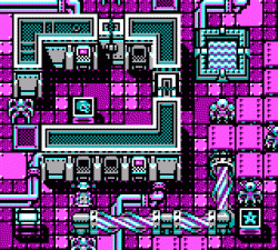
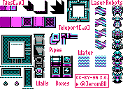
Small tileset using the CGA palette. For top-down roguelike, action game, etc.
7 robots/characters.
Animations:
- laser beam (4 frames)
- door (3 frames)
(Made for @pixelWeekly.)
File(s):


Comments
Awesome stuff but it looks like you're mixing high-intensity and low-intensity palettes together.
Thank you... but what do you mean by "high-intensity & low-intensity palettes"??
CGA standard modes are four colour.
The standard palettes have high-intensity and low-intensity versions.
You are mixing colours from both high-intensity and low-intensity palettes resulting in more than four colours.
Ok i see! I didn't know that... well, let's say it's not perfectly accurate according to the 1980's CGA computers, and I just used a 8-colors palette ^^
Amazing! Never thought CGA may look so cool!
Amazing :) though you mixed both offical palletes of CGA mode, which would be Ega.. Sorry ima dork but I ABSOLUTELY love them. I would LOVE to see more bro :D
There appears to be some hacks to achieve more colors on CRT monitors:
http://www.youtube.com/watch?v=yHXx3orN35Y
I don't know what this guys are talking about, but this is tiring eyes. You may think not ot use too many bright colors on background, they would be nice on foreground objects instead.
Good luck!
I agree that this would be more EGA than CGA due to it being more than the original four colors (White, Cyan, Magenta, and Black, if I recall it right) but this does bring back my childhood memories when most games were in the CGA/EGA color pallates. I love it!
If I ever make a game with CGA/EGA graphics, I will definitely concider this :3
@Stac: Yes, the colors are a little hard on the eyes, but at the time of the CGA/EGA color pallates, they were relatively harsh to begin with due to the fact they could only use 4-8 very high contrasting colors, especially in the old 1992 Dos Games (Arctic Adventure by Apogee is a very classic example and one of my favorite ames from that era.) Thankfully, graphics have made leaps and bounds scince, but without the 4-to-8-color-make-your-eyes-bleed CGA/EGA that started it all, we wouldn't have the breathtaking graphics we have today. :D
It's a fantastic design.
Where is the rest of the tile set it looks like it's missing some parts'
Repacked this as a 16x16 set and baked in the shadows on certain parts. Also recolored some 16x16 icons from Jerome's Fantasy set and dropped in. Technically 6-colors, so it's CGA-ish
EDIT: Posted a little too soon, was missing some of the shadows and made a few more adjustments
A little mockup, not as nice as the orginal :)