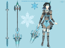
Niariekyia Ijyiakariene Arcyriea
- Realspace Saga
Miss Elven Sentress Arcyriea of the Niariekyiai is a lonely soul of the mystical lands who has her home among her Ijyiakaryai people as the protector. For her, the main goal is to protect her fellow elven people. However, she is depicted as the brilliant and courageous fighter who is not afraid of anything. Unfortunately, the great unrest that is to come will not only forge her character, but her fate will be tied with her entire species and the peculiar Tiarieans, another race very similar to humans, who will also be dealing with the resulting internal wars of Artificial Intelligence civil strife within their community. The Tiariean's own creations clash between one another, beams engage beams, and the sound reverberates through the void, colliding cries of conflict and a storm that seems to be rolling in to consume them all. Amidst this conflict, a dark figure on the horizon is the Isindor race, whose goal is to introduce deception and displeasure within both the Ijyiakaryai and the Tiariean parties. But they are not the only danger that lies in the dark as there is a greater evil that desires to rule over the great expanse of space which hides in darkness and evil. Therefore, the battle shall commence, relationships shall be made and broken, kingdoms shall fall and rise, and heroes shall rise and fall in the grand drama of survival in the realms of the universe.


Comments
Shaping up to be a pretty sweet ice mage. There's more that's right with it than there is that's wrong with it!
Just my impressions...
Left elbow and forearm don't look quite right to me. I think it's that the pose suggests that the hand should be coming forward, out of the page, but there's no perspective to indicate that it is.
Pose also suggests to me that the right knee should be slightly bent, and have a bit of a silhouette line or shadow under it.
The mouth design doesn't quite seem to fit the style.
Knuckles don't extend far enough to wrap around the weapon handle - look like they're passing through it.
Thumb on the left hand is a bit too long, and the way that the line at the base is drawn makes it look at first sight like the joint bends in the wrong direction.
Hair probably needs to be a bit more cartoonish.
Blue line on the right forearm is at an odd angle. Looks like a perspective error.