Chat with us!
Discord: OpenGameArt
discord.gg/yDaQ4NcCux
Active Forum Topics - (view more)
- Sharing My Music and Sound FX - Over 2500 Tracks by Eric Matyas
- Vitruvian Studio - LPC Character Generator (proof-of-concept) by Gaurav
- "NESFeel" Art Challenge by JaidynReiman
- I'm looking for game assets for a new game.......... by MedicineStorm
- Mix distribution by glitchart
- Endless Darkness [UNITY/C#][Rogue-Like][30%] by glitchart
- Derivative works of Free characters? by JumboSizedFish
- Pixel Artist - FOR HIRE by pixel
Recent Comments - (view more)
- Re: face update by byzmod3d
- Re: face update by byzmod3d
- Re: face update by MedicineStorm
- Re: Village Game OST by MedicineStorm
- Re: Brick - darkbrown_0.png by godotVB
- Re: 16x16 Weapon RPG Icons by Destus
- Re: Good Neighbors pixel font by bigbeargames
- Re: Game art by MedicineStorm
New Art Collections - (view more)
Chapter 7: Textures and Dithering
Except that in fact we speak of dithering before talking about textures. But it sounded better in the other direction. After stepping into the land of soft and sensual with anti-aliasing, we will now tackle techniques for creating areas that are wild and full of pixels - namely, textures and dithering.
1. Dithering
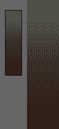
Dithering is an old technique invented in Malthusian times, when machines were too primitive to display more than a few colors at a time and where pixel artists had time to waste. Dithering is a technique that aims to achieve a gradient using a minimum of intermediate colors (ironic, yes, but not absurd.).  Specifically, how does it work? The human eye is imperfect and can only distinguish the colors of pixels with questionable accuracy, so it tends to mix the color of a pixel with its neighbors. The green square to the left of this paragraph consists only of yellow and blue pixels interlaced, and your eye makes the mixture to give it its green color. Wonderful is not it? We will use this property to create color gradients (eg, from yellow to blue, using the above Interleaving to create green between the two). There are 3 good reasons to do so rather than using a gradient, as a Photoshop user might suggest: the first is that by using few colors, you hold to the "pixel art" style of the rest of your game (as long as you do pixel art), the second is that it allows for more intelligent management of your palette; you can reuse some of your color palette in the gradient to make the image consistent. Finally, the 3rd and probably the best is that unlike a gradient automatically making a seamless but monotonous transition between 2 colors, you can choose intermediate colors (a little more saturation over the middle for example) to make things more interesting for the imperfect eye.
Note however that the heyday of this technique has been over for a long time and, misused, it is more likely to ruin your masterpieces instead of embellishing them. Furthermore, this technique requires a lot of space to be applied and it is completely unnecessary in the creation of a sprite. It's been used well to make the images of the demoscene or background of the sky in some games.  The image to the left is an example of a gradient made with 3 colors using dithering. It's easier to look at it than it is for me to describe it. The general trend is to increasingly use a particular color as you approach one side or the other. You shouldn't put two separate patterns to close to one another, or else when you zoom out, your patterns won't appear to follow any sense of logic.
 Of course, there are many different patterns you can use to dither, some of which are more difficult than others. Here are some popular ones, although there's nothing preventing you from creating your own. You're not even obliged to create any pattern at all; sometimes a chaotic dither can work if you want to create a rough and dirty surface.
2. Lighting and materials
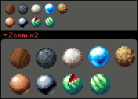
Achieving textures in pixel-art means knowing how to represent different materials regardless of their form. This allows your player to think "I'm crossing the little wooden bridge" rather than "I'm crossing the little plastic bridge". Indeed, all materials have a texture of their own, which helps to distinguish them. Two criteria are decisive in achieving a texture: the first is the pattern that covers your material. It is usually bumps on its surface (nodes on the tree, small scratches on the stone) to be represented by performing shading on a very small scale. The second criterion is how the material reacts to light (whether that material is bright, how it reflects, light, etc). Let's look at this small set of textures as an example:
 Wood: For wood, everything depends on the surface pattern, which is a network of lines which are sometimes cut to form knots. It is insensitive to light, unless it was varnished (this is not the case here). Granite: The granite surface has much larger irregularities than wood, and a ball of granite doesn't act exactly like a sphere. To represent granite, you must add shadows to the surface -- small touches of color used to represent isolated holes and bumps on the stone: it is actually shading very small scale. Its reaction to light is a little less shy than the wood, but still very dull. Marble: The technique for marble is virtually the same as granite. The main difference is that the marble is generally smooth (use more colors and more antialiasing). Furthermore, it tends to receive brighter highlights than granite. The water (or glass): These two subjects are semi-transparent and thus tend to reflect the light within themselves, where the second highlight comes from the bottom left. In addition, a large part of the received light is returned and that is why the main highlight (top left) is very big and bright. Finally, water and glass are very smooth materials that require a lot of anti-aliasing. Clay: Clay is one of the most simple to represent. It requires few colors just because it is rough and un-detailed. The ball was made entirely with a size 2x2 pencil (ie, the details are unimportant). Copper: Copper, like all metals, strongly reflects light in the highlights and quickly becomes very dark in shaded areas. Do not be afraid to use a wide range of colors, not only to reflect the contrast, but also to give a smooth surface (antialiasing is the key). Please note, the shadows on copper tend to go in the green (yes, green. Do not ask me why, look at pictures to convince yourself of this). Metal (steel): As stated just above, metals explore the full range of values from black to white ... but without the gray. It is common for beginners to represent metals as grey, but it is a mistake. Metals are always colored, either intrinsically or by the ambient lighting, but it is never simply gray. Watermelon: Actually, watermelon reacts almost like plastic but I found it more fun to make a watermelon than a piece of plastic. The highlights are very plastic and quickly desaturate towards white, while the shadows are not very pronounced. Of course, there is are neither patterns nor bumps on the plastic. But for watermelons ... 3. HAIR! Hair, and fur are a special case and particularly difficult to treat (3D artists have at least as much trouble with this as we do, if reassures you). The problem is that hair is finer than a pixel and therefore is very difficult to represent. Sad, huh? I guess we'll have to give up. Or not. -- The solution is not to draw hairs individually, but to focus on highlights (and hair looks prettier with highlights anyway, so it's for the best). Each highlight can be represented by a line or triangle whose thickness depends on the length of hair (more hair give you longer ones, but most highlights are small), and whose orientation is used to define the volume underlying the hair is in the direction of the surface they cover, or perpendicular to that direction (whichever is closest to the vertical / what you think is the most logical). The solution is not to cover the hair or hair, but wicks (and there's more pretty than that wicks of hair, so it's all benefit). Each bit can be represented by a line or a triangle whose thickness depends on the length of hair (more hair is long, more bits are fine) and whose orientation is used to define the volume underlying the hair, either in the direction of the surface they cover, or perpendicular to that direction (whichever is closest to the vertical, or whichever way you think is the most logical). For example, the hairs on the back of an animal are horizontal, while they fall more vertically (but not entirely) along its flanks.
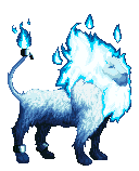
 Finally, the hair texture is smooth (think cozy: 3) and this must be reflected in your choice of color for the drawing. The transitions between colors must be hidden as much as possible. Consider the fur coat layer that covers your creature: some hair falls lower than others and is thus in the shadows. You can use these shadows to allow you to transition between colors without having any sharp boundaries, and while maintaining the texture of the coat. This is precisely what I tried to do in the example of the lion on the left.
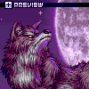
 Finally, I leave you again with some pixel art to admire. Thank Ahruon, who generously provided "Moonlight Parade" to illustrate this section. I advise you to zoom in and take a close look.
In conclusion, restraint must be demonstrated with dithering and textures. It is often preferable to keep certain areas or objects in the dark or light enough that their texture is indistinguishable. This strengthens the depth of your image, it makes you work less, and it serves to define areas of emphasis (which are thus the most detailed). Note that the left rear paw of the lion is almost a solid color. Pessimistic note: If you're planning to animate, think twice before you add too much detail, or you'll be pulling your hair out.
