
User login

What is OpenID?
  • Log in using OpenID
  • Cancel OpenID login
  • Create new account
  • Request new password
Register
  • Home
  • Browse
    • 2D Art
    • 3D Art
    • Concept Art
    • Textures
    • Music
    • Sound Effects
    • Documents
    • Featured Tutorials
  • Submit Art
  • Collect
    • My Collections
    • Art Collections
  • Forums
  • FAQ
  • Leaderboards
    • All Time
      • Total Points
      • Comments
      • Favorites (All)
      • Favorites (2D)
      • Favorites (3D)
      • Favorites (Concept Art)
      • Favorites (Music)
      • Favorites (Sound)
      • Favorites (Textures)
    • Weekly
      • Total Points
      • Comments
      • Favorites (All)
      • Favorites (2D)
      • Favorites (3D)
      • Favorites (Concept Art)
      • Favorites (Music)
      • Favorites (Sound)
      • Favorites (Textures)
  • ❤ Donate
2D Art

how should I improve my pixel art?

smacaroni
Friday, January 3, 2025 - 05:38

Hi, I'm sbird, and I'm learning how to pixel art!

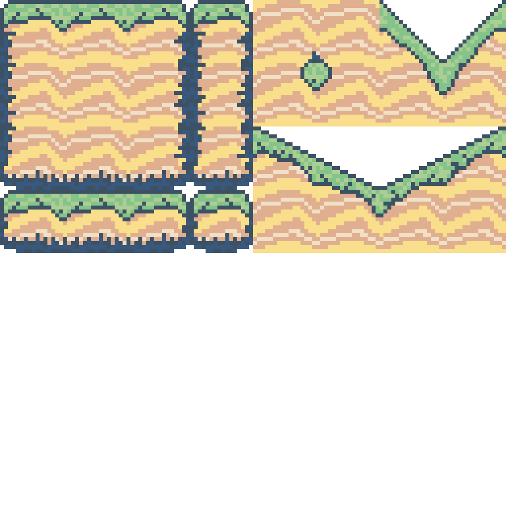
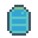
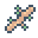
I'm making a platformer where you have to try to get materials to build a raft to escape a deserted island. I've made a tileset that looks beachy and the resources (water bottles, sticks, logs, and rope)

how should I improve my pixel art? The tileset looks okayish, but the resources don't look good at all. Is the outline too much? Any tips for me to improve my pixel art?


for reference, I'm using this palette: https://lospec.com/palette-list/warm-breeze-on-sunny-days (i just searched "beach" on lospec)

should I keep using this palette or should I try using a different palette with more colours? or should I not use a palette at all as a beginner?

Attachments: 
Preview
coast-tileset-scaled.png coast-tileset-scaled.png 11.2 Kb [6 download(s)]
Preview
water-bottle.png water-bottle.png 555 b [4 download(s)]
Preview
sticks.png sticks.png 598 b [2 download(s)]
Preview
small-log.png small-log.png 493 b [2 download(s)]
Preview
log.png log.png 651 b [1 download(s)]
  • Log in or register to post comments
Ragnar Random
joined 4 years 3 months ago
Friday, January 3, 2025 - 06:25
Ragnar Random's picture

i think it looks great! the palette works well, atleast for the tiles. and you can always expand a pallete with compatible colors. i've attached a simple example of an expanded pallete :)

as for whether sticking to a palette or just winging it as a beginner, people will have different opinions. for me, pixel art in a retro style is all about limitations, and having a palette is a good limitation. but if it's too limited, i am not averse to expanding the palette for my own needs.

withthelove also has a nice PixelPaletteTool that can be used to easily try out swapping your pixel art to different palettes. https://withthelove.itch.io/pixelpalettetool

Attachments: 
Preview
warmbreezeplus.png warmbreezeplus.png 2.3 Kb [2 download(s)]
  • Log in or register to post comments
smacaroni
joined 6 months 2 weeks ago
Friday, January 3, 2025 - 18:23

using the extended palette, I was able to add a bit more detail (subtle shadows and stuff like that)

i also removed the outline. Is it better with or without the outline?

Attachments: 
Preview
log-scaled.png log-scaled.png 617 b [1 download(s)]
Preview
rope-scaled.png rope-scaled.png 624 b [1 download(s)]
Preview
small-log-scaled.png small-log-scaled.png 451 b [1 download(s)]
Preview
sticks-scaled.png sticks-scaled.png 517 b [2 download(s)]
Preview
water-bottle-scaled.png water-bottle-scaled.png 469 b [1 download(s)]
  • Log in or register to post comments
Ragnar Random
joined 4 years 3 months ago
Saturday, January 4, 2025 - 15:20
Ragnar Random's picture

i think the details read better with the outline, but it really depends more on how it looks in game  -- do the sprites read well against the background?

  • Log in or register to post comments
smacaroni
joined 6 months 2 weeks ago
Thursday, January 16, 2025 - 01:45

yeah the background is a light blue so I think the dark blue outline is good. It'll also help match with the buttons and tileset :D

any other tips to improve my pixel art?

Attachments: 
Preview
sticks.png sticks.png 267 b [3 download(s)]
Preview
rope.png rope.png 309 b [1 download(s)]
Preview
log.png log.png 320 b [0 download(s)]
Preview
small-log.png small-log.png 234 b [0 download(s)]
Preview
water-bottle.png water-bottle.png 213 b [1 download(s)]
  • Log in or register to post comments
Some Weirdo
joined 3 years 1 month ago
Tuesday, July 8, 2025 - 05:34
Some Weirdo's picture

Maybe make your interior outlines a little darker? Otherwise it looks like you're well on your way.

A good thing to do to help is just zoom in on sprites and play with the colors, observe the shapes they use ect... it'll give you a feel for working at that scale dot by dot. But it seems you got the basics at least.

  • Log in or register to post comments
Yaroslav_Novikov
joined 5 years 4 months ago
Tuesday, July 8, 2025 - 10:38

Second bottle more fresh, but first can be used fun, if you put it in water.

Not bad tileset, but too trivial. Try to add more object-details and some colors or shades. You can add some shadow below grass and shape accent.

You can make more variations of created tiles, because when they repeat much time they became annoying.

I add some screenshots from old games ( sorry, they stretched ). You can use them as examples of relationship between shades of colors ( and as examples of background ).

Attachments: 
Preview
desert.png desert.png 66.7 Kb [0 download(s)]
Preview
beach.png beach.png 74.2 Kb [0 download(s)]
Preview
gato.png gato.png 97.1 Kb [0 download(s)]
Preview
gato2.png gato2.png 74.8 Kb [0 download(s)]
Preview
gato3.png gato3.png 95 Kb [0 download(s)]
Preview
talesofdestiny2.png talesofdestiny2.png 40.3 Kb [0 download(s)]
Preview
talesofphantasia.png talesofphantasia.png 34.8 Kb [0 download(s)]
Preview
rhapsody_oasis.png rhapsody_oasis.png 97 Kb [1 download(s)]
  • Log in or register to post comments
Some Weirdo
joined 3 years 1 month ago
Wednesday, July 9, 2025 - 11:24
Some Weirdo's picture

uhhh not sure about the tales series, but they look very pre rendery, Legend of Mana is sprites on a painting. I think mostly watercolor.

If you want a good example of complex pixel art look at the SNES version of trials of mana or Treasure of the Rudras. 


Though in pixel art, simpler is better. Too much detail (especially from someone just starting) can kill a work.

Attachments: 
Preview
1-sd3_48_1.png 1-sd3_48_1.png 43.7 Kb [0 download(s)]
Preview
r110.jpg r110.jpg 54.9 Kb [0 download(s)]
  • Log in or register to post comments