Pages, an MMORPG (for now)
Hi there! I've been formulating an idea for a game for a while now, and came up with Pages.
The basic idea of the game will center around magical books holding the spells players will use, the player will be able to craft pages in the spell books, which are ripped upon use, creating a sort of mana system, where the player can eventually temporarily run out of uses.
Originally I was planning for a RPG style of game, but decided that LPC fit much better with an MMO style.
The main baddies will the the Necronaids, (Redshrike's Imps) who wield the power of the dead, and are responible for the large amounts of undead roaming the land.
The player will start out in the far northeast, and have to venture out further and further until they reach the capitol city, which I'm still trying to name. but I'm thinking of some spin on OGA or LPC, like Lepclesa or Ogashire. From the capitol the player will be able to venture out into other parts of the world.
As for development, once I'm far enough along and sure I'll be comitted enough to finish the game, I'll start looking for volenteer artists, tilemap creators, and coders. I want the game to be community-driven, and will hopefully be able to make it easy for anyone with basic knoledge of tileing and such to be able to submit regions and dungeons of their own. As for revenue to pay for art commissions and the servers, I'll probobaly offer several premium DLCs (which will be the only closed-source part of the code) and maybe clans that one can maintain for a small yearly fee.
I hope to offer eventually offer the game on both Mobile and PC, probobaly through Itch.io.
Below I've included the full world map, as well as some select screenshots of the game.
I'll continue posting updates as I go.
-Sincerely
FiveBrosStopMosYT
Whole map here, was too large to upload.


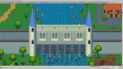
The great waterfall on Menta River, just south of Pearlbrook.
Hey, looks very cool! Always excited to see new projects with the LPC assets!
The link to the big map seems broken... can you repost?
Are you interested in feedback on the maps?
Sure, I'd love any feedback or suggestions you have. :) I'll work on finding another image hosting site.
Here's the links to both the TMX and PNG files for the main map and the tiled files.
Main Map png
Main Map tmx
Necromancer's Fortress png
Necromancer's Fortress tmx
Ps. I'm going camping over the weekend, so I'll be off for a few days.
Whoa, those are big maps! The Fortress PNG still doesn't load for me, and the TMX files aren't really viewable without the tilesets.
I'll post some thoughts later, but overall looks like very creative use of the tiles!
(To be clear, I'm not saying you have to upload the TMX files, just that I tried to view them but it didn't really look like anything. I'd love to see the fortress though, if you're able to upload the PNG somewhere!).
Thanks, I already downloaded through the fortress link to test if the site was legit, so it may have been a onetime thing. I'll send you a fresh link.
As for the map, I may have gone a little overkill on size, I may have to downsize down the line.
Here's that link, please no one else download, as the link is a onetime download.
Noice; thanks! Yeah, looks like Menta is gone now. You may want to look into using Dropbox or similar in the future, that's what I usually use. Also Necromancer is only 1.2MB, should be able to upload here if you want.
Also wow, the Necromancer's fortress looks pretty badass!!
Thanks, although, no offense, please don't use language, I'm a Christian. :)
I looked at doing dropbox, but it seemed to be a premium service, did I miss something?
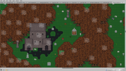
The Necromancers Fortress, in the heart of the Fell Woods. Quote from, On the History of Magicks, by the High Wizard, circa 307,000 AAP. "The Fell Woods were once a verdent forest, the only place in the world that the medicinal blessed herb grew until, according to legend, the Necronaids moved into the woods, defiling the forest with their dark arts. Many thousands of years later, during the Age of Purification, the Necronaids were driven from their stronghold, which by that time had become a foul, sprawling fortress of crypts and graves, slain foes stockpiled for their vile necromancy. Their last act before abandoning the forest forever was to curse it, withering the leaves and transforming it into a place of death, filled with ravenous wolves and vile spiders. To this day it remains as such."
The Tipsy Cat Inn:
Built on the site of an ancient bathhouse, the inn is renowned for it's medicinal spa.
The inn was actually built directly onto the bathhouse, the structure is now over a hundred years old, while the bathhouse it's built onto is thousands.
The interior: First off is the bar, and above that the rooms. The rooms are going to be actually rentable by players, with customization options from the scores of furniture available in LPC.
The bathhouse: Both the changing room and the baths are gender segregated. As you can see from the preview characters, I used the male robe bottom, and the female tight dress as towels, as so far there aren't any intentional towel costumes.
Inns like the Tipsy Cat will populate the world, and will operate as shops, spawnpoints, player tradingposts, and safe areas during the dangerous night.
Pirate Archepalengo:
Avast ye! Hear the tale of the dread pirate Captain Black and 'is band o' scallywags 'n wenches! Far to the east of Menta lies the Lumu-Lumu islands, famed for their sandy beaches, lush scenery... and pirates. On the largest island of the archepelango lies Dead Man's cove, the bastion of Captain Black, from there he launches his attacks on the Royal Mercantile Fleet, with their headquaters, Fort Stalwart, to the far north of the islands.
Mechanics for this area of the map will include a stealth storyline, taking on the disguise of a pirate, players will have to do several quests and mini-dungeons to reach the area's boss, Captain Black himself, in the heart of the volcano. Unique drops will include pieces of eight, sabers, and the conch shell, a rare drop that will summon a band of pirates to fight for the player when blown.
For the docks on the pirate town, I used the tiles from Avanti's dock tileset. With some modifications I did, I was able to get them to meld pretty well with LPC.
Hey man, this is really great stuff! I meant to post some feedback earlier but lost track of time. A few quick comments (let me know if unclear and I can make additional demonstration images):
- for big patches of grass, water, etc.: you are using mostly the "accent" tiles; this makes the pattern obvious and the tiles look repetitive. Instead, try using mostly the plain version (~8 plain tiles:1 accent tile). For grass, this is just a plain green square. You can setup tile probabilities in Tiled (Edit tileset > Properties > Probability) to paint this way using the Random Mode (D) or the terrain tool. Counterintuitively, the simpler pattern will make your scene look less repetitive and more organic.
- on a similar note, ease up on the ornaments in the necromancer's fort. A lot of the ornaments don't have solid bottom border and are more meant to be used with tiles that have an implied top border. They look kinda strange hanging without that. Likewise for some of the windows, though that's more my bad.
- the geometry of some of your buildings is hard to visually parse. For example, the blue bridge in screenshot_24.png , it's hard to tell where the wall ends and the ceiling begins. Consider using small drop shadows on the right side of an object to emphasize this. You can find some in the LPC Base Assets > UI > shadow.png . Using tiles with harder/darker borders also helps with this problem.
- in screenshot_25.png, the smaller parts of the fortress building should be further forward/down in the image. As it stands, the roofline is longer than the floor line, which doesn't make sense. Also those walls don't really have roof tiles, if you'd like to use them as walls of an enclosed building I would suggest getting rid of the inner row of merlons and draw/appropriate some roof tiles. If they're being meant to enclose a small space, they might benefit from some shadows on the inside.
- buildings work best with the windows when each storey of the building is 3 tiles tall. Buildings that break this rule end up looking strange. You can see this in the building in the southern Menta village, just north of the dock (see image). The white huts on the dock have kind of the same problem, but I think they would look nice with a window on the upper level, as you've done for the blacksmith.
- speaking of which, I love the little blacksmith area. Great use of different tiles and nice little implied space. The only problem I see is that the backing wall is kinda too high contrast compared to the objects hanging there, so it's hard to parse them. That's partly my bad, I'll be making a higher-contrast version of the furnace whenever I get around to releasing the Blacksmith pack. I could make a lower-contrast version of the wall too eventually, but there should be other options as well that let your objects stick out better.
- in the tipsy cat interior, the ceiling moulding looks too thick with both that decorated top row of wall tiles against those thick room border tiles ("ceiling"). I would suggest swapping out the top wall tile for a plainer version, leaving the room border tiles alone.
- finally, I've made this comment elsewhere to pvigier, but it helps to have variable density of trees and to pick one or two dominant species for an area, rather than having all kinds of trees be equally likely. Preferably these should be the more round, symmetrical kind, rather than the weirder more asymmetrical ones. This will have the side effect of making different areas of the game more distinct.
I don't want to come across as too negative, because overall I think you are doing a great job! I love the tavern scene and the little towns in Menta. Just trying to provide some constructive feedback to help you improve :)
Thanks for the feedback! :) I'll work on making the changes you suggested and come back with something more detaled after I get back from camping. I really appreciate the time you took out of your day to help me out.
-Sincerely
FiveBrosStopMosYT