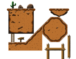
First Tileset. Need Feedback please.
Hi guys, This site has been very helpful so far. So I thought I would come back to get some constructive criticism. I am use to working in Inkscape, But despite trying really hard I just couldnt get tilesets to come together as well as I hoped. So I decided to go with photoshop. I quickly realized after a hour or so that 64x64 tiles were not going to give me the detail I was use to in Vector. I should have bade the tiles a Little larger, But I was to long into the project to stop. So I ended up with this creation and was curois about a few things.
-Does this look like it could be a working tile set? Or do you see somewhere there could be some problems?
-Anything you would change about the colors to make it pop more? Is the pallet to dull?
-Any opinions would be appreciated. When I go to to do this again I want to get it right.


hey nice work. i also asked here for some help, so i think i should help others too :D
First, i would never use photoshop for this kind of thing. You may want to scale it up or down later. Imagine you have a customer who wants lets say 4x larger than you did. That would be a mess in photoshop! But you also said this, so i skip.
As for the tiles, they seem to work. You have implemented different variations which is nice, but something is missing. Yes. The corner tile. The corner tile is like a normal tile but has a rounder shape on one side. You would place such tile on the end of any tile, so it doenst end sharp, but smooth. Hope was clear enough :D
The colors. Ill be honest. I didnt like it much. Unfortunately, i cant help you out here. Are you familiar with the color scheme? Try out different "color families". Its all about experimenting. At least thats how i do it untill i find the right color :D
I dunno if the top should be dirty earth, then brown is ok. If it should be sand, then you should go for more yellowish and brighter colors. Because at this stage it doesnt look much like sand for me. Maybe someone else will comment different.
and dont forget, many artist go over and over again until they really reach the wanted quality. So keep up the work :p
Hey Cliipso,
first of all good work! And kudos for your will to improve that's the greatest skill an artist can have ;)
Regarding improvements for your tileset:
The light and shadow in your picture are to hard and look a bit unnatural.
I think it might look better if you go with a more thin line of dark and smoothly blend over to the brown sand color. The color for your highlighted areas is too cold and greyish. Maybe you could simply use a little more contrast to the original ground color?
Although the walking ground on here seems more like waves with up and down points so instead of using one straight top lightning how about going with the shape? Blending in with the ground color again would add up to the effect I guess.
In case my english is too bad or weird ^^ here is a picture of what I just tried to say.
Hope that helps. Good work!
---------------------------------
2DPIXX - Game Art and Design by Jana Ochse
Website: http://2dpixx.de
Artstation: https://www.artstation.com/2dpixx
Ko-fi: https://ko-fi.com/2dpixx
Thanks for the feedback guys! I do agree with what you guys have said. I am going to to try and touch it up. I am going for a sandy/dirt level. Because the game I will start working on soon will start in such an area. Again Thanks!
So, I gave the idea a little rethink. Ended up making the tiles seperate in inkscape then piecing them together in photoshop. Do you guys think this would be an improvment? are the colors better?
I always have stipulations with things I do..but they say you are your own worse critic. But I believe its a step in a better direction. Also the tiles are 256x256
yes this does look better for sure.
But still needs improvement. The Color looks a way too green now. Try to find the right tone IF you want to achieve a sand like look.
Then i didnt see at first glance but a moment later i recognized that your tiles are not seamless. What i mean by that is that i can see a cut off in the tiles where they are connected. it is not going smooth but looks misplaced. You can see this on the black wave almost everytime it connects with another tile. The round waves is suddenly stopped by 1 sharp edge. You may want to avoid that.
Other than that, the crates and ladder should be brown colored unless you want to do some artistic style which I think is not the case here :D
Give the crate a black or dark brown border. You need something to make the crate look as a single crate not 3 together as in the picture. The border will do the job for now. i cant differantiate the crates. Can you? :D
I also would go and watch some youtube about how to draw certain things, learn new techniques and so on.
For example your rock looks very simple. Watch this speedpaint video https://www.youtube.com/watch?v=-j7dp5M5wic and see how the artist takes time redrawing it over and over again. Puts layers over layers sometimes erases and redraws. I mean it needs some time to get some quality in the art you do. So take your time and think how to achieve not only a simple rock but an interesting rock.
There is lots of things to say but so far i think its enough :D