Feedback about Some of the art I created / selected for my puzzle game
Saturday, March 26, 2022 - 03:59
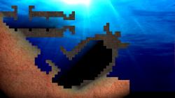
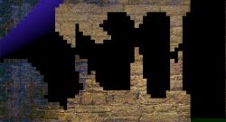
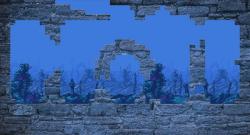
Hello, I would be happy to receive feedback about the textures, designs and backgrounds I selected / created for the levels of my puzzle game.
I'll be specially thankful for any tip regarding the colors, I need the backgrounds to be clearly different from the foreground.
Thanks in advance!
Attachments:


The darkness effect is cool... and I think you put a lot of good colors for those specific places.
Don't know what others will think though.
thank you umplix, the darkness and fades have a purpose too: to limit the extent to which shader effects can reach. It looks better in realtime with the effects.
I agree. These are looking pretty cool.
bzt
Thank you, those graphics are the result of experimentation with textures and colors with a process of "hit and miss" till I get to results I like. I'm glad you like them!
Reminds me of Lemmings. Looks quite good.
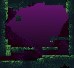
Where do the tiles come from that are used to build the 4th image (the green and purple one)?
Thank you, this is the link to the tiles used on the purple level:
https://opengameart.org/content/underwater-diving-pack
The rules are quite different but you are right, the levels looks very much like lemmings!
Here there are a pair of two of the last level recreation I made. The color of the background in the Airplane level is changed through the code. I can reuse backgrounds and change their colors or use different filters and shaders to make them look different. The original is in reality blue. I'm always unsure about the colors so feel free to give me any feedback about it. Is there good contrast between the foreground and background?
The zx spectrum level have a CRT filter with a slight noise to simulate and old crt.
Thank you!
The airplane level is a funny idea and looks good in my opinion.
I never used a ZX Spectrum so that level looks just odd to me. But I would say keep it that way because there will be players who have a nostalgic feeling :) (as I would have with C64 and Amiga).
Greetings
Peter
Hi, thanks. The design of the levels are not mine and they are almost 20 years old. It is all based on the original game. What I'm actually trying to do is to enhance the graphics with new models and assets and higher resolutions and filling the original design with them. It is basically a recreation of the original designs.
If anyone reading this feels creative and thinks he/she can do better feel free to submit your art to me. I'm also opened for a second set of assets if the set is complete and with good quality.
Hey glitchart, I have made background for your game, at least you can use it as desktop pic.
Hi Commander, it looks super cool! it looks like an alien world to me... I think it could fit on extra levels... It will take me time to think where it fits but I will probably use it. Thank you!
-OK, Then a few more for you for joke. CC0 free by me, haha ..
cool, definitely those underwater backgrounds are not from the earth, will see what I can do with them. Thank you!
-Hold down, did you really think to escape so easily, what about that foreground you mentioned in first picture. You are in need to clearly separate it from background using solid outline and add some shadow under, check this first picture. Also I have task for you, second picture is background in 800x600 in .png, resize it for your desktop resolution and then add foreground as I train you. Don`t forget, that most important thing, outline and shadow.
Hi Commander, I'm not escaping :)
That background is also cool but it does not fit the story on that level I'm afraid, and the backgrounds do not look like anything on earth so I'm afraid they would only fit with an extra script and extra levels. The game has a story and the graphics needs to fit it. Regarding the shadows and outlines, it is not a bad idea I will think about it... The neon outlines is maybe to extreme and differs completely from the current art style... I have to think about it, thanks for all the contributions sir!
Hi Commander, thanks for letting me know there was a contrast problem on that level. This is a test of how I think I can apply your idea. It looks kind of cartaoonish and it helps visualizing the edges that were otherwise hidden by the dark sides of the background.
Now I'm going to think about applying this effect by software instead of editing every foreground (and choosing which one need it), if you see the outlines of the objects on the screenshot they are done by the game so I can achieve the same effect by coding it including the shadows.
Regarding the backgrounds, I'm sorry but that level is themed on the world war and in the background there are two bombs from that war which by no means could be million light years away in an alien planet :)
Thanks!
-Excellent job, now add some moving grass in unimportant area, plus some bubbles and so on and we are done with your case. Good work.
it does not look bad but it is hard to say with that resolution, but this is what I added, I hope it is not overdone...
-Not bad, but add more, add bubbles also, like in aquarium. In any case play game called Subnautica, first part when spaceship Aurora crashed on the unknown planet. Be sure to have at least 4GB memory to start the game. Consecrate your attention to underwater atmosphere, and especially water sounds, and music.