Bright, fantasy-themed palette

Just for kicks, I put this 32 color palette together. I don't recommend using it at the moment, as it's subject to change, but the general look of the palette that I'm going for is the Chrono Trigger overworld and Secret of Mana.
I know some people have pointed out that the Dawnbringer and Arne palettes are both kind of geared toward this sort of game, but I find that the lack of a really vivid red and green color prevents them from having the effect I'm looking for. In a sense, I'm giving up a bit of versatility in the form of muted colors in order to be able to better express bright, saturated ones.
I considered some specific gradients when I made this palette:
- A light blue gradient for sky colors.
- A dark blue gradient for the ocean.
- A light yellow-green to dark blue-green gradient for foliage.
- A beige to brown graident for earth colors and skin tones.
- Red, yellow, and purple gradients for accents such as flowers, etc.
- A greyish gradient.
This palette deliberately avoids:
- Muted colors in middle luminosities.
- Greenish-brown colors that are common in more realistic games (that's for another palette).
One thing I noticed about it is that I have an an off-white color in there that's close enough to white that I could elimitate it pretty easily, which would free up an extra color to shore up any other weaknesses. I'm thinking about maybe a rust color. Thoughts?


I like the idea of this palette. Maybe to test it you could take a small scene from an existing game and recolor it with just these colors? Seems like a useful exercise for validating that it's useful in practice.
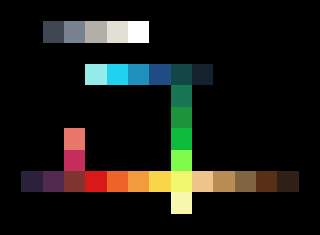
All the darkest colours have very similar intensities which results in them being barely distinguishable and reduces their value for varied detailing of shadowed areas.
One thing that can be handy when building a limited coloour palette is to work within a lower colour resolution. Reduces the number of potential colours to consider (RGB333:512 vs. RGB888:16777216) and guards against overly similar colours.
Output from DB's analyse palette script:
Red warrior needs caffeine badly.
All the darkest colours have very similar intensities which results in them being barely distinguishable and reduces their value for varied detailing of shadowed areas.
Thanks for the heads up. That wouldn't have occurred to me. It also looks like, in addition to those two off-whites being really similar, there's a dark brown and a dark purple that could probably be merged into one color, which would free up a second color for me to do whatever with. Any thoughts?
Here it is with an update based on the analysis you posted. That's a pretty sweet tool for finding and merging close colors, so I was able to add a bit more variety to the palette without losing too much.
I took some pointers from Hapiel over on a pixeljoint thread and have evolved the palette into this (you can see the intermediate step there):
The original was too much, even for the bright, saturated look I was going for, so I toned down the saturation a bit and (at Hapiel's suggestion) I tried some palette remaps of existing images.
Wow, I love it! My only suggestion would be to slightly darken the lighter green color. It seems to have a slightly too large of step compared to the main green color.
Dawnbringer stopped by the pixeljoint thread and has been giving me some pointers (one of which was to even out the green ramp like you mentioned). Here's the current iteration. I think it might be approaching a point where it's ready for primetime:
Hmm. I'll have to play around with it, but this could be a pallet I could use. I wonder how the LPC artwork would look remapped to these colors?
This was just a quick recolor, but I'd say it works pretty well with the example image (note that I've made another alteration, replacing the light cyan with a darker cyan midtone that works fairly well in both blue and green gradients:
Hmm, not as great as I hoped but not as bad as I feared. Most of the stuff that isn't working is just the stuff that's meant to be low contrast. A remap to these colors could be made to work I think. The whiter shades work really well, I'm surprised. I was mostly curious about LPC because the coloring inspiration for that and this palette are the same. I've also always felt that LPC's pallet could use a little unification and tweaking
Some of the lighter browns are lower contrast. If you're talking about the dirt colors in terhs of having too much contrast, I agree with you there; I think that color choice for the mapping may have been a mistake on my part. That being said, this much contrast may also just be an inherent issue with palettes that have lower color counts. There are already a number of colors that this particular palette just can't express at all (brownish green, for instance), and toward the end I felt like it would have been great if I could just have three or four more shades to work with. :)
I tried going for redder bricks, but the red is too bright for large areas. I'm okay with that, because it's intended more as an accent color (which in my opinion is something that can make or break a "bright" set), but for the bricks to be redder, they may need to be reworked a bit so as to include the red color in a less blatant way. That being said, I think the colors I did choose at least *suggest* that the bricks are red.
One thing I did notice about the LPC palette is the huge number of brown shades. I'm guessing that 75% of them could be optimized out.
So, here's an attempt to address the shortcoming of excessive contrast in brown colors... I removed an off-white and replaced it with another brown in between the second and third brightest brown tone, since the orange that was already there wasn't really working as part of that ramp.
What do you think?
I like that brown quite a bit better. The shadows under the trees are what's standing out most right now; they are too red, IMHO.
I'm sure if we were to really remap the LPC stuff to this palette the shadows would still be done the same way as before, with an overlay so there's really no point in worrying about those.
The remapped image is working a lot better with the new brown, not just the ground but the barrels too. The lack of a good red seems a pretty big weakness in the pallet, I don't really see a way to make a decent ramp from it. Since this is supposed to be a bright set you may want to sacrifice some browns or greys for it. Or maybe just tweak things that could work in a red ramp so it isn't the odd color out.
The deficiency there was with my choice from among the existing colors. I chose a different brown from the palette. Same with the red... now that I've picked out better colors for the other (non-red) bricks, I think it works reasonably well. What do you think?
I like it, though I think the red is TOO intense, even for an intentionally bright palette.
One of the things that I don't really like about the other multi-use palettes is the lack of a really intense red. I could see about merging the two very dark blue-green colors together and adding a more subdued red, then pushing that purple color a bit more toward blue.
I think you'd be better off pushing some of those browns towards red than sacrificing a purple. Purple is what got sacrificed in Dawnbringer and Arne's palettes, I'd hate to have that happen to this one too. Brown, red and orange ramps could all easily go to the same colors at the darker end. Or you could push the browns, reds and purples to a purply brown in the darker spectrum. I think a lot of your problem here is that the ramps are still a bit too straight and so instead of tweaking a color to fit multiple ramps you're taking things out to make room for new colors. In the end a really great palette will let you make multiple ramps of the same color because mulitple colors work for the same position in the ramp.
Could you post the current version? I think it'd be easier to show you what I mean than tell you.
You know, looking at that picture again, I'm second guessing myself about whether or not it's too red. I think you're right - it looks fine.
I'd be interested in seeing another example with some of the other colors; like Sharm said, purple is often neglected. Maybe another look at the purples, blues and yellows would be nice.
The last color analysts I posted is current. I was playing with it a bit after that, but I'm not satisfied with the changes.
Okay, let's see if I can do this. I can't figure out how to put this into words and I don't have the skill to actually fix the palette to do what I'm thinking of but hopefully I can show you enough that it'll make sense. The changes I'm making to the palette are to make a point, I don't necesarily think they'd be better.
Here's my attempt at making a red gem with the current palette. It's all washed out and the ramp is uneaven.
Took the two darkest colors and combined them. Used the new space for a purply dark red. I then punched up the intensity on the rest of the colors. The entire red-orange end of the spectrum now clashes with the other colors but I didn't like how greyed out the red spectrum was, it won't work well for lava or pumkins or fire at all. Anyway, the point was to make that purply red. Looks really great in the red ramp and look! Looks good in the purple ramp and the brown ramp. (I tweaked one of the purple colors BTW).
So here's where we actually get to the point that I'm trying to explain. Now that the red and purple are in better places, this is now possible.
All the other colors are exactly the same as the purple gem but putting the red in doesn't look out of place and gives it a completely different look.
I hope this makes sense. I'm having the hardest time getting my thoughts out at the moment 'cause of a nasty head cold.
Your demonstration explained what you were going for pretty well. Can you post an indexed color image that uses your version of the palette? I'd like to test it out on some images and see what happens.
Sure thing.
So, I like where you went with the red and the dark purple, but I feel like now the oranges are a bit too loud to work in skin, wood, or earth tones (see the Secret of Mana picture for what I mean). From a practical standpoint, is there an advantage to having the orange colors be that saturated? Would the red ramp still work reasonably well with the original orange colors?
You've got two essentially identical greys in there now.
The bright-red and dark-orange are very close and the transition from bright-red to dark-red is quite a jump.
Red warrior needs caffeine badly.
Bart, you've only got exterior tiles that you've been playing with, it's skewing your perspective. When adding the saturation to the reds and oranges I was thinking of things like fire, lava, red headed characters (imagine if Crono was bigger), fall items like pumkins and leaves and so on. The screencaps your working from have almost no warm values at all and what they do have is pretty muted.
Ah, good point. I'll try some other scenes.
Bart, did you ever finish this? is Sharm's last post the final rev?
Looking for a palette to use on a project and like the idea a DB-esque palette with more vibrancy.
ps
let me add another gentle plug for some kind of palette category for sharing this stuff!
https://withthelove.itch.io/
So I think I'm going to resurrect this thread and maybe try to finish this palette.
I think what I'm going to do here is maybe just add a few colors (4 or 8, perhaps) to shore up the weaknesses of the palette, rather than make sacrifices by combining colors. 32 is kind of an arbitrary number nowadays, anyway.
So, trying this again, with 36 colors instead of 32:
I've added a pink, a purple midtone, a saturated yellow, and a saturated orange, and tweaked a couple of the other colors. Hopefully this is now approaching a usefully complete color set. :)
Here's one more try at it, with the addition of a couple saturated blues:
Here's a quick test of the new version.
http://opengameart.org/content/berry-garden
So, a question for anyone who happens to be paying attention to this, particularly artistic types. Given the visual style that this palette is going for, are there any serious deficiencies left that need to be addressed? I'd be interested in minor nitpicks too, but I may not act on them; at some point I need to stick a fork in this thing and declare it "done".
Note: I've modified the dev version of my color ramp generator so that it uses this palette:
http://static.opengameart.org/gradientifier-dev/rainbow.html
I can't really call myself an artist type but for what my opinion is worth, you've hit the nail on the head here. It's looking quite nice.
I'd be interested in seeing some of the above images in the latest palette, particularly Sharm's jewels, as those used the combination of colors to good effect.
No plans for the last two color slots?
https://withthelove.itch.io/
Honestly, I'm kind of at a loss as to what to put there. I'm open to suggestions.
No bright ideas myself, but if you have two extra slots, I'd say you can't go wrong adding two new greys.
Maybe one between: #848c96 and #b7b4ad
and another between #848c96 and #51555f
https://withthelove.itch.io/
Well, if you've got two more to fill in I think you need more dark browns, you've only got one. I'd like one that's a less saturated and slightly yellow brown that would work for things like grain and sandstone. Something to work with that skintone ramp. I'd also like a warm dark brown that isn't nearly so purple. Perhaps slightly darker than the darkest brown you've got. Hmm, you're pinks are also weak. It'd be nice to have a light pale one. This is tough!