Sunny and Strata Tilesets
A year and a half ago, I was contacted by a coding enthusiast who started working on a game using my Slates tileset. I was quickly impressed by it and wanted to help him, and as I regularly gave my opinion on his latest updates, I began working on graphical assests to fit the project. The project was getting more and more ambitious, thanks to his coding and my drawing. It was the first time I worked on video game with someone and I loved it, it was very exciting.![]()


But as for every project, time was the real test, and after a couple months of collaboration, events led us to abandon the project. I'm still very grateful for the good times spent on it, and all of what I learned thanks to it. I won't reveal anything about the game here, because I still hope to get the opportunity someday to try again making it, and because as long as it doesn't exist, it's something I share with that friendly and creative coder I met on this website.
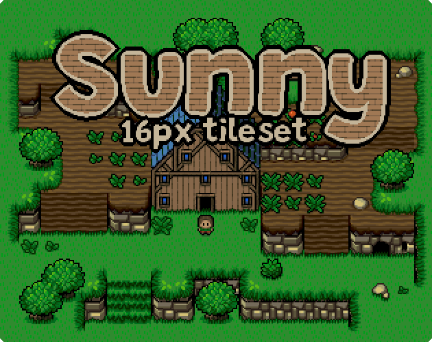
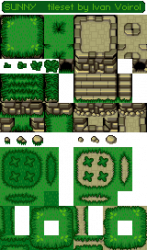
I then had this unfinished (yet very ambitious) tileset on my hands, without purpose. So I reduced its scale (both figuratively and literally) and tried to make it as if it was finished, to finally release it and let people use it on projects of their own. I changed the name from Strata (which surely will be the name of my next tileset) to Sunny, and went from 32px tiles to 16px.

You can now buy Sunny on itch.io and try the demo I uploaded here, but this post isn't about this tileset. I mean, buy the tileset if you like it and want to use it, but I wanted to take the opportunity to thank this community for everything it brought me.
I first started working with Pixel Art to design the flag of my guild on Ragnarök online, and as I found myself enjoying that a lot, I carried on. I then found OpenGameArt, and posted most of my work here. Here, the community gave me confidence and advice to help me improve my work, which was the only thing I really needed, it gave me support. I believe that beyond offering free assests, the best aspect of OGA is its community.
So I wanted to try to give something back. So I'm giving here every version of the Strata tileset (v1 to v6) which contains many different textures and animations (and how they evolved with the revisions and improvements), and will asnwer every question about it for the people struggling with tileset making. And by the way, Strata is compatible with LPC assests.
Tanks again !


Comments
Thank you for all your wonderful art!
But I'm afraid this is not something you can post on OpenGameArt, because your added copyright clause makes it non-open:
"These asset packs cant be used in any commercial project, resold/redistributed, even if modified"
See https://en.wikipedia.org/wiki/Free_license for a more thorough description of what is an open license, but basically all the art on OpenGameArt allow commercial use. Adding this clause to CC-BY turns it into a license similar to CC-BY-NC (which is not supported on OpenGameArt).
This clause is basically incompatible with the idea of the website. The idea that the art can be used in any open-source game, but open-source does not mean free. For example, Battle for Wesnoth is open-source, but they sell their iOS version. Open-source licenses do allow commercial use, and a non-commercial license is not compatible with most definitions of open-source.
You can still advertise your paid tileset on OGA's submissions, but you can't put it as a resource. You either need to put this link in the Slates submission, or re-license a small part of the new graphics as a 'sample' under a free license, submit that sample and add a link like 'you can find more like this for a price here'.
Thanks for the detailed response, it's actually a typo ^^ just fixed it.
These tilesets can be used in any projects, no restrictions.
Strong work, as always Ivan! As usual, I particularly love your stonework. I'll have to try it out with some LPC tiles!
I love it!
Do you have the animated png of the tree in gif form? I don't think the site and/or browsers know what to do with it as it is. I don't mind converting it myself, but... I don't know how to edit an animated png either.
.hit happens.
Hacker detected.
Nice, but it looks like it's missing a few frames.
Just added.
I just converted the files to gif, but if you want the apng back (animated png), just modify the link from .gif to .png, the files are still online.
Have you ever used ezgif.com? It's a very cool site with many tools to manipulate sprite sheets, gifs, apngs and a lot more stuff. It's very powerful, I always use it for the animations I publish on OGA. I even converted the apng of the trees and plants in one click ^^
Thanks bluecarrot, coming from you it means a lot! I spend a lot of times figuring out a new stone tile style, and worked a lot on the palette.
Huh, TIL that animated PNGs are a thing... Tree looks great BTW!
You're welcome---big fan of your work!
That said, I wanted to discuss something I noticed looking at the walls a little closer. There's a weird effect where the wall looks kinda blurry, even fully zoomed out. It looks like the image went through some kind of nearest neighbor interpolation due to non-integer scaling... but even when that's not the case and you're looking at it at 1x or 2x. I didn't notice it at first because I thought it was just the usual browser blurring pixel art, but when I downloaded the image and looked more closely, I was kinda perplexed.
I think it's basically due to banding, but a little worse in this instance due to two factors: 1) the 2px border around most rocks (in this color #4f4932), and 2) something about the colors at the top of each stone that I can't quite pinpoint.
I tried a few ways to fix this (see attached image---Ivan's original is on top, then my edited versions are below):
I'd love to get Sharm or someone more experienced to take this apart and explain what is going on here, because it was surprised how difficult it was to make the "blurry" effect go away.
-Hey bluecarrot16, to make "blurry" effect go away, just add more "Sharpen" effect on that final zoomed picture.
You make a very interesting point. When I last worked on those tiles, I felt the same but couldn't get rid of that blurry feeling without loosing the general style. I also had made the mistake of making too many stone tiles to remake, and got too lazy to make them all over again ^^
But your ideas seem to improve it by a lot. I used your last sprite to try something also. I reinforced the volumes with more shadows and trimmed some more of the 2px borders you left.
When compared to the original tiles, I think it looks better. the remaining blurry effect may come from the fact that the palette may contain too many colors, and introduces gradients too smooth for pixel art. I agree that an experienced artist really could help here :P
I saw the preview, and immediately knew who had posted! I love the style of the set (and I still want to do a proper project with Slates!). Thanks so much for sharing the work, the quality of the art is superb.