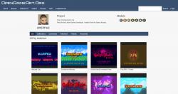
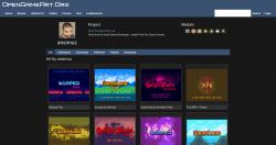
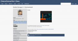
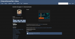
Site design: Light and Dark
Author:
Monday, March 18, 2019 - 06:28
Art Type:
License(s):
Collections:
Favorites:
6
Light demo: https://frozen-harbor-40210.herokuapp.com/
Dark demo: https://frozen-harbor-40210.herokuapp.com/?dark
Source: https://github.com/Daft-Freak/oga-mockups
Saw the challenge, needed an excuse to write some CSS...
Some notes:
- The home page is a bit unfinished looking, mainly happy with how the user/art pages turned out.
- The demo seems to work in all the browsers (surprisingly)
- Yes, the background isn't blue
- The downloads have all images removed to avoid any licence issues
- All the previews/downloads are at 2x DPI scale.
- (unrelated) The submit art page really needs a '<input type="file" multiple>' on it
File(s):


Comments
Very functional design
Artists' pages look really good
"Featured" art thumbs on home page seem a little big...they could probably be the same size as the "popular" and "latest" thumbs.
In terms of the layout, I'm mostly interested in the new art and collections. "Featured" art is nice, but it seems like a random assortment of older work, so it's usually a little lower on my priority list (that's just my opinion....others may disagree).
Only other suggestion would be to move the download link(s) up above the preview section on the content pages - some artists submit lengthly previews and you have to scroll down a bit to get to the actual files (just a pet peeve of mine, not a big deal).
I really loooove this, and I think if this design is selected, it default to white and have a choice to change black, cause I turn everything that allows me to, to black; from software to web apps.
I also like how the post information is organized! Brilliant work! :D
Forgot to mention: https://frozen-harbor-40210.herokuapp.com/?dark for the dark theme. Also, all the previews/downloads are at 2x DPI scale.
@Daft-Freak I love this! I like the live site! Keep up the hard work! :)
Made some adjustments to the home page:
- Featured is no longer huge.
- Shows some collections
- Sara is back.
There's also a collection page (mostly just the artist/art pages mashed together). Oh and this slightly meta page.
EDIT: Also pixelated tiles for fun
I mean, this is really good ! I could see this being a great foundation for a future OGA site, as it doesn't change too much.
I've always had a pet peeve with how the featured art field always recycles really old stuff, but that has nothing to do with the site layout itself per se, though. And I'm excited that someone actually took the challenge to do the CSS ^^
Link to source added! (Check src/components and the html in src/routes for the layout/style).