OGA3 front page layout feedback

The initial rough layout for the front page for the new OGA3 layout is viewable at http://199.180.155.219
Any feedback is appreciated.
Source code for the theme is located at https://github.com/OpenGameArt/OpenGameArt-OGA3-Theme any patches are welcome!
Here is what I'm thinking on some of the comments bring up. Ideas/suggestions?
1) people can post animated previews currently, should we keep the rendering them out to a static png or let people actually see the previews that are posted? Is there a way anyone knows of to deal with this? Maby allow animation on hover? Anyone know how can that be accomplished?
2) There will be a forum menu item I just haven't added that yet, the menus' will stay basically the same
3) I think I will move the news button to the top middle as a pull-down
4) @chasersgaming the idea is to bring more prominence to the art, not all the other items, currently things like "who's online" does that really matter to anyone?
5) I am thinking to make the previews a bit smaller with a border around them, still larger than the current ones but smaller than now. Was also thinking to add a "left and right" preview button for if someone has more then one preview image. Thoughts?
6) I like the idea of an opt-out on the scroll, I removed the scroll for now but I think alike X or something to close it? Thoughts?
7) The duplicated popular this week and stuff at the end of the page is just for testing
8) Should I auto zoom in on images that have bad proportions, ie 10px x 500px or stick to showing the (almost useless?) super zoomed out image?
Note: The current theme is not migratable, the entire thing has to be redone as its impossible to just keep what there currently is. As such its an ideal time to redo it with support for mobile and other optimizations.
Comments
Early preview and all, but it seems to me that it hits the worst possible combination of an overall convoluted and chaotic look, while the same time offering very little content with the huge pictures.
But maybe this is just the impression you get on a smaller laptop screen ;)
i Got the same fright from the iPad.:) like the scrolling text though.
I like that you've cleaned up the look of the header area by bringing the links and the logo into the same box.
The scrolling forum posts just make it take longer to see if there's any recent topics I'm interested in, and the motion draws attention away from the art. Also, I don't see any other way to get to the forum.
The animated previews are a good idea, but probably shouldn't be moving by default. Motion strongly draws the eye, making it difficult to focus on anything else. It would be way too much if all the previews on the page animated, and it's very possible that this could happen. Either a button to start the preview, or only having images animate when you hover over them would fix this.
The larger images are fantastic. I always though the old design had the previews too small. However, it's hard to see where one preview ends and another begins, especially when they have similar background colors. Adding a little margin would help a lot to make it feel less crowded and chaotic.
I'm not sure what the menu in the lower right corner is for. The icon is what's normally used when the header is hidden inside a drop down menu, but it seems to be the most recent site news instead. It's really kind of confusing.
It's super nice that the page fits on mobile screens.
Overall, I like the direction. With a few changes and a little polish it will be way better than the current site.
the bugs are the most problems i think, and some newer features.
you could have the animated gifs work on rollover
you could have the banners all the way down with seperated categories, 2d,3d,fonts and music, music could have a Play all from the latest section that plays constanly whilst browsing the site, optional of coarse. im just throwing things out there now, hahaha
Sorry, but I have to agree with the previous reviews.
Agree with everything that's been said, particularly chasersgaming and Boom Shaka. I don't really feel like there's anything wrong with the layout of the site right now---it seems like bugs and maintainability are a much bigger issue. Mobile responsiveness of some kind feels like it's missing from the current frontpage.
That said, I like chasersgaming's mockup. Seems like now might be a good time to add a few niceties while focusing on cleaning up the backend.
Also just want to say thank you so much for what you're doing, and for all of your efforts maintaining the site. It's thankless but much-needed.
Here is what I'm thinking on some of the comments bring up. Ideas/suggestions?
1) people can post animated previews currently, should we keep the rendering them out to a static png or let people actually see the previews that are posted? Is there a way anyone knows of to deal with this? Maby allow animation on hover? Anyone know how can that be accomplished?
2) There will be a forum menu item I just haven't added that yet, the menus' will stay basically the same
3) I think I will move the news button to the top middle as a pull-down
4) @chasersgaming the idea is to bring more prominence to the art, not all the other items, currently things like "who's online" does that really matter to anyone?
5) I am thinking to make the previews a bit smaller with a border around them, still larger than the current ones but smaller than now. Was also thinking to add a "left and right" preview button for if someone has more then one preview image. Thoughts?
6) I like the idea of an opt-out on the scroll, I removed the scroll for now but I think alike X or something to close it? Thoughts?
7) The duplicated popular this week and stuff at the end of the page is just for testing
8) Should I auto zoom in on images that have bad proportions, ie 10px x 500px or stick to showing the (almost useless?) super zoomed out image?
Note: The current theme is not migratable, the entire thing has to be redone as its impossible to just keep what there currently is. As such its an ideal time to redo it with support for mobile and other optimizations.
I'm excited to hear OGA will be getting an update!
I like @chasergaming's design with the left-right scroll. I think it would be even better if you split up the latest art by categories, like you do on the "Latest Art" page. So instead of having 1 row for latest art, have 1 row for "Latest 2D art", another for "Latest 3D art", etc... Looking at amazon.com right now, that is similar to how they do it, where they have popular/featured content on top, then rows for different categories of products.
My thoughts on your numbered list:
1) I think starting the animation on hover would be great. It looks like a common way to achieve this is to have both a static and animated image, and use javascript to swap which one is displayed based on hover (https://stackoverflow.com/questions/7473117/animating-a-gif-on-hover)
2) n/c
3) Using the 3-bars icon for news is a little confusing for me. Like @BenCreating says, I am used to that being a replacement for the top menu, especially in responsive websites, such that when the window is made too small to show the full top menu, it all gets hidden, and can be shown by clicking on that icon. It's not straightforward to use it for news.
4) I had never seen "Who's online" before, but I do look at the recent comments and recent forum posts whenever I visit the site, and would like that to be maintained somewhere easy to get to (prefereably not the scrolling marquee at the top).
5) I agree with all of this. I also really don't like how the previews span 100% of the window width, I really like having margins on the left and right, like is the case now. When I visit sites like amazon or youtube, they have pretty big borders that actually help me focus on the conent, rather than be overwhelmed like I am when I visit the new page now. (See point 8 for my thoughts on a left/right button)
6) I didn't really like the scrolling marquee, because I didn't want to have to wait to read all the recent posts/etc.
7) n/c
8) To help the layout be more uniform, I wonder if the upload page could have an image crop widget, such that the crop area has a fixed aspect ratio, but the user could position/enlarge/shrink it. That way previews whose proportions don't work well for the front landing page would all be cropped down (allowing the user to choose what part is shown), while the page for the actual submission would show the whole preview image. There could be some default crop for users that don't set it themselves. I don't think this would work well with the left/right buttons you propose in point 5 though, unless he user picks a crop for EVERY preview image they upload. It also might not work well with future site layouts, where you want to change the aspect ratio of preview images on the landing page.
@botanic, yes I get that buddy, but I didn't want to take anything away from the mock up, but your quite right, more art. So how about having the comments,forum comments,leaderboards favourite submitters etc 'tabbed' in a side bar?, a sidebar that is closable or appears on rollover.art images could be expanded on rollover to 'full size' and play animation if it has one, now 'full size' would ultimately be whatever size the upload was/is? If image sizes are problematic then it may be a suggestion that OGA has a restriction in place for preview images, now I don't actually like that idea, I hate having to resize images to fit a restriction, but if it can be automated like it is now then it shouldn't be to much of a problem, everywhere else has a recommendation, maybe that would be better to best showcase the art and keep OGA consistently looking. Rollover seems to be my favourite word,Hahaha, why I like about rollover experiances is it keeps thing simple and tidy without losing the information, it's there you just have to move the mouse, or in terms of mobile friendly, a finger touch away and is totally a user optional feature whether they want to see the information,or just look at the art.
i like the banner scrolling and I would maybe prefer the catagorys separated like @Dezradragons suggests.
sorry, I do waffle on sometimes, :)
Riff on @chasersgaming's design with tips from @DezrasDragons. Mostly non-functional so probably not useful. That said maybe you guys can make some of it out. version with no shadows here.
Haha! I kept trying to zoom in on that mockup, pistachio.
I like that mockup. Personally, I think no left sidebar as shown in chaser's example is slightly better; one of the main problems the current layout has IMO is not enough room to show off the art. We have 3 fairly important categories (popular this week, newest art, and featured art) but only the first two can be seen without scrolling around, and only 8 at most in each category are visible. The more room there is to show off art, the better IMO.
After looking at these mockups, I do think one sidebar to show stuff like recent posts, popular collections, etc is a good thing if we can fit it.
@Botanic. Didn't mean to leave all of this on you. I'm just getting back to a point where I can dig into that stuff and help out. :)
Moving pictures on hover like on porn sites.
@Botanic: you commited in git as "root"
What I would like to see: (not design; totally overkill)
I do not really care for the frontpage, but maybe it would be nice to customize it with filters.
I only care for 2D and I guess some are more into 3D.
Maybe pinning searches to the front.
I would like to add this don't know if it will happen tho
Not sure what you mean by this
That's already part of the new site
Maybe possible ill put it on the list
The new site will allow this
I don't know how to describe it, but the design makes it hard to focus. I think it would look good with a menu/title that is easier to distinguish from the art content (different background colors or something) and one side bar that can kind of condense the important parts from the current two sidebar design. I like the banner idea that chasersgaming mentioned for the art categories where the user can scroll left and right. If there would be animated previews, please only allow it when hovering over it.
Thanks for taking the time to make a preview and letting us give feedback!
I like it, but I think the images are a bit too big. I also don't think that the previews fit in, they should have a border to look nicer. Just my opinion!
It has nothing to do with your laptop because it also looks like a complete nighmare on a 1080p 39" monitor. It looks like something optimized for mobile devices except no one is developing directly on those unless you count an RPi3, which then you're running it like a desktop, so I don't understand the point. I wish people would stop trying to fix things that were never broke. It's just going to be like Reddit in which people prefer the older interface. I think the current look is perfect. I smell a young web dev trying to sneak in some kind of JS tracking nightmare. If that happens, I'm not going to bother wasting my time learning a new interface after experiencing the ease of what we already have. There's a reason DeviantArt still looks the same as it did 10 years ago; "Keep It Simple Stupid" and don't fix it if it's not broke.
Also, maybe instead of adding complicated 3D previewing features, people could just upload a model to Sketchfab and then embed it here but it seems as though OpenGameArt blocks iframes.
@TheOuterLinux Some of this, I agree with. The JS, I'm with you on that. Without going into why, a lot of the web is a bloated dependency nightmare and this current mockup hits most or all of those bad notes.
Unfortunately "if it ain't broke" is generally not applying to high tech/web design, or some modern industry like this. Everything moves fast and if you don't fix it they break you eventually. I have no idea how DA is still hanging on, probably it had most changes under the hood. Also in fact parts of the current interface could be a hell of a lot simpler. Most of it works, some of it doesn't. Points there have already been raised, and I tried to bring some of those here in my mockup.
Mine so far are pretty wide reaching. Better organization of categories (user, news etc), put that in a hierarchy. In my mock I think I tried to put the social networking buttons with email/IRC as example. Who's Online probably goes in the forum. But when you group things like that there's more room to put art and its stats in your face.
Devs! I don't know how you're implementing this but don't make it a bloated dependency nightmare, code tight.
@MedicineStorm Years of pushing small-ass pixels on sub-HD displays will do that to a man.
I'll probably make one for info page or user page, but waaay down the line. Zoom in on that.
It is broken. That's why we're doing this. I'm guessing your recommendation is 'I prefer the new layout to be as much like the current layout as possible'? That could be useful feedback. Are you saying there is nothing about the current layout you would change? Keep in mind this isn't an adjustment to the current layout, it's a replacement; It's possible (although more difficult) to replace the current layout with a layout that is nearly identical, but the site code has to change either way. New layout features are easy to make now, and not as easy later.
I might actually have a go at this Drupal and experiment with an OGA mock up type thing, and see if I can get anything to work.if there are no objections? Won't effect anything here, just so you know.
I'd just like to request that everyone keep the feedback positive and constructive. Botanic (and MedicineStorm, and so on) is doing this for free, as a hobby. They are trying to fix a system which is becoming difficult to maintain. That maintenance is necessary to keep this amazing resource available. Let's remember that OGA benefits us all and most of us don't pay for it, so the least we can do is be courteous to those who are trying to take care of it.
Thanks to everyone!
I want to vote for Basto's idea about submission dependencies. It would be REALLY great to explicitly track which submissions/works a submission is derived from; this could help automatically generate attributions (like with a collection, but you could "follow" the graph of attributions to identify all the works a given submission borrows from), and also to check for license compatibility.
Hi, I just checked and I find it confusing and a bit chaotic :(.
I think we should focus on a simple clear landing page, to add constructive criticisim I made a quick concept in inkscape of what it could be
https://opengameart.org/content/concept-for-open-game-art
@TheOuterLinux One part of the design is to make it work on mobile devices, I do want to avoid too much code bloat where possible, which was part of the reason we are using pure.css rather than some big framework. Also, we want to avoid external dependencies to try and make maintenance easier moving forward as a huge part of the current issues is dependency hell. Also just FYI DeviantArt's look has -not- stayed the same, you can see what it was originally at https://web.archive.org/web/20000815205911/http://www.deviantart.com:80/ then it became https://web.archive.org/web/20030801085953/http://www.deviantart.com:80/ then https://web.archive.org/web/20060425205358/http://www.deviantart.com:80/ etc, even the Google homepage changes over the years! :) I think DeviantArt's current layout is only like 2 years old IIRC.
@chasersgaming go for it! There is a reason the code for Oga3 was open sourced! :)
@samuncle I like the idea of having the search a bit more prominent, also the colors are much better than mine :)
Just to be 100% clear to everyone, we want this process to be as open as possible with the community, obviously there will be things that people won't like, and decisions that have to be made, ideally everyone would be 100% happy but as it always goes the only thing I can guarantee is that -someone- will hate it! Hopefully, there will just be that one guy tho ^.^
Note: for the animated images only on hover, does anyone know how you actually do that for gifs? I was looking at https://github.com/ctrl-freaks/freezeframe.js any other suggestions?
Ok, my two cents:
1) I like the bigger preview pictures. I do think they need a border of some kind around them but certainly there is a happy medium between having no borders and the current display which uses about 50% of the available space for borders.
2) I don't like pistachio or chasersgaming's mock ups. Nothing wrong with them really, but they are both far too close to the current setup which works just fine as is. To me those mockups would be just change for the sake of change. That's not to say they don't offer some improvements over the current setup, but really just not enough to make them worth the effort. My advice would be, if you are going to alter the site have a good, strong idea to serve as a guiding light for your changes. For example, 'showing off the art better' or 'highlighting the community more' or 'minimalist & clutter free'. Set this as your goal and re-work everything around that one idea and see where it takes you. The current site is definitely a pretty good 'jack of all trades' design, so if you're going to change it, I'd say be bold, pick a direction and lean into it. There's no point in re-working everything just to come up with another 'does lots of things well but nothing great' design.
Ok, I'll make it 3 cents and say 'who is online' can definitley get the axe IMHO. ;)
This isn't really a factor this time; We aren't modifying the current layout. We're starting from scratch on a new framework. Building it identical to the old layout is not neccessarily any less effort than building it entirely different. The goal is also not neccessarily to have something totally new and different. It is just an opportunity to make some changes while we're building it from scratch.
@MedicineStorm: For the coders maybe, but you also have to consider the work for all the users. Alot of us have been using this site for a long time, why force everyone to learn a brand new layout if it only marginally improves on the old one?
Honestly, even for the coders, using the existing layout will be easier because all the design questions are answered for you. 'Where do the recent comments go?', 'What font point should we use for the headers?', 'Should the title go above or below the art preview?', 'Where do the social media links go?', 'How many preview images per line?', 'How many lines per preview category?' You get the idea. I get where trying to mimic every last detail of the current site might be a pain, sometimes things done with one layout language are harder to achieve with another and dredging up the exact fonts and colors used might be a non-trivial task. But still, no doubt it will be easier to target the existing layout than come up with a brand new one. This is especially true when you consider that there's more than just the front page involved, there's the search pages, submission and forum views, user profile pages, message center, etc. etc.
On top of that, makes changes and be prepared to field an endless stream of 'why did you move xyz?' or 'what happend to the blah blah link?' questions. You can see some of those sentiments floating up here and this is just a preview that users had to go out of their way to look at. Expect it to be alot worse when the main page changes and every user is confronted with a new layout.
Not trying to knock the OGA3 efforts or disuade anyone from trying to improve the site. Just saying that if you're going to change things, make it worth while. The current layout works well enough as is. There's no point in just pushing things around the page a bit.
About making things work better on mobile. The current site is obviously designed for desktop without even a thought to mobile, and yet I have never had a problem navigating it on my (now considered luaghably tiny) 4" iPhone. The problem I have had is that I can no longer post messages from my phone. No idea why this is, it used to work, I think maybe the site takes so long to respond to the post query that the phone gives up on it? So just to re-iterate what some have said already, I'd much rather work went into bug fixes and general site maintenance than page layout and site redesign.
@withthelove: Good points. I just wanted to clarify that I was not opposing the suggestion that OGA3 have a layout similar to OGA2, only that doing so is unlikely to save coding time. The time saved reusing design elements from OGA2 is unlikely to make up for time lost trying to translate incompatible features between OGA2 and OGA3. I see you were referring more to the effort involved in users learning a new system.
I am all for making changes carry enough improvement to overcome the distaste that comes with new interfaces. :) Again, I'm not against any of the suggested layouts, I just don't want people basing their decision on invalid assumptions about effort involved. To clarify what I was trying to say:
Creating OGA3 from scratch will take too much effort. Let's instead keep OGA2 and just fix the bugs.= Invalid assumption.@MedicineStorm: Gotcha.
Are you all to the point where you need a design to forward or is there still more backend work to be done before a page layout is an absolute requirment?
If you've time for it, might I suggest a 'Design Your OGA Home Page' Art Challenge? I wouldn't bind yourselves to going with the winning entry, but it might be a fun challenge and good way to get the community talking about and prepared for the change.
5127608305
@samuncle: I like it! Should 'latest art' be up front instead of 'featured art'? I can see lots of little problems but you did say it was a very rough concept and as a bold new direction I like it. It certainly accomplishes the goal of hiding the clutter and highlighting the art.
A general thought to toss out there, does it make sense to separate the visual from the audio submissions on these pages? The current site just kind of lumps the two together, but for these designs that blow up the preview pictures, maybe it makes more sense to have a separate section or colomn for audio submissions. Obviously, you'd want to do it in a way that didn't appear to de-emphasize audio works, just thinking that a screen filled with giant 'Play' icons isn't going to look real hot.
I also like it. The look is sharp and appealing. As I mentioned elsewhere, I think we might need more than just 2 submissions visible on the front page, but I can definitely get behind the immediate visual appeal. I think having smaller, but more, audio preview buttons down the side or something may work for the audio submissions. Since large play buttons don't help for audio, we could substitute quantity for quality that way?
Not sure why you are all trying to start something from scratch... there are excellent themes available for Drupal that could be forked.
Just have a look at some image gid heavy themes like these:
https://www.drupal.org/project/yg_news
https://www.drupal.org/project/premier_league
Or a searchable catalog like theme:
https://www.drupal.org/project/used_cars
by "starting from scratch" I mean, "not using any component of the current layout". Definitely not opposed to drupal8 compatible layouts. however, OGA has some pretty customized features of it's layout. The DAM plugin you pointed out is a good start, but no precrafted layout has all the things we need, so there is likely to be some manual building of features still.
ugh, that 'Used Car' preview really highlights my one major concern with samuncle's mock up: It looks like a place you go to get stuff, not a place where you go to participate in a community. I'm sure the current layout brings tears to the eyes of graphic designers everywhere, but I'll say this, it does mange to look more like a hub or portal into an interesting community than a place a where you go to get some free stuff.
Hi everyone,
I took some time to adjust the concepts based on your feedback. I added more thumbnails to showcase the artwork of the week and the latest artwork submitted by users.
Therefore, it was natural to give something back to the community. I have designed a few websites and I have experience in graphical user interface. It would be a pleasure for me to bring my experience and knowledge to improve this website.
Thank you very much for all your feedback
Goodwin Madron
Let's not forget about music guys and gals, all aspects that are available here should be displayed straight from the landing page, it's should be Spaced out fairly for the catagorys, and the less scrolling the better in my honest opinion.
I can't get cPanel to work, so I can't do mock up without paint or something. I would decicate the landing page to the assets, lose the text, and in one of the tabs next to home have 'community' replacing forum? and have the page dedicated to all things from the community, so moving all the text from the front page now,recent comments etc, and have them all based in the community page, forum posts, recent comments etc, maybe sticky some such as, 'show of your project' FAQs, admin posts, collections and tutorials will be a good one to have as a sticky. That's how I would do it anyway.
@sam - new version looks a LOT better!
I'd still like to see recent community comments and new/popular collections in a side bar. I viewd it in my phone (Galaxy S8 standard) as well, and think you could probably get away with reducing the preview picks to 65-70% of this example without compromising the quality at all. That might mean fitting four images in a row instead of just three and/or viewing both "Popular" and "Latest" categories in a single screen view.
Good work samuncle! Very clean and easy to navigate.
I agree with the others that I'd like to see recent comments and forum posts somewhere. I love the prominent search bar, but I'd love to see an equally visible Submit Art button. The site is for both finding and sharing assets, after all.
Very good observation. I just made a rough change, it could be interesting way to promote the website and encourage sharing artwork
Like the /share/ change, that was kind of what I was getting at with my used car page comment.
I'll second Boom Shaka's request to work the community stuff back in there somehow. Think about stuff like the Art Challenges and Game Jam, where is the place to announce/promote those things?
I'll add that in my time on OGA there are countless discussions I never would have seen or gotten involved in if it hadn't been for all that stuff being on the front page. Now that I'm more familiar with the site, it wouldn't be a big deal to have to check a separate 'community' page to see all that stuff, but thinking back to when I first started visiting the site, not sure I would have ever taken that extra step of getting involved with the community of it hadn't been for some comments or forum threads catching my eye on the main page.
So I definitley see the point that all that stuff can look like clutter and confuse new users, but it does serve a real purpose for the site and the OGA community. I think the design challenge is trying to work it in there in a way that doesn't despoil the clean look you are going for.
> current layout of the website looks confusing
For better or worse, the current layout is very much a 'dashboard' style page. It crams a lot of info into one page. Totally get where that can be confusing, but it does have the strength of allowing you to quickly see almost everything that's going on with the site at any given time.
> the color palette
I think it could go quite a bit lighter, more like the current layout. But I do see where you have reduced the /number/ of colors which definitely does help make it less busy.
I like it! I think a different color for the share button would better signal that it's not a search box, though.
i couldn't do the drupal thing, so i had a mess about with Wix, as its the one i use for my site. nothing works, its only a visual demo of what i invisioned. didnt get a chance to do anything with images, like mouse rollover as i just dont have the time now. anyways, it was good fun having a play around with web design. :)
https://chasersgaming.wixsite.com/mysite
@withthelove If the front end of the layout works, keep it. That was my rationale and I don't see how it contradicts our goals. Correct me if I'm wrong, but if it's clean and stable under the hood which we're doing anyway you can mess around with the shiny stuff more later.
@samuncle Nice rebranding, bad redesign. Maybe the all-out route is what we need, but I'm not a CEO making 5 year plans, so my thoughts are only sort of formed on that.
I'm really likin @samuncle's layout currently. Any ideas on how to bring back the community stuff? I tried a ticker and everyone seemed to hate it... Also any suggestions on a way to show news? The popout seemed to be disliked.
Maybe it's just me, but I think currently Samuncle's layout looks very generic, almost like one of those domain squatting pages :p
And I agree, it needs more direct access to the community features.
Well, granting it's almost always NSFW, I always rather liked Furaffinity's index. With, again, the note that quality control on SFW vs NSFW is bad on the site before you click it.
http://www.furaffinity.net/
Notice how the site has the header bar, then the ads, then literally it's just sorted bins of previews. This straight, low-nonsense approach seems close to what you're wanting.
Free-form arrangments of previews (like the one that site preview seems to be) are better at cramming a lot into very little space, but they're a headache inducing eyesore to any semblance of order or organization. I think it says a lot that DeviantArt uses a comparable ordered presentation on their front page; in their case, there is a fixed height and then everything is thumbnailed in scale to maintain that. I would say anything more free flowing than this and it's going to be an eyesore.
I've heard people complain about animation on hover as being tempermental on mobile (this is on Discord's client apparently), but the basic, zero-frills way of doing it is pretty straightforward; here's a codepen with it in it for reference. https://codepen.io/QDeltaE/pen/VWGYOB
Dropdown menus are great at tucking navlinks together as long as they can be sorted. I have nothing to offer beyond the obvious here.
Post-submit edit - the next three paragraphs are supposed to be struckthrough, but for whatever reason the submitted version doesn't display it. I left them here in case they were useful or wound up context for things said later in this comment; they can be, otherwise, disregarded.
It varies, but for example, FurAffinity assumes that users are more likely to browse than submit, yet both functions are important to the site; therefore, "Browse" comes first in the navigation header, followed directly by "Submit". DeviantArt, on the other hand, wants people to post their art and to make it as straightforward as possible to do so; although the presentation is mixed based on a combination of what DA wants you to do and what it assumes you will want to do, "Submit" is a highlighted action in the navbar.
Given my experience of the site, I would assert that FurAffinity's model is correct; and also that you seem to have that already set (now that I finally scrolled up to check). I don't know what it is you hope to accomplish by changing the ordering.
It's also important never to disturb workflows without good reason. It's getting quite tiresome to point this out to company after company. I doubt that submitting art on OGA is a live-or-die proposition for anyone who comes here, but I would prefer to see it not change so much that people are bewildered until they adjust just in time to wreck it again with OGA v4. Figure out what you want to establish as the navigational flow and stick with it, whatever it may be.
Pre-submit edit: Christ I'm tired. I just realized I'm going on about the submit button and you're talking about news. I got nothing and I'm tired of writing at this point.
"Who's Online" is a social feature. So if you're asking me, be aware I'm not here to socialize. I'm here to find art that I find interesting, or potentially find artists that I could hurl money at to get work I need done. I suspect that's not shared with the people who keep OGA running.
Like DeviantArt, there is likely a need to strike a balance. Being non-social, I can't begin to illustrate that nicely and neatly and packaged for you. But I can say this much: If the site needs people to come here and hire out artists and encourage them, then some part of that balance has to go to there; likewise, if the artists and creators themselves have strong desires about what the site should be, some part of the balance has to go there as well. Again: I don't know because I don't interact with what I assume to be "the other half", so to speak, very often. Research will have to be done on the matter and the site's longer term design and orchestration has to follow what it is that research says.
Be very, very careful how much functionality you try to cram into the thumbnail space. The information density of many previews on site is high, but a small thumbnail isn't going to reflect that well at all. I would advise against this, and further advise considering auto-gen thumbnail from first image in preview with the option to provide a thumbnail image with a fixed presentation size.
I have no clue what this refers to precisely so I'm skipping it.
Lorem ipsum dolor sit amet, consectetur adipiscing elit. Vivamus posuere mi ex. Integer id dui semper lacus eleifend vehicula sed in leo. Pellentesque varius facilisis malesuada. Aenean egestas nulla turpis, ut efficitur nunc tempor eget. Etiam arcu nulla, ultrices non elit sit amet, placerat posuere justo. Sed in eleifend elit....
There's no good fix for creators who submit art in such a way that it doesn't format well. Instead of worrying about how you handle this problem, accept that there will always be people who break your intended presentation, then create tools to empower the submitters to make use of your intended presentation. Custom thumbnails and a fixed size (or a size recommendation) are the solution here, as well as just biting the bullet and scaling them outright into scope if they're not properly set up.
Yes, every part of me that wants to be kind to creators cringes, too. But it's important to have some sane, stable stance and to let people conform to that instead of saying "oh, we'll just try to conform to everyone then". Trying to be too many things for too many people is a very dangerous overreach of scope, even in something as simple as thumbnailing.
nota buena: responding to a bunch of comments from different people here, I haven't attributed them all, hope that's ok.
> https://chasersgaming.wixsite.com/mysite
I actually like this one quite a bit.
The idea of sorting the front page stuff by category is great.
Only quibble, what's the difference between 'community favorites' and 'featured art'? I'd suggest we only need one.
The current page does have a 'recent work by your friends' which would be nice to keep.
I don't know if the left/right arrows are strictly necessary. I don't mind the current system where you see what you see on the front page and click on the list headers to see more.
Still, I like it a lot. My favorite of the proposals so far. I think you could take this design, add the community side bars back in, restore the current top menu bar under the title, and you would have a really great refresh that brings a new look and idea to the website without completely upending it. And I say that knowing full well that I was the one advocating for radical redesigns just a few posts ago...
> I doubt that submitting art on OGA is a live-or-die proposition for anyone who comes here, but I would prefer to see it not change so much that people are bewildered until they adjust just in time to wreck it again with OGA v4.
I agree with this 110%. The current submit process works just fine, please don't upend it for the sake of change or addressing some minor quibbles. I'm sure we could all come up with a dozen or so things the current process doesn't do right, but it is a single page process, located a single click off the main page. Please do not add so much as one more click to that process!
> There's no good fix for creators who submit art in such a way that it doesn't format well.
Agree with this.
> Custom thumbnails and a fixed size (or a size recommendation)
Just giving a size and/or aspect recommendation for the preview images would be address 90% of the issue. What you are seeing in the data now is just the predictable result of going years and years with no guidance on the size/shape/number of preview images. That said, the current 'anything is accepted' policy works very well as it allows artists to handle all kinds of corner cases, like submitting a large work with many different environments, etc. So let's just keep that but toss up a suggesting for the size/aspect and a note that the first image given is what will appear on the preview thumbnails for a submission.
so...
> Should I auto zoom in on images that have bad proportions,
Just scale them to whatever the thumbnail size is. It's simpler, works 90% of the time and you'll save yourself the headache of trying to AI up the perfect zoom algorithm. One note though, if possible, use an unfiltered when upscaling 2D art.
> re: social vs. submit vs. browse
OGA has been around for something like 7-8 years now. Great high-quality submissions are still flowing in daily, the community while not huge is strong,varied (programmers, artists, etc) and engaged, and have heard few complaints about the site's browse-ability. So I think you could say the current layout strikes a very good balance. Maybe it's not perfect but there's 7-8 years of real world example to show that it works pretty darned well.
Deviant Art and Furfinity both lean almost 100% towards 'browse', which I can tell you is 100% the wrong direction for OGA. I don't need research for that one, just simple math: no community = no patreon support = no website
(speaking of which, where did the patreon link on the front page disappear to?)
Even samuncle's layout, while visually appealing, leans too far towards browse and submit. Well, I mean it cuts out community entirely so by default it strikes the wrong balance.
> but I think currently samuncle's layout looks very generic, almost like one of those domain squatting pages :p
I see where you are coming from with this. I would definitely put the OGA logo and Sara back in there.
> @withthelove If the front end of the layout works, keep it. That was my rationale and I don't see how it contradicts our goals. Correct me if I'm wrong, but if it's clean and stable under the hood which we're doing anyway you can mess around with the shiny stuff more later.
I think the point MedicineStorm was making is that the new under the hood tech won't work with the existing display/layout tech, so a re-write is required even if the goal is maintaining the exact same layout.
That said, I'll admit that I probably came on too strong about making big changes. My thinking was, the current layout works so don't break it unless you've got something special up your sleeve. In hindsight though, the fact that the current layout has worked so well for so many for so long augurs for hanging onto as much of it as possible. So at this point, I'm willing to entertain pretty much anything from a slight tweak to a wholesale revamp.
> Any ideas on how to bring back the community stuff?
Just bring it all back. Bring it back exactly as it is now, a big busy sidebar that's not perfect but has done the job for years. You can twiddle it from there. But yeah, a ticker or a menu drop down are not going to be a fair substitute.
Finally, I want to apologize if I came off as a bit curmudgeonly earlier. All I can say is the idea of changing OGA really struck a chord with me. I've actually done a lot of thinking about why, and I guess it just comes down to I really love this place and so I'm naturally anxious about any changes to it. That said, now that I've had time to absorb the idea, I'm very excited about the re-design and certainly grateful to MedicineStorm and Botanic and any others that are working hard to make it happen.
@withthelove thanks for taking the time to look at the pages I designed.
The focus with my design was the community, the artwork for the most page is the front page of coarse but when looking to use OGA as a tool I felt keeping most stuff within a community page really emphasise the community and the participation here. Submissions , seeing the active comps, posts etc, sadly I never really got finished, I terms of a friends list would of been available as a log in page, seeing a much more personal page preference. previous searches, downloads, messages, as it is now I suppose but perhaps a little more tailored, or tailorable. I tried to keep the design the same as much as I could, without changing to much, that is maybe still recognisable. As for the Patreon link, well, il be honest here, I actually see the patreon page as a negative for OGA. It's been dormant for so long now that anyone clicking on it will immediately feel that this is not worth the effort. Sorry but that's how I see it.:( I could be added at any moment though.
ive said it before and say it again, I don't actually see any problem with how OGA is now, only that the bug fixes are sorted.:)
Edit: not sure about the featured art? I think it's older stuff submitted as oposed to community voted.
As others have said, it was pretty out-of-date. I removed it until we can get it current.
"Featured art" is a random sampling of the most community-voted submissions. It has nothing to do with age. Although it is difficult for newer art to achive that level of favorites quickly, I feel like it is a great feature that showcases some of the most incredible assets this site has to offer.
I love the idea of having short front-page "advertisements" for contestant winners. I think I (and many other artists) would love the opportunity to prominently show off our stuff on this site. It would definitely encourage me to passionately compete in the challenges and contests. Yes, consistent art challenges are a must moving forward. I don't always have time to host the full thing, though. If we get a few volunteers to commit to helping with the various parts, I'm sure we can set up user permissions (in OGA3) to grant access to the volunteers:
These aren't individual tasks for each volunteer. Everyone can do all parts if they feel like it. It's just the stuff we'd all be helping with.
I agree the current layout is pretty darn great (bugs aside) but I feel a few minor tweaks could take those good ideas and help them be realized even more. The social links are good, but I feel like the way they are laid out could be adjusted. A lot of the stuff on both sidebars is unneccessarily taking up valuable showcasing real estate IMO. One sidebar with recent posts, recent comments, ect. is enough in my opinion.
I'd like to find some way to emphasize the really good collections, but I don't feel like "popular art collections" really does that well. "favorite submitters this month" and "popular art this month" also seems redundant when the visual "popular art this week" ulitmately does a better job leading people to the same place. Same thing for "New art collections"; the visual "Latest art" (and generally browsing the art and seeing what collections its in) does a better job showing people new art collections.
"Who's online" and "Affiliates" could also be moved to the one sidebar, but moved down toward the bottom. They don't need to be above the fold; I might view them, but they aren't so important that I need to see them right up top without having to scroll down.
the "Chat with us" feature is certainly an important social feature, but I'll bet there's a plugin that makes it much easier than it is now; IRC restricted accounts to registered-nicks-only for spam reasons, which made it somewhat difficult/confusing for a lot of users to jump on the channel and hang out. I've seen other sites have an embedded chat feature; if you're logged into OGA, you're one click away from chatting with others in the OGA channel. no need to re-authenticate with a separate utility using different credentails. What do you guys think?
It is very interesting to see this feedback. Thank you all for contributing and please continue to let us know which ideas you do and do not like. :)
Regarding a chat: yes and no... it drives away communication from a forum and thus can make it appear dead, but I guess that is a general trend.
But if you implement a chat please no walled garden. XMPP or Matrix both federate and can be set up to link with Drupal accounts. XMPP is a bit lighter on server resources and also more mature, but Matrix is a bit easier to bridge to other networks such as Discord or IRC.
hello. my advice as a consumer (i have not the skills to add assets) of this site.
First, some suggestions about content structure to ease (in my opinion) navigation in the site.
- add a notice (in asset presentation page) to explain how to get credit file (and so collection) & add button download credit for individual assets
- add a notice (in collection page) to explain what are collection for (assets that comes together ? video game project ?) // personally i always keep my assets library locally because i doubt between some assets until the end of the game dev.
- add a clear and concise paragraph/scheme at beginning of homepage to answer the five Ws (who, what, where, when, how, how many (optionnal), why / for what)
- many things are in FAQ.... FAQ is for motivated people : try to answer question before people have to go in FAQ
( - i would love to have an API to use OGA from my scripts )
Second, some thoughts about the main topic points 1) and 5):
1) About GIFs, this is effectively complex. And there is 2 points.
A good example of the problem is : https://opengameart.org/content/cat-fighter-sprite-sheet
where we see N times the same pictures and have to click to see the animation on a previewer over the page.
Below my opinion with reasonning.
a) When animate ?
If we look in many search engines, GIF are animated on click.
When clicked, it open/unhide a preview block that play the animation. For exploring one by one the images, it is pretty enjoyable.
This design is probably motivated by the fact that hover is not usable on smartphones/tablet pc.
So on user side, i think there's 2 good solutions:
- the "click for animate" like used by popular search engine can work very well.
In fact this similar to the current behavior on the differences that (on duckduckgo for example):
- the preview window don't hide other contents
- the size of the previewer is stable.
- the "hover for animate", sadly not compatible with tablet/smartphone, but easier to implement that previous one.
Too, in order to easy identify a GIF from other images , the same kind of indicators that are on videos sharing site could be used , that is a rectangle with duration.Too it can be usefull to show number of frames.
b) About the choice of the preview; going back the the aim of the site : assets for video games.
For example, in point&click games, hover make only appear the name of the element, the animation is played on click (action). It is fun, i made a choice and accepted the action, and i don't want animation played while i was on simple observation.
This is the subject : observation phase (hover or focus) before action (click).
In observation, it could be usefull to have the key moments (start postion - illustration of move - end position ////// or just the illustration of move in cat fighter example) as a preview.
I don't think these moments can be analysed by a simple algorithm.
The contributor have to choose what is the key moment of the GIF (it could be done by a time cursor interface, but if someone can do an animated image of good quality, this person can easily take the key images from the source).
5) About adding a "left and right" preview button for if someone has more then one preview image. I like the idea, and more could it be combined with a timed preview sequence on hover .
This is what the new design looks on a 39" 1080p screen using Firefox on Linux, using both the newer v60 ESR version and the Palemoon derivative that still supports oldschool XUL addons:
How is this look ok for anyone? Thats why if you crawl up a ways to see my comment, I mention being designed for tablets. And please, don't ask me to try it on Chrome, Chromium, IE, Edge, etc. instead because that's not the point. I can't be the only one that sees this.
@TheOuterLinux: what are you suggesting as an alternative? I can definitely see how that is not a good look, but saying "this plan sucks" doesn't count as an alternative plan.
@TheOuterLinux: Just to confirm you are not seeing things, that is the same way the page at http://199.180.155.219 renders on my laptop (Window 10 Firefox) and my desktop (Windows 10 Chrome) and my tablet (IOS 12 safari), so it's definitely not an issue with your choice of browser or platform, the page layout is just borked of it's own accord. To be honest, I don't remember it looking this insane when I first discovered this thread a few weeks back, so maybe we are just catching it in a malformed state due to someone being in the middle of working on it. On the otherhand, it's possible it was always like this and I am just confusing that page with the many other alternatives that have been presented.
@MedicineStorm: I agree folks should strive to provide constructive feedback, but I don't think TheOuterLinux was intending to pile on or be overly negative. The page at http://199.180.155.219 really does look a mess right now. Also, TheOuterLinux did express a preference for mirroring the current page and a rationale for doing so (not forcing users to learn a new interface), so the comments were not without any suggestion of an alternate solution.
Is there no interest in having an art challenge for 'Re-Design The OGA Homepage'? This thread almost seems to have become an art challenge itself and I think it might be cool to see what the broader OGA communitity might come up with.
@WithTheLove: Ah. I see. Thank makes more sense. It seemed obvious to me there was no intent to implement the example layout exactly as it is now, but was instead intended to be a "first step" demonstration of a potential layout. Looks like that was not quite as obvious to others. Still, as you say, if there is something we don't like about the example layout, we should be discussing how to improve it beyond "this layout is borked! It should be fixed!"
@TheOuterLinux: Sorry, I thought you were previously saying the layout should be kept and have no new layout at all, not that the new layout should try to imitate the current one. Is that what you are suggesting? I assumed this more recent response was attempting to add a new suggestion.
I am interested in an OGA layout art challenge! that sounds fun, but there doesn't seem to be enough interest in hosting the art challenges. As I mentioned earlier, I don't have enough time to handle the basic site administration as well as art challenges by myself (not counting my other time-consuming obligations :) If anyone is interested in helping out, let's do this! :D
i offered to do the art challenge i think, but @Danorder had it under control, then you did a good job too. may i suggest that this thread be the art challenge as suggested by withthelove, and then who ever wins the challenge creates the new art challenege, or the 'winner' of each challenge creates the next art challenge?. id be more than happy to do it if no one else wants to. :)
I'd be happy to run an Art Challenge for this. I guess it would be a bit different than other challenges, in that submissions would just be screenshots or links to demo pages. We wouldn't require anything to be functional, so even just PNG mock-ups done in PS, GIMP, etc. would be accepted. That way even folks with no web programming background or access to hosting for a demo page could contribute.
@chasersgaming: I had an idea about how to handle running the art challenges but when I wrote it up, it seemed like it was getting kind of off topic for this thread, so I started a new thread to discuss ideas on that. Here's the link for that discussion:
https://opengameart.org/forumtopic/sharing-art-challenge-duties
@MedicineStorm: I do hear a lot of voices in here saying they like the current layout, but I think you can always safely read that as a suggestion to replicate/imitate the current layout with whatever new code/layout you come up with. I don't think anyone is saying you should try and use the exact same layout/code from the current page since as you've already made it clear that that isn't technically feasible. I don't think anybody particularly cares what goes on behind the scenes, we are all just giving suggestions for how the final page should look.
@Botanic: There's not enough presented on the front page. The captions are off center and I don't like the background gradient. I think the concept presented here needs some work before it can be adopted.
@withthelove: given my main area of talent is web design, I'd love to participate in an art challenge for that. Your concept has a pretty nice layout by the way.
Hello people,
I do not participate much on the forums, but i'd like to chime in.
I am a full stack web developer, i know php,html,css,js(among many other back-end languages and frameworks and many of the popuplar front-end frameworks(vue,angular,react), i can do everything vanilla js too.) This project clearly needs help, and i want to help but i need a few pointers and have few questions.
Do you actually want outside help apart from comments/criticism ? I see it has a perlimnary version of the drupal theme is on github, so i assume "yes".
If that's a yes, how much help do you want? Do you only want css/html/js coding help? do you also want design help? Do you need any php/backend help?
Do you need the work done directly on the drupal theme or just need the html/css/js files and go from there?
@Botanic thank you for working on this. If not for the irregular grid, I would favor http://199.180.155.219/ over the current homepage.
@Samuncle ( https://samuncle.github.io/opengameart-new-gui/ ) gorgeous work.
1. Title length breaks layout. Solution: white-space:nowrap; text-overflow: ellipsis; https://i.imgur.com/N0F42RI.png
2. Title placement should be below image
3. responsive webdesign is missing (sketchfab has excellent width limits https://sketchfab.com/models/popular ).
4. General de-clutter. https://i.imgur.com/2p204jy.png 1. huge title/call-to-action, 2. large section titles, 3. wasted space around thumbnails
In general I would suggest to learn/copy/steal a lot of the UX from https://sketchfab.com/models/popular . No, sketchfab doesn't share OGA's values and goals but some goals (growth) match and some methods (growth through attractive presentation of user content) can match. :)
If I had the burden of processing the feedback, I would pick one and only one purpose of the page that is supposed to be designed for (landing page for guests) and focus on one purpose only (impress them). Maybe later there'd be time to implement a dashboard landing page for logged in users (or simply a dashboard) that is more community-focused.
Sounds cool but complicated to implement and mobile-unfriendly. I'd focus on one preview and in a future project see if the upload form needs improvement.
I would ignore the effect on submissions with non 16:9 thumbnails and find solutions (uploading requires 16:9) later.
@quadraxas: Yes, we would like outside help beyond just critiques. :)
css/html/jp/php/backend help would be great.
Both(?) Work can be done directly on the drupal theme AND we could use modified/new html/css/js files.
Idk what just happened but I logged in to OGA and everything was organized by specific art type and the 'new art' section was bigger on the front page and it was everything I had dreamed of then I refreshed and it was back to normal. What sort of witchery is happening? Tests? If so I liked that one definitely.
@MedicineStorm,
What i meant by "directly on the drupal theme" was that you have a base development setup/theme and need the html/css work done on those. And by "just html/css/js" i meant that i build or help you build a static html+css+js and we go from there and at the end you convert it to a drupal theme.
Also i installed Drupal 8 and the theme from github on my local machine, but i am not sure if you have a spesific content type/setting stuff going on, or if the drupal 8 plugin work started.
@quadraxas: Understood. My response remains unchanged: We would appreciate help with both html/css work in drupal as well as templating out stuff in html/css/js to demonstrate proof-of-concept before it is ported to drupal. However, the former is more directly beneficial since it doesn't require 1 design being recoded. Definitely still helpful though.
I don't know about the drupal 8 stuff. I don't think much has been done on it yet, but it certainly is not in a state anyone would consider "ready for beta".
@all: Ok, the 're-design the OGA home page' art challenge is officially on!
https://opengameart.org/forumtopic/spring-2019-art-challenge-a-new-look-...
If anyone wants to submit a concept they have previously submitted to this forum, feel free! Just take a screen grab or whatnot and make a proper OGA submission out of it being sure to add the 'Challenge' and 'A New Look' tags.
Hopefully, the image shows,
Anyhow, I definitely think this website would love a more simplistic, effective, and beautiful look like that.
I didn't include it, but I think the profile area should be a drop down and have the collection and other things governed by the user.
Willing to help in the coding area if needed.
First of all I want to thank you for all the work that has gone into this amazing project!
I think it's great that you let the community have a say in how to proceed with OGA.
I think a redesign of OGA would be nice. I personally would prefer a "radical" redesign with a much clearer and modern look. For example I really like samuncles draft.
But before discussing about HOW it should look, you should make an agreement which elements and features will be included on the start page:
I've tried to read all the previous comments and it seems there is an important question not answered yet:
What is / should OGA be? A platform to share and grab free game assets? Or a community to discuss about game assets and get in touch with artists?
To answer this question it seems to be very important to also think about: "What does an average user expect when visiting this website?"
Are there any analytics/logs to analyze what are the most used functions/sites on OGA?
After having answered this question you can think about: "What features should show up on start page to satisfy our main user group?"
And then you can think about: "How should that features look like?"
What do you think about that?
Furthermore I have some skills in web developement (js,html,css,php,nodejs) and would be glad to help you with developement, if possible.
I will also try to participate in the art challenge with a fork of samuncles draft.
I can suggest the option hide real name only for public??
@superjojo140:
Admittedly, OGA is more about the sharing of free game assets, but there is no denying the large community component and artist contact/collaboration. The most used functions are the browsing of art assets. The second most-used feature is the submission of art. Third most-used feature is the forums, comments, and messaging system and finding skilled people to help with asset requests and making a game. As for the features that should show up to satisfy these needs, I think every layout suggestion (including the current site layout) addresses these. It seems like that isn't the final question. Those needs are being met, but I'd like to know if one layout provides for those needs better than another.
Those coding and site markup skills will certainly be helpful. Thank you!
@ciberproyector:
That is a possibility, but the level of effort required compared to the benefit provided by such a feature indicates it would be a very low priority implementation. If you do not wish the general public know your name, just remove your name from the entirely-optional "Real Name" field. If there are specific users you'd like to share your real name with, just tell them in a Private Message. I may be misunderstanding your desires, though. Does this seem like an unreasonable solution?
THANK YOU MedicineStorm
The security, stability and efective are important and highest priority.
Another thing that we need in the design for the future is a way to make contest pages (For the Admins Only) so that you could easily edit new information and new users can easily get the information for the contest. So something more like your post page, but a little more special, so that it sticks out that it's a contest :D
I dont see that much wrong with the current layout
A bit of a delayed response, but I'm working on reinvigorating this effort. The 'next step' is, unfortunately, a slog. It is both a chicken-and-egg problem, and a resources problem. Any thoughts on how to approach fundrasing for a site revamp? The primary purpose is site usability. That means making the site more efficient, faster loading, and easier to search being the primary goal. However, considering this will effectively require a total overhaul, it is a good opportunity to make layout and UX improvements at the same time without much additional barrier.
@LuckyModify: True, the current layout is not bad and serves the functions the site seeks to provide. The question is, could it be better? The look and feel is undeniably outdated. Not really a problem, but it's been described as 'early 1990s childhood on dial-up'. It would be nice if it looked sleek and modern along with improved performance to match. :)
@MedicineStorm: Just a thought and a question re: fundraising.
Question first. What happened to the Patreon link on the front page? Is there a link anywhere on OGA to the Patreon anymore? How would newcomers to the site even know about the patreon today?
And my thought, is there anyway for OGA to accept/receive one-time donations? Might be a way for people to give to the cause without going to the trouble of setting up a Patreon account and/or committing to making a monthly contribution.
It was removed because there was no access to maintain/update it with current data. The Patreon funding fell below several prior-reached goals, which is normal... but still disappointing.
Nowhere obvious. Something I hope to fix. Bart's profile and submissions all have the patreon link https://www.patreon.com/opengameart Also, there is a donate page linked to in the FAQ https://opengameart.org/content/donate-opengameartorg but it also seems quite outdated.
They probably wouldn't...YET. Thus the call to brainstorm ways to clean up existing donation features and create new ones.
Yes. This page has the paypal link for single donations. Again, it could be improved.
I very much agree that a more obvious option to make one-time donations would be helpful. That doesn't mean avoid or eliminate the recurring donation features like patreon, but personally, I can rarely commit to making monthly contributions even though I still have some extra cash every now and then. A clear and easy way to give either one-time or recurring contributions certainly would add appeal.
UPDATE: I think I can get the patreon link to work, add a one-time-donate link to it, and (maybe) create a more up-to-date patreon page as well; The current goals listed on the patreon don't make much sense anymore:
So yeah, what are some new goals we should strive for?
'Right now it's a one gal show'
it's such a shame that it's always you busting your backside all the time to do your best here for OGA, and we thank you for it, you do a great job. :)
Where has everybody gone? Where is Bart, Botanic, Redstrike, and all the other gang that were/are behind the scenes here at OGA?
As someone who once was on the OGA Patreon(all be it a small amount) i can tell you i gave up the support because it became dormant. No updates from Bart on Patreon or even here on the site itself led me to believe that Bart wasn't actually doing anything. A regular monthly post would of made all the difference, and i may of contributed more over time, but sadly that wasn't to be. I have said on another occasion that the Patreon page is a negative for OGA because it is so dormant. When users experience errors, or see a 'dated' looking site and consider Patreon, when they realise it hasn't been used for years, its kind of 'flogging a dead horse' as we would say here.
Now that said, i would be more than willing to become a Patreon again or donate if there was regular activity or something that lets me know that something is happening. For example,(and i'm not suggesting you do it) If you MedicineStorm had a Patreon account i would pledge to you because i know that you are always here, and you deserve something for YOUR efforts, not just the upkeep of the site, even if its buy you a coffee, or paypal donation. I would welcome a donation type button for OGA.
One thing i was thinking is, as we are all creators here, perhaps it might be an idea to create some exclusive assets to sell? where the money raised from them can go to OGA admin, this might help the effort to raise the funds needed for implementing certain things here at OGA. Anyone interested in this idea?
I would keep the Patreon as is(updated of coarse), and let that take care of the 'Basic Maintainance'. For everything else i would perhaps go with a Campaign funded route which has can have the 'Goals' to strive for, these can then be added/updated when they need to be.
Goal: We need better Content Creation/ Est cost $???????/ when reached then that job can be done and then move on to the next milestone.
:)
Haha! Aww, thanks. :D Well, don't get the wrong idea; I just mean the current content curation is pretty much just me. Botanic still does the hard stuff like fixing the site when it breaks, and of course, maintaining the server. Redshrike does some curation and moderation as well, but both he and Botanic are pursuing a cutthroat career in law and the like; very busy. Sharm also drops in occasionally, but her work keeps her busy enough that she hasn't had much time to work on her craft, much less moderate the art of others. Bart has hit some pretty rough things in his life and is juggling those. Botanic and I talk with him sometimes, but he has to delegate the site stuff to us so he doesn't drop any of the chainsaws he's got in the air. Basically, we all lack time, money, or both; A site of free content doesn't really pay the bills. :( Fortunately, my situation is uniquely suited to be "present" more often than the others. :)
I hear you about the dormant Patreon. Definitely working toward either taking over the current Patreon page or creating a new Patreon page so we can have regular updates.
I will have to get back to you on the other points you've made; I have to do some errands right now. I'm very interested to see what others think of those ideas as well. :)
Great the discussion on here continues and of course thank you all for your effort! Just thought I might add my moral support to this by commenting. As a user I have honestly wondered what actually happened with the topic of refurbishing this site.
I think what chasersgaming mentioned is a great idea, especially for persons like me who would love to contribute, but can't commit to it on a regular basis. I have profited from this site over the years and think this is an awesome community and honestly also think it is a shame it is not supported more for the value it provides.
If my quality of work suffices I would gladly contribute works to be sold on a donation level on here. Maybe one could even take this idea further and create something like a user status "official contributor" and make exclusive downloads only accessible to these users for a certain subscription duration. Obviously this would need a few more volunteers and obviously - if not regularly - at least more than a one time donation of work to keep the subscription interesting over time.
Edit: Just an additional thought because I mentioned the marketing value this site provides. If there are not enough longterm-commited freespirits on here maybe the site administration could provide motivation for art donations by highlighting the 5 to 10 latest donators on the frontpage for more visibility. I know it is not really something this community stands for but oh my sometimes one has to make deals -_-"
Obviously such uploads would need a professional legal text and checkbox for the user to give agreements to, but other than this why not contribute open content to keep the structure of the open content community afloat. I also think it does not flatten the marketing value we creators obviously get from our names being distributed on here. I don't think I only contribute to the community I also see this site giving value to the contributors. A lot actually.
That all being said, should this site ever need smaller works of UI graphics or some very simple frontend functions like animations of banners, buttons and so on, be sure to contact me (jana@2dpixx.de). I will gladly help out on my freetime.
Also in regards to the current design route you are going for. I have not read all of this topic, but it seems like you have a newer version of the website already in the works? Or are you looking for a designer to create a structured layout for each page type and are you still open for ideas? Obviously a mobile first route would be advised today. Would that be an effort that would help you in upgrading the site?
@chasersgaming: Exclusive assets for fundraising. That is a cool idea. So long as it doesn't seem to undermine the 'free and open' nature of OGA, artists can donate some exclusive content to reward others for donating some
exclusivefunds. I see more than one way to handle that:Good point about separating patreon from kickstarter-esque campaigns. Patreon is for recurring sustained donations. Paypal is for one-off contributions. But a campaign to achieve specific (non-recurring) funding goals would probably work very well.
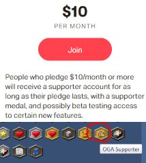
@2DPIXX: we'd love to have your contribution of exclusive content showcased with this! Incidentally, the patreon does have something like the 'official contributor' status, albeit small: "OGA supporter". That or something similar seems like a good fit for this campaign.
Users self-promoting is not against the rules on OGA. That is a bit like ads, but I don't think that would be an issue. "Thank you to our top contributors! Check out their profile/webpage and return the love!"
Regarding 'new version already in the works': We have begun hunting for the best upgrade path and researching how we will migrate data. We're pretty sure the framework will be Drupal, (the site's current framework) but an up-to-date version of it (currently OGA is several years behind the latest stuff... 2016, I think?). We have not settled on any sort of UX or layout and are still open to contributions and suggestions. There have been several design layouts suggested, all of which are fantastic and worthy of consideration. The more ideas we have to work with, the better product we'll end up with. By all means, we'd love to have your take on a UI/UX site layout. It also promotes collaboration when we can all look at each other's concepts for this.
Free and open might be a slight issue, best license may be OGA-by or CC-by license types. its open but not so open where someone could buy it or receive as exclusive content, only to sell or upload for free elsewhere which would defeat the purpose of the thing. some restrictions may be needed, but i think for the sake of funding the site as a whole, an exemption could be made, but yeah i get a possible conflict of goal of OGA. Failing this idea, i propose that an OGA account is created on itch, where artists can submit assets for a bundle, and the money raised can go straight to OGA admin. Assets sold under any license terms but an annoucement saying all proceeds go to help the running costs of OGA. Technically speaking it doesn't have to be an OGA account, that way its not in a conflict free opensource assets that OGA promotes. :)
Drupal: before we go down the drupal road, have we considered other options? Man power: is OGA more likely to get more volunteers to work on the site if a different development tool is used. there could be 100+ members here that are more fluent in say Java, CSS & HTML etc then there are in Drupal. This could make a massive difference to the upkeep of OGA and ease the workload on OGA admins. currently it seems that only a few people can access and work on the codes site, even with the source code being open on Github, there still arn't any takers?
This may sound like a horrid idea, and i will imagine some will scream over this, but migration is such a big undertaking, i fear that you may have to what all other websites have done when upgrading, and that's to ARCHIVE the old site whilst we all move to a newer one. theres no reason why we cant still use OGA as it is, but have the newer version running alongside, eventually bringing to a close a few years later, that would be more than enough time for users to move over and re upload there assets.
Curation: i think it may be a good idea to allow the community, or at least some longer users of OGA to 'mark' asset uploaded with an 'OK' or some sort of tick box. Once uploaded it sits waiting to be marked off OK before it reaches the latest art.Any concerns with an asset, such as license, copyrights, files, presentations, tags can be addressed right away, instead of having to come back to it a week, month later. i say this to help ease the workload, so the focus can be the site code other than weeks of curating content. Also i think it would be a good feature is to include a notification to users that have records of downloading that asset, so they are made aware at the most earliest opportunity.
i might have another play with the website mock up i made sometime. :)
"Free and open might be a slight issue, best license may be OGA-by or CC-by license types. its open but not so open where someone could buy it or receive as exclusive content, only to sell or upload for free elsewhere which would defeat the purpose of the thing. some restrictions may be needed, but i think for the sake of funding the site as a whole, an exemption could be made, but yeah i get a possible conflict of goal of OGA. Failing this idea, i propose that an OGA account is created on itch, where artists can submit assets for a bundle, and the money raised can go straight to OGA admin. Assets sold under any license terms but an annoucement saying all proceeds go to help the running costs of OGA. Technically speaking it doesn't have to be an OGA account, that way its not in a conflict free opensource assets that OGA promotes. :)"
This sounds good. As stated I would be supporting such an effort with works. This other account and the ways of a trustworthy submitting should be promoted prominently on the frontpage. If funds like this can buy a professional individual to create a great UI Design for this site and someone who could take the time to implement a frontend from that it might even be better than the community effort in these regards.
I also think a continuation of dragging the usage of the older implementation because of the fear of data-loss just enforces the problem over time. It is an issue that can not be solved without starting something more clean and modern as chasersgaming stated.
I myself could only help in a very small way, which I gladly provide, but could sadly not take any lead of such a web improvement project. With graphics and funding however it is a whole other topic since I do that on the daily.
hi all, apologies in advance if this sounds harsh. I have nothing but love and respect for chasersgaming and MedicineStorm and they know that, but I do feel compelled to chime in with my thoughts here.
I can't stress enough what an awful, awful idea introducing any kind of exclusive, pay-walled, or otherwise paid for art is. It violates the very first principal of OpenGameArt which is that all this art is meant to be free and shared publicly. On top of that, the amount of money you're likely to raise off such an endeavor is minimal and easily out weighed by the number artists and users you are going to piss off or otherwise turn off by doing such a thing.
Secondly, with regard to migrating to a newer/different/better web technology: OGA's collection of assets, years in the making, isn't just it's main strength (although it most certainly is that), it is, in fact, OGA's entire reason for existing. Literally, the point of this site is to host all of these art assets. The idea of dust-binning years worth of accumulated art work is insane. Asking artist to re-submit their work is insane. You'd be lucky to get 25% of the works re-submitted, if that. As if that wasn't enough, it would be a complete disservice to the artists who contributed their work here to toss it for the sake of better web code. People worked to create this art and generously donated it to the community and it's not fair to them to now treat it like it's problem, like it's getting in the way of OGA running the latest fancy web platform. Without that art and those artists OGA is nothing.
I certainly get the frustration of dealing with old or otherwise limiting tech, but I think that's getting caught looking at the problem from an admin and developer's perspective. And while that's certainly a valid perspective to consider, it's also important to pull back, think more broadly and ask 'Does this action further OGA's mission?' And if that action involves tossing half or more of the art on OGA, I just can't see anyway the answer is 'Yes'.
Now for my positive paths forward on both these points...
I could get behind handing out an 'OGA Highlights' package that was simply a curated collection of material from OGA as reward for donors. The material would all be available on OGA and provided under the same license terms as it is on OGA, so really all donors would be getting would be a little curation and convenience of having a nice set of assets all bundled up into a single download. But it'd make a nice bonus for donors and realistically probably likely to bring in around the same amount of funding as 'exclusive' content would without pissing anybody off. On that note (not pissing people off), I'd say we'd want to contact the artists and get explicit approval before including any of their work in such a package.
Regarding web tech and the path forward, I'm not at all opposed to trying to move the site forward or onto a new platform if that's what progress means, however I'd just say that any tech change needs to start from the position that ALL existing submissions will be maintained and supported on the new platform. If that means some kind of wild and crazy script's got to be written to migrate the submissions from the old style to the new hotness, then count me as first line for volunteering to write that magic. It's all just data at the end of the day, so don't tell me it can't be done.
About the patreon stuff, I see the meter is back up. TBH though, just a 'Support OGA on Patreon!' link might be better. The meter is kinda sad, and like you say, all the funding benchmarks are kind of dated and meaningless anyways. On that topic, maybe just three levels... 'Pay Monthly Hosting Bill' and 'Hire Development Contractor to improve site' and finally 'Hire Full Time Development Staff' Something like that anyway.
Final unrelated but related note, any hope of getting a link to the Discord server to replace or supplement the IRC link on the top of the page? Not sure how anyone finds the discord server...
"I can't stress enough what an awful, awful idea introducing any kind of exclusive, pay-walled, or otherwise paid for art is. It violates the very first principal of OpenGameArt which is that all this art is meant to be free and shared publicly. On top of that, the amount of money you're likely to raise off such an endeavor is minimal and easily out weighed by the number artists and users you are going to piss off or otherwise turn off by doing such a thing."
When i talk about exclusive, i just mean assets purposely created for the purpose of generating some income for OGA. Paywall is a turn off, and conflicting with OGA's principles, which is why i mentioned that if such assets where created and sold, it could be done without any affiliation to OGA itself. Regardless of how minimal those funds would raise, its funds non the less, to help the efforts to pay someone somewhere to get OGA where it needs to be, because at the moment without some sort of financial help, nothing will get done or ever get done.
"Secondly, with regard to migrating to a newer/different/better web technology: OGA's collection of assets, years in the making, isn't just it's main strength (although it most certainly is that), it is, in fact, OGA's entire reason for existing. Literally, the point of this site is to host all of these art assets. The idea of dust-binning years worth of accumulated art work is insane. Asking artist to re-submit their work is insane. You'd be lucky to get 25% of the works re-submitted, if that. As if that wasn't enough, it would be a complete disservice to the artists who contributed their work here to toss it for the sake of better web code. People worked to create this art and generously donated it to the community and it's not fair to them to now treat it like it's problem, like it's getting in the way of OGA running the latest fancy web platform. Without that art and those artists OGA is nothing."
Woah, i never said to 'dust bin', or 'toss it', and i certainly don't regard any assets as a 'problem'. I mentioned running 'alongside' the current version, and then once the old version has had its content 'merged' or moved over it could be archived or discontinued when completed, however that long takes. I wasn't clear about 're-uploading', what i meant was, as the admin curate the assets here they could do it as part of the curation process, and have users help out and do it themselves too. its not so much about fancy web features, its about outdated code which no longer works or serves its purpose and becomes an unnecessary drain on infrastructure, and perhaps site performance. but removing those nodes completely actually risks losing assets, which we don't want to happen, so there may not be an alternative. This site is nothing without the assets and community i agree, but its nothing without the development either, and the development team do their best to accommodate its users here, so we should consider their needs to, the door has to swing both ways, so we have to have some sort of compromise somewhere down the line. But i absolutely agree that no assets should be lost to any sort of tech change, it would be a diservice, and its paramount that where ever OGA moves to or changes to that every asset moves with it. the question is how and which way it is done. @withthelove i share you passion for OGA mate, and change is never good and scary, but something needs to be done soon, because one day most things here will become outdated, unsupported and wont work at all, then it will be lost forever.:)
On the topic of front-end things-- a UI/Design revamp could make a _big_ difference to OGA's traffic, without mucking around in the underbelly. Responsive design, cell phone resolution support, an emphasis on the art, and a prominent Patreon link and maybe top-supporter profile links could all give the site a good boost. Making things easy and pleasant to browse through would be a great start.
About a month ago, I found this redesign (CC-by-SA 3.0). The link to the final render is dead, but I liked where the artist was going with it and started plunking away at coding a similar design. My CSS/HTML is years out of date and severely rusty, but I could polish it up.
(Also, I second a Discord server!)
As to Drupal and revamping... I had to stop working when I got sick five years ago, but I used to be a professional PHP/MySQL dev. _I heavily advise staying away from Drupal and PHP._ I'm also still in recovery from that illness, but I do have time and coding skills if needed.
Eh, I was already leaning more toward a "contributors give, but everyone benefits" style of things. That's why I mentioned option #2: "The exclusive content becomes available under one of our typical open licenses as funding goals are met." This may mean some people don't bother to contribute because they know the special donated content will become available eventually, but it may also help encourage people who are unable to contribute (or only able to contribute a small amount) to spread the word so that their friends will jump in and fill in the gaps.
It's possible using some other framework may open up more volunteers. It's definitely worth considering. I haven't heard many other suggestions besides HTML+CSS, though. Which is a bit like suggesting programming a game in assembly as an alternative to Unity or Godot. Yes, Drupal/Unity is large and more niche than HTML+CSS/Assembly, but they do a huge amount of the work for you compared to the alternative. I'm not a big fan of Drupal myself, but if there's a more robust content management alternative, it needs to be more ubiquitous than Drupal AND it can't make the migration of Drupal content to a non-drupal platform prohibitively complicated/expensive. The main reason to go from Drupal to new-Drupal is because, as complicated as data migration would be, it's still lightyears simpler than a data migration from Drupal to something-else. The increase in contributions and volunteers needs to do more than offset that additional complexity.
I don't disagree, but OGA creating commissioned art in exchange for contributions was baked into the site from the beginning: https://opengameart.org/content/faq#q-notanartist "From time to time, we commission artists to create free art. If you're interested in donating money to the cause, you can donate to our PayPal account." However, the very next line is "All donations will go directly toward art commissions (as opposed to, say, hosting costs)" So it is true this is a slightly different situation. Never the less, it is still a component of the original (currently outdated) Patreon: Rewards for tiers 4, 5, 6, 7, and 8 are all about custom exclusive assets in exchange for contributions. As chasersgaming has said, any sort of 'paid for' assets would be separate from OGA and created specifically for the fund raising campaign, not taken from free assets nor put behind a paywall on OGA. This is also why I'm more in favor of option #2: Yes, the assets are being commissioned for contributions, but once done, everyone benefits from more free assets, not just the people who contributed. As bart has said "Please note note that OpenGameArt.org is, and always will be, free for everyone. I do not expect anyone to donate in exchange for using the site, as that would defeat the purpose. This page is here for people who would like to contribute."
I agree. Here is the reality: OGA is heading for a point where the choices we will face are A] OGA is gone (Yes, just gone. Only Archive.org will remember the site), or B] A new OGA is made and submissions are manually resubmitted to the new OGA.
The whole purpose of this fundraising idea is to change our fate before it reaches that point. Creating a new OGA with no plan for a full migration is (relatively) easy. We don't need funding or (as much) help for that. But that's also the last-ditch worst-case scenario. That is what happens if we can't get the funding to power a full site migration where all asset submissions are preserved.
P.S. Great idea about replacing IRC link with Discord link. If people still want the IRC stuff, we can keep doing both, but IRC seems pretty inactive to me. Discord link has been put on the "Chat with us!" sidebar.
@WithTheLove: The patreon link is not actually back. You can see it because you're a challenge moderator. This is so I can ask you "How does it look? What should we change going forward?"
@chasergaming and MedicineStorm:
>> "The idea of dust-binning years worth of accumulated art work is insane."
> Woah, i never said to 'dust bin', or 'toss it', and i certainly don't regard any assets as a 'problem'.
> I agree.
phew, glad we are in agreement on that! Thought maybe I was losing my mind for a minute there. :)
@chasergaming:
> I wasn't clear about 're-uploading', what i meant was, as the admin curate the assets here they could do it
> as part of the curation process, and have users help out and do it themselves too.
I'm afraid I'm still not sure what you mean by this.
Let me describe how I think a typical migration would go and maybe you can tell me what I'm missing.
1) A new web site is developed with whatever new back and front end tech we'd like to use.
2) Some kind of massive glue script is written and run to pull all the data (users, submissions, submission infos, comments, forum posts, etc. etc) from the old web site and insert it into the new web site.
3) The new site is launched.
4) The old site is archived, perhaps still visible at some URL (opengameart.org/old) or something, but change-locked and eventually taken offline completely
Is that the rough outline of what we are talking about here?
@all:
> is OGA more likely to get more volunteers to work on the site if a different development tool is used.
> It's possible using some other framework may open up more volunteers. It's definitely worth considering.
I don't think lack of volunteers is the issue. This and several other forum threads like it are replete with folks offering to help out, some with relevant experience, others willing to learn whatever's needed to help OGA out.
The issue is a lack of any onboarding process for volunteers.
IMHO, that's what's really keeping anything from moving forward and also what most imperils OGA's future.
Honestly, even if the funds were found and a big OGA 2.0 migration pulled off, we'd still be looking at 1 active moderator and 1 active developer/administrator. Maybe the revamp would get the site another 10 years on auto-pilot, but realistically, if a way can't be found to bring new developers and admins into the fold the long term prognosis is still going to be inevitable decline and death.
If you look at the new stuff that's been going on around OGA for some time now, the Game Jams, the Discord Server, it's all been done by people working around and outside of the site itself. I don't think that's out of any animosity for OGA's management team or distaste for it's web tech, it's just that people have energy and want to help out but there's no way for them to channel that energy into the site itself.
@MedicineStorm:
> OGA creating commissioned art in exchange for contributions was baked into the site from the beginning
You are right to say this is different from the 'exclusive donor art' concept.
This is using OGA funds to fund the creation of more open art.
That is using creation of private art to fund the operation of OGA.
I just don't think there's a way to square that last idea with the fundamental concept and mission of OGA.
I see where you are going with option #2, but even that I think is anathema to the whole idea of OGA. No matter how you slice it, it is creating and selling private works. The whole lure of 'exclusive' assets is that other people don't have access to them. Maybe the end goal is noble, but from where I sit it seems to be tantamount to selling your soul one bit at a time.
I'll also again point out that the idea seems wholly unnecessary and unlikely to bring in any serious money.
The reality is the world is flooded with art assets. Every where you look someone is selling game art. I don't doubt that a 'Save OGA!' art bundle could attract some talented contributors, but ask yourself, is it really likely to make much of a splash in today's hyper crowded asset marketplace?
Why violate OGA's first principles to raise a few dollars when you could almost certainly raise a similarly paltry amount of money just re-packaging existing OGA art in a way that wouldn't betray the site or any of the artists who've contributed to its ideals over so many years?
BTW, I had actually forgotten about these patreon goals. TBH the actually make a lot of sense. The idea of OGA funding the creation of more open art is fantastic and these concepts probably make more sense to keep as stretch goals.
Also, reading those goals and the FAQ bit, I take them as an implicit promise that no one is going to get rich off OGA donations, that any excess fund will be funneled into creating more art for the community to use.
@MedicineStorm:
> discord link
Awesome, thanks!
And yeah, I think the IRC chat could be dropped completely. Maybe hide the link for a bit and see if anyone complains...
> patreon link
gotcha, and I guess I gave me two cents about the patreon bar. I do like the 'Prefer to make a one-time Paypal donation instead?' link that I see there now. Looks good!
@ElizaWy: Re UX redesign: yeah, that's what I was thinking; It can really get some attention and encourage an influx of support, though it seems there is a divide on that. A lot of people feel the current layout is good. I agree, and I don't intend to dedicate a bunch of resources to UX redesign if it takes away resources from site migration. Fortunately, it shouldn't actually draw much more resources. It's like flushing the transmission while you have the engine pulled out for an overhaul. Normally, a transmission flush takes a lot of effort, but almost all of that effort has already been done just getting the engine out of the car. We might as well do the transmission too while it's easy.
Why stay away from Drupal and PHP? What is a better alternative?
@withthelove: Re patreon bar: so it is just the progress bar that needs to go? Or don't mention patreon at all? Replace patreon stuff with kickstarter or whatever? or patreon is fine, but we should have a reworked patreon page first?
What's the difference between those and 'option #2'? Just to clarify, my concept of 'option #2' has no "exclusive content" involved. It is contributors commissioning (non-exclusive) art that is immediately released to the public as soon as the goal is met and/or commission is complete. Rather, it is artists donating commissions for the sake of migration funding, and contributors paying for that commission on behalf of OGA.
That is how I take it as well. Even with this funding we're talking about, I plan to take zero dollars for any of this, even if I incur expenses of my own. The funds would be for services that I cannot do myself, not to recoup out-of-pocket expenses, and certainly not for personal profit.
Good point. How do we address that?
Good point. How do we address that?
Why stay away from Drupal and PHP? What is a better alternative?
These two kinda go hand in hand i think. Currently using the framework of Drupal only allows certain, well versed coders to use it. This already limits the type of personal that can work on any thing code related, backend infrastructures or even maintenance. even now i suspect that MedicineStorm can only do so much within the adminstrative role they have currently and still has to rely on another admin with more 'access' to get to and work on the 'nitty gritty' parts of the site, and if those admins arn't around for whatever reason then it just makes any sort of maintaince almost impossible to maintain at a level where any 'progression' can be made, or essential upgrades that are needed be done. Drupal are about to drop Drupal 9, and OGA still using Drupal 4-5?. this sort of 'missed opportunity's' run the risk of functions becoming obsolete, and site features not working as they should IMO.
The thing with Drupal is anything that is needed has to built first and installed into the infrastructure. If there is something already available from the Drupal community then that's a bonus, but its not likely that your find something your after. You then have to have that person that built the thing available to fix anything that goes wrong with it, because it likely that none else is going to know where to start with it. in the beginning there were lots of people around that were more versed in Drupals navigation and coding, but now i don't think thats the case, and its left the site in the position that its in now. I am not saying don't use Drupal, but what i am saying is if there is no one around more frequently to fix the custom things using Drupal on a more regular basis, then its not a good idea to continue this way. As withthelove has said, a revamp where it will just go on autopilot for another 10 years and slowly fall apart piece by piece, year by year.
i think it would be a good idea to move to a 'lower end' website tool. Something like a website builder perhaps. These days you can use, HTML, CSS, Java and a few other coding scripts to write custom code and use either or all in combination with each other. the interface is a lot smoother and easier to understand. We have had a lot of people offer there help with such things, withthelove has said he can write code, ElixaWy has said they can write code, theres a few others than can write code. Just because they are 'lower end' doesn't make them any less powerful than Drupal, so lets not get put off by the 'lower end' word. :) at a lower level its easier to learn for others, drupal has a very steep learning curve, which makes hiring, or giving roles to over persons pretty impossible, and its pretty 'overwhelmin', i know i have tried many times to get my head around it. It's also a lot cheaper to host the data than what OGA uses currently. When i made my mock up of OGA 3, it took me a few hours a day to get done what i did, all in all no more than a day. I reckon i could have the whole mock up finished in a week no problem. the only thing i cant do is add the point system and the leaderboard type stuff, and of coarse migrate all the assets, because i don't have access to the database. Could this be done? i reckon it can with the right persons on board, withthelove could write the script that 'scrapes' (not sure if that the right word) the things needed from the database to collect the asset stuff, maybe Elixa could write the code for the points system? or the other way round, i don't know. the point i'm making is not to show off, its to point out the options that are available and the speed at which it could be done if we consider something other than Drupal. :)
@MedicineStorm:
I think I am starting to understand what you mean with this option #2.
My concern was if donors were given exclusive access to the works /before/ the funding goal was met.
So what if it works like this:
Every time a certain funding threshold is released, a celebratory 'OGA Fundraiser' pack is released as an asset under a public license on OGA.
We line up artist(s) who promise to contribute something ahead of time, and they submit their pack to OGA once the given fund raising goal is met.
That way there's no special or 'exclusive' treatment for donors, all the work is /always/ released publicly.
Donors still have an incentive to donate because they get the benefit of the work just like everyone else when it's released onto OGA.
Is that close to what you were thinking?
To me that's the simplest method possible, the only work to be done is get together a list of contributors, assign each to a funding goal, and then let them know when that funding goal has been reach, at which point they submit the work to OGA.
As an example, if artists Billy, Bobby, Susy and Jenny all agreed to contribute something toward the fundraiser, then we could assign a goal to each of them, like so:
$200 - Billy
$400 - Bobby
$600 - Susy
$800 - Jenny
So Billy makes a work and releases it when the funding pot hits $200, Bobby releases something when the pot hits $400, etc.
If we wanted to incentivize contributions, then a funding split of some kind could be considered, eg. instead of outright donating works, artists are paid a portion of the fundraising pot as a commission for their works. Ie, if the fundraiser hits $200 then OGA gives Billy a $50 commission to make and release something on OGA.
Does that sound like the kind of thing you were thinking of?
Because I was hearing something more like an art package sold on itch.io or unity or something and then proceeds from that are funneled back into OGA, with maybe the possibility that the works are released onto OGA at some point if certain fund raising goals are met, which doesn't sound like a great idea to me.
@chasersgaming:
>> Good point. How do we address that?
>> Why stay away from Drupal and PHP? What is a better alternative?
> These two kinda go hand in hand i think.
I disagree. It doesn't matter if the pool of potential helpers is 10 or 10,000 because there is no way for OGA to tap into that pool.
Ask yourself, are OGA's issues the result of running Drupal 4 or are they the result of developers and admins moving on from the project and not being replaced?
My suggestion is that we put our heads together, find 2-3 volunteers who have well demonstrated commitment to OGA and have the desire and time to help out and bring them onboard as developers, mods and/or admins.
From there, as far as tech, transitions plans, etc. etc, we can follow the simple maxim that 'them that does, decides.'
Ask yourself, are OGA's issues the result of running Drupal 4 or are they the result of developers and admins moving on from the project and not being replaced?
I would say both mate. :)
My suggestion is that we put our heads together, find 2-3 volunteers who have well demonstrated commitment to OGA and have the desire and time to help out and bring them onboard as developers, mods and/or admins.
OGA isn't short of volunteers with Commitment, desire, time, but it is short on developers IMO, and i'm at the believe that's what's needed. Replacing/hiring/recruiting developers to work on the sites code to is going to be hard, voluntarily or paid. OGA has been trying since it made the source code available on github.
I think we all absolutely want the same thing for OGA, but we can't agree what's the best way forward to achieve it. but whatever happens either way i absolutely agree with this: 'them that does, decides.'
I'l do what i can to raise some funds and donate whenever i can to OGA to help the efforts of those already doing their best behind the scenes. :)
I don't like Drupal at all, and I'd rather eat raw liver than go back to PHP-- but I'd be much happier working with an up-to-date Drupal than something screaming 'outdated legacy code'. For one, it'll be much harder to work on, difficult to get help on... and it suggests bigger issues under the hood. Personally, I would be much more interested in a modern component-based architecture. Something not nearly as clunky to work with, maybe even Python.
As Chasersgaming's pointed out, it'd be good to have a more in-depth list of what volunteers we do have, and what their skillsets are. Deciding what do do on the overhaul is going to depend on that, as well as what OGA's technical requirements are. I don't think we've discussed that.
This is my skillset:
- Bachelor's in Computer Science
- 5 years professional full stack LAMP developer (PHP & MySQL)
- 2 years working with CakePHP, familiar with MVC architecture
- I've briefly worked with Drupal before
- HTML5 / CSS experience, intermediate level
- 2 years Unity/C# experience
- Fine art / pixel art / animation skills-- I'd be willing to make custom / reward art for funding goals met