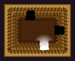
LPC compatible 3/4 view cave interior
I needed an LPC-compatible cave interior, in the style (and perspective) of A Link to the Past. Couldn't find one that was suitable, so I decided to make my own.
Walls are meant to be three tiles high: start at groun level, a middle section, and a top section that fades to black, but you can probably get away with skipping the last one. I currently don't have a need for it, but I might add a third tile that fits in the middle so walls can be extended arbitrarily.
I made the left, right and bottom orientations by rotating and flipping the forward facing tiles and cleaning up the shading (so light direction is consistent across facings), but there is some weirdness in the corners that I haven't been able to get rid of without an extra tile to smooth over the transition (which I prefer not to need). I left the unshaded rough outlines for the rocks in the sheet, in case someone has a use for those.
The included ground tile is a recolour of the LPC base assets.


Comments
I like it.
I added cave entrances in all four facings.
I also apparently suck at using the update system of this site, since trying to replace the tileset with the new version just adds a second file with the same name...
This looks great, I think it could be used even without making the (stupid) Zelda perspective obvious.
@ Spring:
Well, the goal was to make it useable with the Zelda perspective, or without. It probably needs some modified edge tiles for the standard LPC perspective, but that should be fairly straightforward. Really all you need is the front-facing wall(with edge) and transition tiles for the top edge, which might not even need modification.
The Zelda perspective is... interesting, if you're trying to do art for it. Artistically, it's not so great. For gameplay, I think it's awesome though, since it does a great job of showing information to the player (for instance, where doors are) without having to do extra work to make it obvious.
@ both: Thank you for your appreciation! It's welcome.
Never thought about that side of the Zelda perspective. Personally I think it looks rather stupid and I don't understand why everyone seems to like it so much, but maybe the clarity it gives the player in regards to where the doors are could be part of the reason.
Even though I think the real reason is probably just nostalgia and fondness for the charm of imperfection.
@Evert: I think you just missed step #5
@spring: I agree the zelda perspective looks a bit goofy. Probably because it's mixing a 3/4 perspective with a shallow vanishing-point full-overhead perspective. This wasn't done as a stylistic choice. It was a limitation of how to convey the layout of the southern edge of the screen in a true 3/4 perspective; Everything on the south edge of the original zelda screens would be obscured by the wall itself. The player would be looking at the back of a wall where the doors and wall features would be on the other side, away from the "camera". By making the walls a full-overhead view with a shallow vanishing-point, the player is able to see the doors or other wall features on all 4 walls. TL;DR: It's artistically weird, but advantageous for conveying information to the player.
Thanks, I've removed the older file. It's a little annoying that you can't keep track of downloads this way (although... it's not actually all that useful to know that), but it makes sense that you don't simply add the old count to the new one.
On the Zelda perspective: it makes more sense when you don't think of it as a way to draw a game world, but as a way to represent a map of the game world. In such a map, you normally have all four walls visible.
That was the first thing I thought when I saw it, "A Link to the Past". Good work. :)