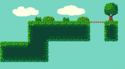
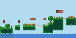
2D Simple Grass TileSet
Author:
Tuesday, August 7, 2018 - 15:58
Art Type:
License(s):
Favorites:
8
As simple grass tileset for 2d platformer games. 16x16 pixels !!
Update:
Old to New !! enjoy for 2d Gaming
Add: Enviroment !!
Copyright/Attribution Notice:
NOT REQUIRED, though appreciated: Facebook: LgSaraiva
File(s):


Comments
Nice tileset, would love to see more! Just a suggestion, the middle tile is kinda plain, only 1 solid colour, maybe you should add something? anyway, just a quick suggestion. Other than that, this looks really nice.
OOWW THANKS A LOT, and yes im begginig in pixel art and all suggestions are welcome, in future i will draw something in middel, "thanks for the tip", and thanks again, I'm excited and looking forward to making more tiles and pixel art !! See you !
The solid color is actually a technique to show the space is solid, or in artistic terms, to create negative space. It's space the player cannot reach by any means and shouldn't worry about, and is much easier on the eyes than repeating patterns or grains that older games used to make, on top of being easier to produce and cutting down on file size. Some games that use textured negative space without a clear distinction between what can be collided with and what can't can cause confusion for players, such as "is this pillar in the background or foreground?". Plus, a repeating pattern can get ugly if not broken up with extra bits and pieces, which adds to the file size, and takes away precious time that could have been spent on tiles the player will actually be interacting with.
Wow thanks a Lot this information is precious for me, im studdying and ALL information are welcome !!! ;-)
Great set! thanks much for sharing!
At the risk of piling on, I just want to add one thought to what Kelvin Shadewing said. When making tiles, it helps to keep in mind that they will eventually be repeated all over the screen. It's easy to got nuts packing alot of detail into each individual tile but once those tiles are spread all over the screen it can become an over-busy and chaotic nightmare. Solid fill tiles like what you've done here aren't always bad as they give the eye a place to rest.
Of course, that's not to totally disregard KingCreator11's point. Solid fills can be dull, or look mismatched if there's a lot of detail elsewhere. What's more, there's certainly no shortage of great looking games out there with hyper detailed tile sets. So it's more just something to keep in mind than a hard fast rule.
I'll add that what you've created here is already about 1,000x better than anything I've ever done so definitely take anything I say with a grain of salt. :)
thank you very much, I want to point out that I am still a beginner in pixel art, so thank you very much everyone who exposes your ideas, and as I always say all information is welcome :)
Here's my 2 cents... Looks great. ;p
Thanks ; ) i appreciated, enjoy !!