Tried My Hand at 16x16 Pixel Art, How'd I Do?

For a while now I've been trying to learn pixel art, with very mixed success. After a little while, I was confident enough to try making an 8x8 tileset for a game idea, it went suprisingly well, but I decided that I couldn't fit enough detaiil in 8x8. I decided to double size to 16x16, expecting to come out with something a four-year-old could have drawn better. But to my suprise, I found that it wasn't as hard as I thought it would be, and the results so far are what I'm posting here. I'd be happy to recieve any pointers, tips, comments, compliments, insults, ect. that you guys can offer. Thanks! :)
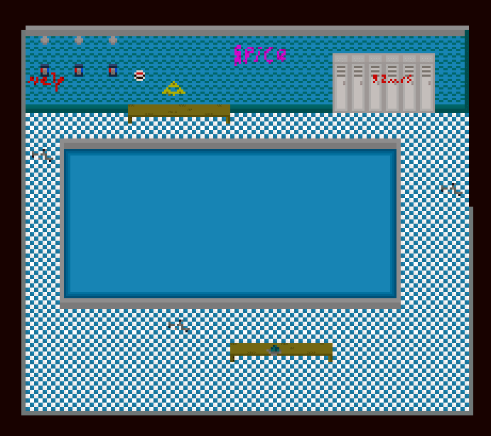
The style of the game is a space rpg, set on an abandoned world, with inspiration taken from urban exploration, and early sci-fi films of the 80's and 90's.
I'm pretty satisfied with what the looks are so far. I went for a dusty, muted color scheme to portray that the structures had been abandone suddenly for a long time
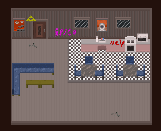
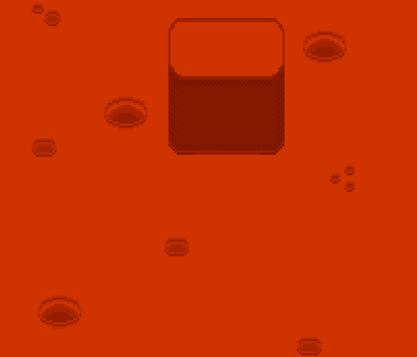
The first screenshot is a pool/bathhouse complex, with graffiti scrawled on the walls, the second showcases the furniture I've made so far, a kitchen set which I'm not completely satisfied with (Not "spacey" enough), tables, chairs and a modular couch. The final picture is of the outside terrain. 'vealso included the tileset as well.


Well done:) Simple yet you can make out what the items are. not easy to get much detail in 16x16 pixels. I don't have that skill currently.
Art by Rizy. Most of my Art is CC-Zero but, Some is now CC-BY-SA due to the fact it uses some of ryzom.com Textures the post will have the licence.
Thanks! :)
yeah, I'd say this is a great start!
my only grow for you would be that the floor tiles in the bath house and dining area are really intense. Especially in the bath house where they fill the whole image almost. I'd suggest making them larger, or toning down the contrast between the two tile colors (blue and white). Maybe try two different blues or something.
I guess one other minor point would be that the perspective on the pool doesn't quite match the rest of the image. It should have a smaller edge on along the bottom than the top. So it looks like you are looking down at it from a slight angle instead of so straight down.
Something like this...
https://withthelove.itch.io/
Great start!
The biggest thing you could improve is modulating the contrast throughout the images. Background elements should have lower contrast, while foreground objects have greater contrast. The tiled floor jumps out because of the high contrast, but the lockers blend into the wall (and into each other) because they are low contrast. A simple way to achieve this is to draw dark borders around foreground objects (it is possible to achieve readable images without this, but takes more discretion); this is what the LPC style does for instance.
Additionally, think about how objects exist in 3D space. It doesn't really make sense that the bottom of the lockers is flush with the wall, but you can also see the top of the lockers (i.e. they stick out). Likewise with the kitchen counters, where it looks like they are offset a few feet from the wall, because the top edge of the counter lines up with the floor line.
Finally, enhance the 3D nature of your scene by thinking about a light source and what objects would be illuminated. In your case, the light source is from almost directly above, so the space under the tables should be in shadow, at least slightly.