Got some feedback that my game's art style isn't cohesive...
Hi guys,
I just posted for the first time about my game on Reddit. The main feedback seems to be that the art style isn't unified... Which, doesn't entirely surprise me.
The only problem is I'm blind to it now.
They mention that some graphics are detailed paintings, others vectors, pixel art or 3D renders. (I'll admit, I knew the pixel art would be an issue)
What's really confusing me is that the rest of it is just UI and the game is built with 3D models, so I don't know what they mean by paintings and vectors. Is there anywhere I can kind of get some feedback so I can address this issue? This is the first place I thought of.
I'd link a url to my game but that's probably not allowed?
Edit: It is! game page can be found here: https://store.steampowered.com/app/1502050/Draculas_Castle/
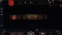
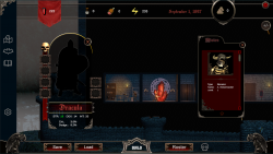
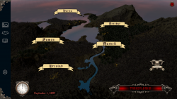
Here's a gif of the building mechanic and some screenshots...

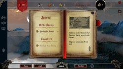

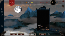
Linking to your game is allowed, though this post may fit better in the "show off your project" forum or the "user interface design" forum. Let me know if you'd like me to move it to one of those.
--Medicine StormSounds good, I guess the "show off your project" one might get me more feedback around the general art design, thanks!
Overall its not that bad, the things that catch my eyes as most unpleasant would be the potion, shovel, meat, energy? and clouds, those are pure pixel art; you should switch those.
You can use something like this:
https://opengameart.org/content/meat-03
Thanks, yeah I had a feeling they'd be problematic. Always go with your instincts! I guess the other thing they must be talking about is the font awesome style buttons... Which I sort of put in there as placeholders but then I grew to like them.
I had some people say go full 2D but that's madness at this point in the game's development.
Which is kind of funny because I started out going in a pixel art direction. /facepalm
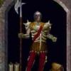
The icons on the left do like the pixel art icons not fit the style of the rest of the gui, so does the skull icon.
Looks good. Switch out the pixel icons and it will be just fine. The rendered skull in the Ui should really be vector in the same style as the garguoles but you could get away with that one I reckon...also the moon seems to be stuck on the background? I would simply get rid of it...hope that helps.
Yes, thats also true, you should exchange the icon on the left margin and skull as well, they dont look bad, but those are vector art. You can also find replacements here on OGA.
Is the moon a moving gimmick? you should really tone down its luminosity, if you are working on Unity you can problaby do that easily and even turn it red at some special events.
The lorc icons may make for good replacement stand-ins: https://game-icons.net/
Vector style icons with just 2 or 3 colors are commonly paired with prerendered graphics like these. I guess they still aren't the same style but they also don't clash as much as pixel art does.
--Medicine StormThanks heaps guys! I managed to devote some time to it today so I got a start on replacing the pixel art. I also found out how to make the moon way less extra haha! It's funny what you get used to, looking at the old one now, it's almost blinding me! :D
Here's the initial re-work! :)
Vector icons will be next on the hit list!
Nice one! Looking good! Fresh eyes work wonders :) For play testing also ...
That is looking loads better. My two quibbles are that your moon is in front of the clouds which looks odd, and you have totally nicked the Batman symbol!
Cheers, that's good to hear! :D
I know what you mean about the moon, I'm aiming for a big dramatic one, like it's almost a character you know? I'll see if I can figure out how to add some clouds in front, that would look so good. (That's actually one of my favourite sights/things IRL! :))
I ended up toning down the ambient light too, it was looking a bit too purple. And I turned down the fog a bit as well, I'll see if I can upload a screenshot later.
I was also thinking of getting an Alpha version of the game up on itch.io or something. This kind of feedback is just too good to pass up. :)
Sorry to say this, but its still not good; The new models are poorly detailed.
I would say you have 2 options, going full vector using https://game-icons.net/ or look for better detailed models, most likely you will need to edit them to look darker/older:
cc0 shovel: https://purepng.com/photo/20865/clipart-shovel
meat: https://opengameart.org/content/meat-03
Ideally the icons (the flag as well) should have a similar style to the gargoyles. It's not important that UI and the game world match in style, but all UI elements should be in a similar style, I think.
Then remove the clouds behind it. You do not have to put clouds in front of it, but clouds behind it is what is looking weird.
I would also remove the sun. The sun's position and the moons shading do not match up.
Yeah, I'm not 100% sure on the skybox with the clouds and sun. The good news is I've got some other options there so I'll see if I can find something that fits better. :)
The new links on the left and the skull are ones I got from https://game-icons.net/
What a wonderful site! Thanks for the link.
I'll see if I can "gargoylify" them a bit more.
As for the icons on the top, I'll try to replace them completely.
It's getting better. Sounds like you now know what to do! Don't sweat it too much. Get to a point where you're happy with it and move on I reckon... If it plays well, graphics aren't super important. Likewise you can't cover up a bad game with nice graphics ;)
Idk, I love how it looks personally
I would drop the sky and add some clouds in the same style as you icons. Then drop the moon behind the clouds as a parallax effect. Right now the moon is about a mile away ;)