Tiny 16: Basic
Author:
Thursday, May 30, 2013 - 08:37
Art Type:
License(s):
Collections:
- 16x16
- 16x16 chibi rogue-like
- 16x16 for voxels
- 16x16 tilesets
- 2D - Complete Kit
- 2D - Tiles 16x16
- 2D Art
- 2D-Platformer Tilesets
- 2D::Tile::Orthogonal
- 8x8_cc0_oga-by_roguelike
- A Pool: Unsorted (GDN)
- Amazing Stuff
- Animals, Creatures, Critters, Mobs, and More!
- Antur Resources
- Art using DawnBringer palettes
- Assets for making DOS games or games like in DOS in the early 90's
- Asteria
- Awesome Game Art
- BackGround
- Best Orthogonal (rectangular) Tilesets for Tilemaps
- C-Dogs SDL art
- cc-by-3 possible game kits and gfx
- CF Inspiration
- Collected
- Complete art kits
- CSCIGameProbs
- CSCIGameRough
- CSS RMMV Roguelike
- DOS Ranger
- DWSG
- Fantasy
- Fodder 8x8
- GAME
- Game Art Packs
- Game Asset Kits
- gb conversion
- Generic Art Collection
- Goblin Adventure
- Heavy Is The Crown
- in space
- In Sprite of Myself
- Infinimon - Procedurally-Generated Pokemon- or Digimon-style Game Assets
- kq-fork
- Library of 2D Game Art
- Libre VCMI
- Lost in the void potential assets
- Mini Adventure
- misc. CC-BY
- Must Use
- other games
- Pixel Art - JRPG
- pixelated pixel pixie
- Project "Jogurt's Greed"
- QuestTown prototype
- Ragnar's CC-BY 4.0 / OGA-BY 3/4 Bag of Holding
- Roguezeldalike
- rpg
- RPG Tiles
- rpg-tiny
- RTS assets
- Similar to Tiny 16
- snes-like world textures
- Sprites
- stardont
- Stranger TopView RPG LPC
- Test
- The 2D Collection
- TILE
- Tilesets
- Tilesets
- Tilesets and Backgrounds (PixelArt)
- top down 16x16 pixel art fantasy
- Top Down 2D JRPG 16x16 Art Collection
- Top Down Fantasy RPG for Commercial Use
- TopDown RPG
- window shopping
- WIP Collection
- World Gen 2D
- Zed: AM: Top-Down
- Zelda Like RPG
- Zelda style tilesets
Favorites:
465
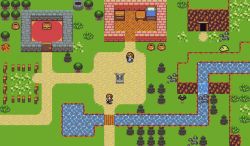
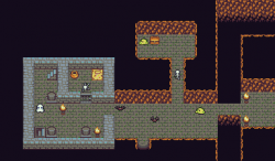
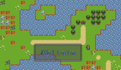
This is a simple set using 16x16 tiles and Dawnbringer's 16 color palette. I attempted to make this set very basic, using as few tiles as possible while still making it useable and pretty. Animations are 2 frames total, some ground pieces are made to be used as 8x8 corners. This should be everything you need to make a simple RPG although it is a little weak with characters and monsters at the moment. If there's anything you think is missing, let me know in the comments.
Edit: Updated! More tiles, more monsters, more animation!
Edit: Updated again! Added a couple tresure items and a few dead and sleeping characters.
Edit: Updated a third time! There are now a few bridges, new trees, and some shop signs in the basic tiles.
Attribution Instructions:
Please credit Lanea Zimmerman. The anti-DRM clause of CC-BY 3.0 is waved.
File(s):


Comments
Thought you might be interested in seeing this being put to use: http://imgur.com/gallery/GEK2W
I really like the style but it's very small. Is there any way to get this like maybe 64 x 64?
just a note, as part of this week's Share The Love art challenge, I've made some additions to the male sprites for this set:
http://opengameart.org/content/tiny-16-expanded-male-sprites
@ralph28561: If you turn the interpolation to None or Nearest Neighbor you won't have that problem when resizing it yourself. Make sure to use an art program that supports transparency such as GIMP. Paint won't cut it.
@Capbros: Thanks for the heads up! I'm very flattered and you did a good job!
Anyone know if this can be used commercially?
Yes, it can be used in commercial games.
Wanted to let you know that I made extensive use of this tileset in a game I just released, SimpleQuest -- https://cozyengine.com/games/simplequest/
As part of that I added some things to the set, including making a more complete set of "edging" for the walls, forests, and mountains (basically by combining the various combinations of the 8x8 sub-tiles in the original tiles) and some additional various bits of room dressing. I also drew more monsters and a PC sprite, but tried to remain true to the original style.
I've included the updates. More importantly I wanted you to know that your tileset is awesome, Sharm! It was very inspiring to work with. :)
Fantastic! I'm excited to try out the game!
Hi, Sharm!
can I ask something?
At first, sorry for my poor English.... I want to make a game using your resources what you upload here!
I want to launch my game with Google play store.
Can u accept me?
Yes, you can make a game for the play store using these resources.
this is so . great! thank you for creating this!
Love these.
Anywhere where I can find maps already created like in the preview?
I am dying to make a game or two, but I suck at creating maps.
If there is any "maps" created that I can use, please share with me.
More than willing to credit.
Ideas:
A town with a few buildings (if it is a snowy map then it will be ideal for a xmas game)
A large, maybe 2 or 3 maps of forsts, with entrances leading to dungeons and a few maps of dungeons?
I am following the Larry games approch where there is a map, and at some point you will click/tap the entrance and go to another area.
Something simple.
Stay awesome :)
No, there's no demo maps. The screenshots were me just throwing something together for the shot, they're not functional in any way. Mapping isn't too hard, you probably just need practice. Focus on placing what you need first, remember what the map is for at all times, make sure you can move around easily, and let there be some places with nothing in it to contrast with the clusters full of stuff, and you'll do just fine. When in doubt, look at a bunch of references of existing maps that you think are good, and use them for inspiration. Maybe recreate them as practice if you still feel stuck (but don't use). You can get feedback on mapping too, just like getting artwork critiqued. But most importantly, don't worry about it too much. No one pays that much attention to mapping unless it's making things obviously awful for a player, and you'll learn more from doing and failing than avoiding and succeeding.
I consider myself quite bad at mapping too.
Thanks for the feedback, much appriciated.
My main problem is probably just lack of patience...
I have spent the last couple of days in a look, starting with trying to create a tile map, for a few hours, get annoyed, spend a load more hours on the net looking for maps. lol, insanity.
I decided for now, or atleast trying to stick to the idea of rather fininshing my game with a blank temp map and later, if I havent figured it out yet, just get someone else to make a map.
Stay awesome :)
I can help with some of that. Here's my favorite place to look at game maps: http://www.vgmaps.com/ My friend does mapping commissions. Normally RPG Maker based, but I'm sure she could switch over to TileD if asked. Here's her commission thread: https://forums.rpgmakerweb.com/index.php?threads/indrahs-mapping-worksho...
I think starting with a temporary map is a great idea. Getting your minimum viable product working before worrying about the details is always a good idea.
It was very helpful seeing other these other products and sites. Proven once again there are so many resources out there to make the job easier.
I will defo appriciate any help I can get, i am just starting up and still finding my feet.
I used Icograms.com to create a little temp map that I have at the moment but I will need many more maps and ideas for them and I am not sure if sticking with Icograms is a good idea as I am abit concered about the limitation like brining in new buildings. There are tons of free useable building in tile sheet, and even creating is easy, but with isometric maps it wont be that easy.
I am planning on launching a playable demo within the next few days for the rts style game, but my concern is that if I have new maps in either Tiled or RPG maker, which is pretty neat quality, then I have to drop the Icograms map. What are the thoughs on this? Switching maps styles like that? It is possible to make the new maps a completly different "feel" and keep the existing isometric maps, but is this wise? Or rather from start use a stable map making platform?
These questions keeping me up at night and there is no one i can go to and talk too.
Hello!
Thanks for nice tiny 16x16. >> Good job!
A modest contribution.
Bye.
The characters even go well with 2bit colors.
Those two are remakes of characters from https://opengameart.org/content/zoria-tileset
i'm currently working on an RPG game () using these pixel art <3 i love it very much .
i will keep posting updates on the gamer here and soon i will share with you a drive link where you can download and play the game.
Sorry about the lack of replies. Just barely figured out how to fix my email filter so I shouldn't miss the comments in the future. I love seeing what everyone does with this set! New art! New games! New ways to combine with other art! It's fun and inspiring, thanks for sharing. :D ScienceJ, you probably don't need your question answered anymore, sorry. But just in case, I'd say stick to one mapping style unless it makes sense for your game to switch. There aren't a lot of games out there who have successfully managed this kind of style change though, so if you aren't confident that your idea is one of them, don't try it. Besides, you should be focusing on making it consistent and fun to play before worrying too much about making it pretty.
I used several of these assets in my free Tower Defense game:
https://www.construct.net/en/free-online-games/tinytd-0-2-2-alpha-9916/play
Thanks!
Thanks bro!! I really loved this pack!!
Hey I am working on a game, and giving you credit for the art. But can you make some tools and some tools animations for the boy and girl?
There are https://opengameart.org/content/tiny-16-expanded-character-sprites and https://opengameart.org/content/tiny-16-more-character-animations
Which tool do you recommend to cut the characters' spritesheet? I tried the online one at www.leshylabs.com, but the human sprites don't get cut correctly as there is no vertical spacing between the different orientations.
Edit: nevermind, I solved using this https://pinetools.com/split-image
This is such an awesome pack. Thank you!
Pages