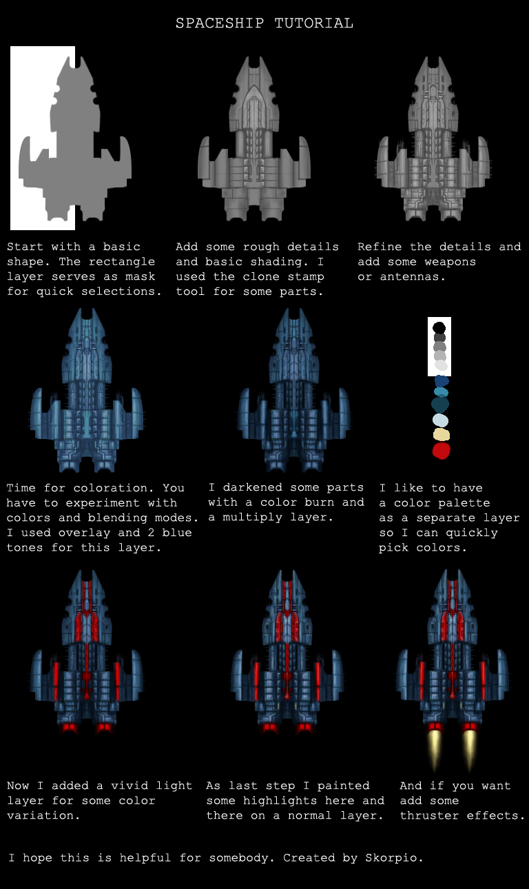
Spaceship tutorial
Tuesday, January 25, 2011 - 06:25
Clrg asked me how I created these spaceships: http://opengameart.org/content/spaceships-top-down
So I wrote this short tutorial. Edit: Hmm, it's a bit too big for the forum, better open it in a new window. ;)

Attachments:


Excellent! The only thing I love more than great art on OGA is having great tutorials!
Sir, I like your style. :)
Bart
It seems so simple to draw these spaceships ... Nice tutorial. What main tool do you use for this ?
Wow the palette layer is a great idea! ;)
I use Photoshop. Oh and I forgot to mention that the color layers are clipping masks, that means the color is only visible on the grey base layer below.
Great tutorial, i agree the colour pallete layer is a great Idea and I will definately use that now! At the moment this tutorial seems aimed at the intermediate level, which is great for me! However, if you wanted to aim at beginner level then it seems like rather a big jump form step one to step 2. It might be a good idea to go over how you came up with the initial shape and how you got from that to step two.
Thanks again for the tut!
I feel like we should stick this somewhere more permanent, but sticky-ing it on general strikes me as not quite the right place for it. Any thoughts?
An own 'tutorials' subforum? Or maybe even an own 'tutorials' menu item?
Yes or a special tutorial section just like the graphics where people can upload pdf or other open formats to (preferably) read in their browser? I vote for the menu item.
Great tutorial btw.
Hello everybody,
Very nice tutorial !
Here is mine for beginners:
Fisrt, I create a 200 x 290px picture in gimp, then add a guide at the middle (50%).
I've made the basic shape using rectangle and oval tools and also another selecting tool, the lasso, for more complexe sharp shapes. The process is to create the selection then fill it with color.
I used a path to create the front shape as it has curves, and turned it into a selection to fill it. Paths are a little difficult to deal with for a beginner, but it's worth trying.
Each time, I make basic shapes that I add or substract.
To cut a circular shape on a rectangle, select and fill the rectangle first, then make an oval selection on one edge, move it and resize it and use the suppr key to remove it (for example the back of the space-ship).
I show on the right below how to make an oval and suppress parts of it with rectangular selections. I did that on a new layer. Then, I move this part on my drawing with the moving tool. That's how the left part of wings is made here.
On the front, I used the rectangle then the oval shape to cut the shape (that was made with the paths tool, then turned into a selection, then filled with color).
I made all the parts on differents layers so I'm able to move them or cut them if needed. Of course, you can paint all the shapes in grey !
When I have finished, I save my xcf file. It allows me to keep all the layers.
To get the final image and be able to use it for the rest of the tutorial, you can export it as a png or a jpg file. png can keep transparency while jpg cannot.
When you mirror your drawing, the proportions may be wrong as beneath left. Undo the mirror opération. Select the part that is too large, cut it and paste it as a new layer. Move it a bit torwards the right side with the moving tool. Cut what is beneath the center line. If necessary, make the space-ship longer by moving the back of the ship torwards the bottom of the picture (select the good layer). Add a rectangle to fill the blank space. Mirror again.
Now I must try to make the same as Skorpio for shadows, hard work I think ! The easier seems to prepare the aerograph to the right size and pressure then choose the right grey. Instead of drawing directly with this tool, I make a path with the paths tool and, instead of turning it to a selection, draw it (with the aerograph). Guides help me to draw a straight line when needed.
For soft shadows, the aerograph must be very light, with not too much pressure. If the shadows are made on a new layer, you can correct them easily. Dont'forget to suppress what is outside the space-ship. A mask may help you but it's rather difficult to use it when you're a beginner.
Very nice addition doudoulolita. I actually start by blocking out the basic shape with a normal brush and then use the shape tools as in your example to get cleaner edges.
Hello Skorpio:
I think your tutorial is the best I've found on the net for drawing spaceship art, and I've wasted many, many hours trying to find at least one good tutorial on this subject.
I'm in the earliest stages of designing a 4x game using MMF2, gimp, and audacity. Unfortunately, I'm not an artist so my original artwork really, really stinks (original ship 1 below). As a result, I needed to scour the net to find a tutorial on how to improve my 2D overhead ship art. I'm trying to create reasonable (my goal is just to create reasonable, passable art that would work in a game like MOO2/3, Distant Worlds, Reach for the Stars, etc...).
What I'm hoping for here is if you could point out what I'm doing wrong. I'm attaching 5 png images; these are based on 210 X 210 pixels in gimp size. This is the smallest capital ship in one alien' fleet. Here's the background:
original ship1 (first pic from top to bottom): This was my original, unskilled, game art that I came up with on my own. Obviously, this stinks and would be unacceptable for any modern quality-based 4x game such as those I referenced above. This image was done *before* I read your tutorial, and was the basis for search to improve my game artistry ability. As of now, I look at it (and the 29 other progressions of it) as concept art for one of my alien races (I have 30 races planned for my game). At this point, I didn't know anything about greyscales, overlays, airbrushing, and shading.
grayscale ship1 (2nd image): After stumbling upon and carefully reading your tutorial, this was is my revised ship based upon completion of step 2 in your tutorial (I also had to figure out what shading, greyscales, overlays, and the other things you mentioned were). Something is still lacking here, but I can't quite put my finger on it: I used grayscale only, shading, and the airbrush tool from gimp with a scattered setting, also a few lines (the pencil tool from gimp).
color layer ship 1 (3rd image): Originally, I wanted this race ship style to have a blue and green theme like the concept art, hence I used a light blue overlay layer that corresponds to step 4 of your tutorial.
color layer2 ship1 (4th image): This corresponds to the color and burn layer of step 5 in your tutorial. I used a seperate overlay with some patterns that were supplied with gimp. The bright red lines for engines, guns correspond to the light layers and highlights of steps 6 & 7 in your tutorial. I haven't got the hang of this yet. As you can see, my hightlights lack the color and vividity of your highlights, so I'm also doing something wrong here; I can't quite put my finger on it at this time.
ship1 final (5th image at bottom): This was my final design based upon joining all the overlays. I "played" with many combinations of opacity, using the different addition, multiplication, difference, burn, grain extract, etc... and basically just stumbled upon this brown color variation which I liked best. However, when I compared it to yours final design, I still see that I'm lacking something somewhere. Whether the final ship theme is blue or brown doesn't really matter to me, as long as the art is good.
I'm not happy with my step 3 final greyscale, which is lacking something in relation to yours, if you can give me some idea what I'm either doing wrong, or failing to do here this would be great? Also, my "highlights" step lacks the vividity of your work, I don't know what I'm doing wrong here? Anything else that you think of that I need to do, or do differently, would be of great help for my artistic endeavors.
Thanks a lot for your very useful tutorial. I can see a 100% improvement from my original work to what I have now just based upon learning your tutorial, but I'm still not quite there yet.
Hey RKK0123, nice to hear that the tutorial was helpful. First of all I have to say that the only way to get better at drawing is to practice (I really need to practice more, too :) ). For beginners it's easier to use only a few gray tones (light, mid and dark gray) and draw primitives like cubes and spheres to figure out how light behaves on objects.
To paint the details of the ships, start with really rough shapes and just block in the colors/shades. Be wild. Then you can improve these basic shades, smudge and paint over with different opacities. For the thinner lines just use a finer brush with a darker gray tone or alternatively set the brush mode to multiply or use the burn tool to paint darker lines. And experiment with the opacity of your brushes till you figure out what's best for you.
The design process is actually the most difficult part. I change the details quite a lot till I find a design that I like. Sometimes I have a design in mind that I want to create and sometimes I just paint randomly and surprise myself. ;)
I'll probably upload another ship with more intermediate steps to clarify what I do.
PS: Wow 30 races sounds like A LOT of work. If you need help you can hire me. :D
Hello Scorpio. Do you mind if I use the final spaceship in this tutorial picture in a computer game I'm making for practise? I won't be selling it or anything like that. Maybe share it with friends and youtube. Need some spaceship and I have no drawing skills whatsoever.
If you want you can reply on my mail (mario.dobaj@gmail.com) and I can send you a link when it is done.
Hope you'll see this and reply soon.. will be using as a placeholder sprite for now and remove it if you don't agree with me using it
Here you go! http://opengameart.org/content/spaceship-tutorial-0
I also included a thinner version of the ship with different colors and a layered gimp file.
@Skorpio
Just an FYI, I've promoted this to a featured tutorial. Thanks for all your efforts on this -- it's awesome. :)
Yay! Finally we have a tutorial section. :)
Really liked your tutorial and plan on using your steps to create some spacecraft and similar artwork.
Thanks for this supplemental tutorial.
Here is my result after follow the tutorial
Muy interesante
For all people interested, latest version of gimp include symmetry (hor/vert) so its easier to design shapes with only silhouette and symmetry on.
one way of adding colour fast is using blend modes, the new blend modes are very good. Just use 2 or 3 layer of plain colours and experiment with blending modes.
Cheers!