A WRPG 2d tileset (CC-BY) using a single, limited color palette
A WRPG 2d tileset (CC-BY) using a single, limited color palette [project kinda suspended atm]
I was struggling to find some sort of cohesive package of 2d ortographic WRPG-like assets to use in my game (which should cover both surface maps and dungeons ones, lots of creatures, etc.).
There are many superb pieces of art here on OGA, most (all?) of which I could never do myself. In order to use them in a good-enough looking game, however, putting random pieces together is not enough (due to the lack of a common style / palette).
I'm not an artist myself, but I decided to get my hands dirty and do some things myself, mostly editing and recoloring of OGA stuff.
My purpose when I wrote this was to discuss the possibility of doing a major rehaul of some large collections of tiles, mostly Stone Soup ones.
Difficulties arose during the very first attempts, proving this to be too time demanding to actually be done by me (let's call this an assessment error, I was hoping I would spend time recoloring plus minor tweaks, but the downscaling of colors actually demanded the redesign of most of what I've touched).
So I'm relaying this to a very low priority but, if I manage to actually produce something, I will still share them here. Or maybe, when my game is finished I can come back and focus on this area. Time will tell...
The outline of what came to my mind and how I was planning to do this thing is kept below, mostly as future reference for myself.
Contents
About the project
The plan
The plan was to make reuse of large collections like Crawl/Stone Soup art, Denzi's art, David Gervais' art, LPC, etc. with a single palette that would provide some cohesion.
At fist I was going to use Dawnbringer's 32 color palette for that, but representing grass and blood (a few of my first attempts) proved to be beyond my skills and available time.
Art made with Dawnbringer's D16 color palette would also be included, because they already do share a similar look and feel.
Contributing
- If you want to do some recoloring or create art similar to the style I was pursuing here, drop a comment and I will include them on the list.
Inspiration: art
- DawnBringer palettes;
- DawnLike (too bad its CC-BY-SA and not CC-BY...);
- dawnblocker;
- Denzi's artwork;
- Davir Gervais' artwork;
Inspiration: games
- Dungeon Crawl Stone Soup , mostly;
- pixel-era Final Fantasy (FF) games, (even if the style here was more of a WRPG one;
- All the great 2d RPGs and roguelikes over there, mostly the open and or independent ones.
Style guidelines
- Most LPC guidelines apply, including the tileset template below. The last line is not required, however, and the width can be any multiple of 96 pixels (supporting variations for each tile, not only the central one - in those cases the last line is not necessary):

- dungeon tiles: Stone Soup has a huuuge art collection. The walls are a nice piece of art, but if you consider them inside a game, they are flat and weird. Shadows help with some depth sens, but what I want is: walls with top. Like FFs, RPG maker, or Adom - the latter brings the "top of the wall" view to a non-JRPG look.
Tools for the job
- I'm using GrafX2 . I'm still learning my way around, but this series of videos gave me a good introduction.
- DawnBringer himself created a toolbox with a lot of scripts for GrafX2, available here .
Art
GUI
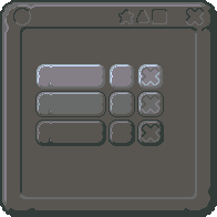
match 3 gui
Authors: vk, Buch, cemkalyoncu and bart
A fitting Graphical User Interface already exists, so that's one less thing to do...
Dungeon tiles
wall_brick_brown
This is how it was (originally from Stone Soup):
![]()
This is how it currently is:

And a sample of tiling in a generated map (click to enlarge):


Would << DawnSoup >> be a nice name for the project?
This is cool. Although I don't really prefer DB palettes myself, I think a cohesive set (rather, a cohesive set of disparate cohesive sets... we've got a lot of great stuff to work with!) of RL art is a good idea.
What about David Gervais art? https://opengameart.org/content/roguelike-tiles-large-collection
--Medicine StormOw yeah, David Gervais definitely has some great stuff.
I was actually checking his isometric surface map tiles today (Stone Soup doesn't really have any of that). Thinking about making orthogonal version of those dunes/hills (only the colors were automatically converted so far):
Any specific tileset or area you like from David Gervais?
Also, could you be more specific on the palette thing? I'm really just taking one that seems pretty popular around the web (even called a "pixel art classic" on some forums / tutorials). And for my untrained eyes all of his stuff seems incredible.
I like both the orthogonal tiles and the isometric DavidGervais stuff, but I probably won't use the Iso stuff in my own game. I like the idea of having wall tops. I think it makes a 3/4 view a lot more comprehensible. I've done some cave-like walls with tops in orthogonal style using DG art. I think it turned out pretty good, but I haven't actually heard anyone else's opinion on it:
(click to enlarge)
As for the palette thing, of all the reduced color palettes I've seen, I think the dawnbringer palette is the best, DB32 especially. Zabin's DB32+Zn8 even more. However, I really prefer having no palette at all. Rather, I prefer the 1.4 million color RGBA32 palette for my pixel art. I know a reduced color set is easier for artists to work with, and somewhat easier for the processer to display, but those benefits do not outweigh the vibrancy I feel is lost. This is, of course, personal preference on my part. I am strictly speaking about what I tend to use in my own games. I have no problem with the DB palette or games that use it. They tend to be the kind of games I like to play, actually.
--Medicine StormPalettes are supposed to make things easier for artists, but for me it is making all of my grass tiles either radioactive or just too dark/grey - I don't think I've seen any grass tiles using DB32, now that I think about it...
So I guess this part will require actual work other then converting colors with one or two clicks.
Edit: re-checking Zabin's grass...
Those cave walls look pretty good to me!

Personally I'm into not drawing (or keeping it plain black or a really dark grey) the inner/hidden areas of the dungeon, thats an Adom bias for sure:
I like your idea to make a cohesive set out of the various OGA assets by sticking to a palette. Your goal is exactly what I'm attempting to accomplish but for another genra. This is exactly what OGA needs.
I chose to go with the DB32 color palette for the same reason as you. It seemed like a popular and good color palette. Initially I thought I could just stick 100% to the palette but I realized later I couldn't get the effect I was going for or couldn't make a good conversion without adding some colors. So I agree with MedicaneStorm about palettes and I feel like vibrancy is lost by limiting the color selection.
That's why I've added 8 colors already and I know I'll be adding more when I need to.
Here's some grass using DB32 since your interested. wood_tileset47 is using strictly DB32 and Len's Whispers of Avalon ground_tiles is using my extended DB32. If your going to use anything in that tileset47 please be aware that some of that stuff comes from The Mana World and is licensed only GPLv2 I believe. I need to research that more to be able to upload it here.
Oh and I recolored those brick wall tiles a couple times because I'm going to use it for my stuff. Thanks for beinging my attention to those :)
http://duskrpg.blogspot.com/
RE. cave walls: Yeah, that drawn-in dark top area was experimental. I think it makes those areas seem like an elevated platform instead of inaccessable/unseen. Fortunately it's easy to just not draw (or change to a black fill) those areas of the tiles.
@Zabin: so are the grass/ground tiles in the Lots of trees and plants submission preview not CC0?
--Medicine Storm@Zabin I'm feeling right now the pain of not being able to color blood or grass that looks like blood/grass. That's too bad, because by adopting a specific/broader palette we do distance ourselves from what could be a "more standard" standard (or at least one that is already used somewhere else)...
I might as well expand my palette - the final product is more important than the palette itself, after all. But first I'm gonna burn my head a little bit and hack those damm pixels.
Nice work you're doing btw. I'm hoping we can help each other somehow, even if we due seek different styles.
@MedicineStorm You can trust me when it comes to licensing the stuff I'm converting. If something is available CCO I'll kepp it that way but if it's under a license that needs crediting I'm sure to do the research to know exactly who did what. I've circled the assets in that tileset that I'm positive came from TMW, thus are licensed GPL but I haven't tracked down who did what exactly, yet. The rest came from Jetrel and Hyptosis and is licensed CCO (except for Hyptosis' grass in the bottom right (cc.by.3.0)
@lukems-br I'll try and help as I like the style your aiming for as well. I provided those grass tiles hoping maybe the way I chose the colors could help you. But keep in mind that the circled items are GPL.
http://duskrpg.blogspot.com/
I trust your licensing validation. :)
The grass I was referring to isn't in the images you've posted on this thread. I was wondering about the grass on the preview images of the Lots of Trees... submission. I'll go wonder about that on the submission page, so disregard my question here. :P
--Medicine Storm@MedicineStorm Maybe you mean this grass? I'll be submitting it to OGA very soon I promise.
@lukems-br this uses my extended DB32 palette if your curious to take a look.
http://duskrpg.blogspot.com/
Ugh... Made a big mistake. Even removed my huge comment so that people don't waste their time reading it. :(