Need help / critiques with my 2D character Art

Hey opengameart community :D
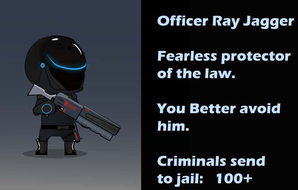
i was trying to draw a futuristic police character for platformer games. Now i finished it up to 60% i would say. But i encountered several design problems.
And it would be nice if the community could help me out and give me some feedback. Im too afraid of going to the wrong direction and the character looks bad at the end when its finished....
First: what color is the best? Keep in mind that this should be a Police Officer. ( i thought of blue, white,black,silver and white)
Second: If there is too much detail, what would you remove? e.g pipes on body armor or the round circle on the right hand
Third: i want him to have a jetpack, but how much cool is this or how much sense does it make on a police men. (look picture)
And last , would you go for more classic way of police men e.g bulletproof or like i did with the chest armor instead of bulletproof? (look picture)
Anything else you like / dislike just tell. An overall feedback is also welcome ;D
thanks


Just my two cents.
I like the white-blue or white-black. They are a bit softer, not quite as mean looking. black-grey with the red highlights looks downright evil!
I think you might try without the pipes on the armor. The variant with no armor at all is a little bland. I'd also keep the armored boots, his legs look thin without them. Similarly, the hand looks a little bland without the circle. Although, the circle is kind of odd, it doesn't really seem to connect or relate to anything else. maybe more of a 'hand' look, a circle plus a small lines radiating out toward his fingers?
Cop with a jet pack makes pefect sense! Robocop even had one in one of the movies! :)
Jet pack is a bit small and covered up.
https://withthelove.itch.io/
some valuable 2 cents :p
the idea with circle and lights going to his fingers sounds awesome .. why i couldnt imagine that :D
i think im going to white and black color, with jetpack and different style of chest armor.
thank you for your feedback, capbros.
I can't offer too much of a critique but interms of colour-scheme. I think the white black works best. it has the futuristic aspect while still looking like a police officer
www.crownjoseph.com
yes i also thought of making him black and white
thanks for your feedback ;D
> the idea with circle and lights going to his fingers sounds awesome .. why i couldnt imagine that :D
Oh, I'd love to say I imagined that, but I'm sure I got it from some movie or game I saw once. :)
https://withthelove.itch.io/
ive updated my art and look where i got with your feedbacks :D
still needs work on it though..
wow! He's taken a turn for the renegade! with that cigar and magnum he's like Dirty Harry 2000! :)
otherwise, I think he is coming along well. The new hand and chest bits look good! Only further feedback would be that I'm not sure I like the blue and red lights on his helmet, why not just two blues? Red seems out of place since it appears no where else and makes the helmet asymmetric. Police lights maybe?
https://withthelove.itch.io/
ahaha yes, he looks more badass now :D
The blue and red lights are for police sure. And its awesome that you mentioned it because you remembered me one principle of designing where you should reuse colors.Like on top of helmet red light then on chest somewhere needs red too. Else it looks misplaces. thanks again ;D