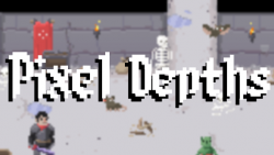
Pixel Depths (a pixel adventure/roguelike game)
Hey! Rogue Games here!
Just thought I'd let everybody know about my new game (as I've seen others do the same here) that is now finished! It features sprites from two contributors on this website; "Calciumtrice" (http://opengameart.org/users/calciumtrice) and "Buch" (http://opengameart.org/users/buch). Anyways, I'd love to know what you guys think about it!
Info for the game:
"Get ready to embark on an adventure into Pixel Depths! Explore and find rare loot, which you can store in your inventory! Attack and kill passive and aggressive monsters which lurk inside the dungeon walls. Choose whether to engage in combat, or simply leave the monsters behind with the chance of loosing rare loot along with them. See how many rooms you can survive before it's game over!
It's up to what to do, in Pixel Depths!"
The game is avaliable to play here: http://gamejolt.com/games/pixel-depths/79328
Thanks a lot :)
- Rogue Games


Looks cool! I dig the graphics. However, there is already a popular mobile roguelike called Pixel Dungeon.
https://play.google.com/store/apps/details?id=com.watabou.pixeldungeon&h...
http://store.steampowered.com/app/365900/
Thanks! But as I have said before on the exact same comment made previously elsewhere on this website, I don't think there is any harm in calling my game Pixel Dungeon, unless the people who made it have any copyright grounds that say otherwise? If there is, the developers will need to contact me and I'll change the name.
Titles of projects fall under trademarks, not copyright. Although you can register them, trademarks are considered established automatically by their use to sell goods or services and marketing. That's already happened with another game. Since Pixel Dungeon is already well established as the title of someone else's game software and you intend to release your own game software with a very similar theme and the exact same name, you'd be better off changing your title as soon as you can instead of waiting around for a cease and desist order.
Ah, well. Thanks a lot for that. I'll look into it.
Also, think how bad will be if your game is ALSO called "Pixel Dungeon". When you refer your friends to it, they may actually download Watabou's game. You will have critical marketing problem with your game because your game title will be conflicting. Better, make a game with own name. Best - if you aim to make commercial / indie game, use a name that have domain free [as in free speech], then actually register the domain for yourself and get going :)
Take your tools and shape your world.
~Crafterria
That's a good point! However, I'm still trying to come up with another name - anybody have any suggestions?
EDIT: I have been toying around with the name "Pixel Adventure" but I'm not too sure about it, as it doesn't really fit the game, in my opinion. I also like having Pixel in the name :)
I played through the demo - I'm glad somebody is putting those sprites to good use!
Re: the name - perhaps "Pixel Keep", "Pixel Depths", "Pixel Crypt", "Pixel Delve", "Pixel Treasure", "Pixel Tower".
IANAL, but perhaps you could even call it "Dungeon of Pixels", or "Rogue Games' Dungeon of Pixels".
Pixel Crypt sounds really cool. I'm a fan.
-RAW GAMES
Thanks a lot! Yeah, they were incredible sprites - had to use them! :D
Those names are actually quite good, I especially like "Pixel Depths" and "Dungeon of Pixels"
Pixel Depths sounds cool :P check your PMs ;]
Take your tools and shape your world.
~Crafterria
I'll most likely go for "Pixel Depths", I'll edit this post, the game title and everything else very soon :D
Thanks for your suggestions guys.
The game is now COMPLETE! Feel free to download it and feedback is very much appreciated.
This is awesome!!
some minor quibbles
any thoughts on adding diagonal movement?
I frequently engaged in combat whilest more or less right on top of a monster. This made it very hard to tell who was damaging whom as the damage reports spawned in more or less the same place. Maybe slide the sprites apart when combat beigins, or give player damage a slightly different color, or better yet a 'hit reaction' animation for the player (something to play when he takes damage). just ideas...
little bug, the 'must collect all books before proceeding' message didn't always appear for me. Well actually it only appeared twice, thoe other times I jsut got a small green check mark in the top center of the screen (empty dialogue box maybe?). Be cool to give a little motivation for having to collect all the books, like maybe your character is a hopeless bibliofile who is actually raiding the dungeon for musty tomes instead of treasures...
on the 'character select' menu, it took me a bit to realize I had to click the tiny little box beneath the character portriat. what about accepting a click on the character portriat?
clicking to open the inventory tab makes sense, but having to open the status tab just to see the player's health was a big of a drag.
And finally, DANG those sprites are good! That skeleton is ten kinds of genius! It actually made me happy when it killed me! Hats off to Calciumtrice for such an amazing set!
Pixel Depths is an even better name btw. At least for me as a frequent graphics programmer used to dealing with pixels and depth buffers, the name struck an immediate chord, even though I don't know what rogue style dungeoning has to do with graphics programming, still it just sounds right :)
https://withthelove.itch.io/
Thanks a bunch!
I did think about diagonal movement in early development, but it broke most of the player's collisions with walls, enemies etc. unfortunately. I may attempt to implement it, but it probably won't happen. The damage reports may need to be changed, I will most likely change the colour or something like that.
The bug you've mentioned did appear in all rooms for me, I'm not sure what it is, it may just be a minor bug, but I'll look into it. And yeah, I guess they're could be a story behind this all, but it was really just to see how many rooms you could survive, or if you can survive them all.
For the buttons in the character select and options menu, they may need changing I guess, but as long as people still realize what to press, it should be alright.
Clicking to see the stats of the player was an addition I added because if it was open all the time, it would block the players sight in the rooms, as the UI is always on top of objects. However, there is a "low health" indicator when the player's health is low, which should give the player enough time to press "h" to quick heal, or quickly open their inventory and click a health potion.
And yes, I 100% agree. Calciumtrice does extraordinary artwork, I hope a lot of people who play the game see that. Also, I'd love for him to see his artwork in action, but I'm unsure whether he has seen my message I left him, or whether he just wasn't interested.
But thanks a lot for commenting and thanks for the feedback.
- Rogue Games
Fun game! I came across a bug that really prevented me from continuing. It seems like items are added to the inventory from the bottom, but potions are used (H hotkey) from the top of the inventory. I would collect so many potions that my inventory was completely full. I intentionally got hit by enemies to use up a few of them. However, after hitting H to heal and using up a few potions, I still wasn't able to pick up any new items like keys or scrolls despite having some inventory space freed up at the top.
An inventory hotkey would be nice. Something like hitting the [I] key toggles the inventory screen without using the mouse. If there is one already I haven't found it.
My character will occasionally stop in the middle of an attack to scratch his belly. Not sure if it's an intentional "feature" to break up the attack pattern or if it's a bug. I have died several times because the belly scratch animation came at a critical point in combat, preventing me from completing the attack.
I'm enjoying this game quite a bit, though. :)
--Medicine StormI'm glad you're enjoying it! I have not encountered this bug before, although I'll look into it. That sounds like a good idea actually! That may be implemented. And I'm not sure about the "belly scratch". I assume you mean the Ranger class, but I have never been stopped in combat because of this animation myself, but once again, I'll look into it :D
Thanks a lot!
- Rogue Games
I'll try to duplicate it better. It may just be coincidental that my ranger is adjusting his baldric (not so much a belly scratch, I've realized) after stopping his attack. Might just be a debounce issue. Quickly letting off of space and holding it down again restarts the attack fast enough in most cases.
--Medicine StormThe animation is actually the idle animation. Because the player is standing still whilst in combat/attacking in most cases, after the attack animation, the code goes back to the idle animation as the player is no longer attacking and is idle, because it isn't exactly a smooth transition, it may cut to animations in the middle of other animations... if that makes sense.
@RogueGames:
I don't know how much this helps, but as someone who has worked this issue out the hard way many times over the years, I can't help but say that for me the key to getting diaganol movement to work right with collisions, etc. has always turned out to be seperating the two axis out and handling each move independently. So instead of moving (1,1) and then doing collisions, move (1,0) do all collisions tests, then move (0,1) ad do all collisions tests. Again, I know that's a pretty general statement and may or may not be useful depending on your setup, but I thought I'd mentioned it on the off chance it could be useful. In your game you might even be able to go extra cheesy and just alternate between moving horz/vertical every other frame if the player is holding down two axis. Just a thought.
re: the status bar, yeah I noticed the status bar hogged the screen if it was open. Personally, I'd suggest that buch's set, as great at it is, might be a little bit too heavy or large for the game. The inventory part works fine, but you might just viddle a smaller status bar setup, maybe just a reduced version of buch's set, to make it fit better. Just me, but I'd say health is a pretty important GUI element and you should do your best to keep it easily visible for the player.
On that note, I'll also toss out that I think stylistically buch's set might not be a great match for Calciumtrice's sprites and tiles. If you look at Calciumtrice's set, it's got a fairly clean vibe to it, not a ton of dithering. Whereas buch's golden UI has got more of a 'dirty' look, lots of little dithers and fine pixel details. It does also feel a bit large for use with Calciumtrice's set. Well, I love buch's set so don't get me wrong, but you might fish around and see if you can find a better match, or do a pass of shrinking/cleaning buch's set to make it fit better with Calciumtrice's stuff. Another idea would be to port buch's set over to Calciumtrice's palette which might help them jive better together. Again, just some thoughts.
https://withthelove.itch.io/