User login

What is OpenID?
  • Log in using OpenID
  • Cancel OpenID login
  • Create new account
  • Request new password
Register
  • Home
  • Browse
    • 2D Art
    • 3D Art
    • Concept Art
    • Textures
    • Music
    • Sound Effects
    • Documents
    • Featured Tutorials
  • Submit Art
  • Collect
    • My Collections
    • Art Collections
  • Forums
  • FAQ
  • Leaderboards
    • All Time
      • Total Points
      • Comments
      • Favorites (All)
      • Favorites (2D)
      • Favorites (3D)
      • Favorites (Concept Art)
      • Favorites (Music)
      • Favorites (Sound)
      • Favorites (Textures)
    • Weekly
      • Total Points
      • Comments
      • Favorites (All)
      • Favorites (2D)
      • Favorites (3D)
      • Favorites (Concept Art)
      • Favorites (Music)
      • Favorites (Sound)
      • Favorites (Textures)
  • ❤ Donate
2D Art

What is it lacking?

xremal
Tuesday, February 17, 2015 - 09:58

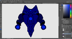
hello, after making my 2d drawing i have left,right,front and back versions of it. Something about the colors does not sit right with me. (even though it is suppose to be the water varient of what i am making thus the blue) I guess what i am trying to say is how to get the colors more vibrant or cartoony or i cant explain the look i want just feels like it needs something before moving to the animating stage, advice on what it needs please.

Attachments: 
Preview
2015-02-17 17_28_48-.png 2015-02-17 17_28_48-.png 349 Kb [3 download(s)]
  • Log in or register to post comments
christiandasi
joined 10 years 10 months ago
Tuesday, February 17, 2015 - 11:42

I would vary your color palette and add a contrasting color. such as my photo.


If you want a good resource on color theory

http://www.worqx.com/color/index.htm

https://www.youtube.com/watch?v=Qj1FK8n7WgY

Attachments: 
Preview
greenwater.png greenwater.png 1.6 Kb [1 download(s)]
  • Log in or register to post comments
p0ss
joined 14 years 8 months ago
Wednesday, February 18, 2015 - 17:46
p0ss's picture

I broadly agree, even if you don't want secondary and tertiary colours, your current pallet lacks dynamic range. The entire image is relatively dark, and the vast majority sits on the darker end of the range.  I'd suggest that just icreasing the lightness range would improve its immediate recognition .

  • Log in or register to post comments