Skip to main content
User login
OpenID
What is OpenID?
Username or e-mail
*
Password
*
Log in using OpenID
Cancel OpenID login
Create new account
Request new password
Register
Home
Browse
2D Art
3D Art
Concept Art
Textures
Music
Sound Effects
Documents
Featured Tutorials
Submit Art
Collect
My Collections
Art Collections
Forums
FAQ
Leaderboards
All Time
Total Points
Comments
Favorites (All)
Favorites (2D)
Favorites (3D)
Favorites (Concept Art)
Favorites (Music)
Favorites (Sound)
Favorites (Textures)
Weekly
Total Points
Comments
Favorites (All)
Favorites (2D)
Favorites (3D)
Favorites (Concept Art)
Favorites (Music)
Favorites (Sound)
Favorites (Textures)
❤ Donate
Search Terms
2D Art
Messing around with a cave tileset
bart
Thursday, December 19, 2013 - 07:44
What do you guys think?
Attachments:
cavetest.png
9.8 Kb
[
1
download(s)]
cave1.png
8.6 Kb
[
1
download(s)]


Update.
Update!
I love the foreground but the background confuses my eyes a little. Not quite sure why...
Edit: I think it's because the background should feel like a *wall*, which means there wouldn't be stalactites as much as large pillars or something else that's tall?
Changed the background in a big way.
Sorry I haven't commented yet. I really love the edge pieces, especially on the latest one where they've got the proper contrast with the forground. The darker forground worked a lot better, it had better visual priorities. These new walls don't quite work yet, I think the random elements worked a lot better but if you just incorporate them into the new tiles it'll be an improvement for both. You've got good volume on the individual rocks but the shapes are too uniform and don't overlap making it look flat. Break up the lines a bit like you did with the slope edges and it'll look a lot more visually interesting and organic. You've made some daring choices with the colors but it works surprisingly well. I really like this set so far, I look forward to seeing more of it!
Yep, I love the new background, though it is somewhat repetitive. Maybe like Sharm said, the background needs more organic shapes?
The backround is good as it is as long as you make edges for it , the only reason it doesn't look good now is coz you can't see all the assets normally in a finised tileset.
@Mumu: I really like those random elements. I'm going to use some of those ideas. :)
More poking around.
Mumu, you're right. I don't care at all about repetition when there's interesting stuff to look at elsewhere!
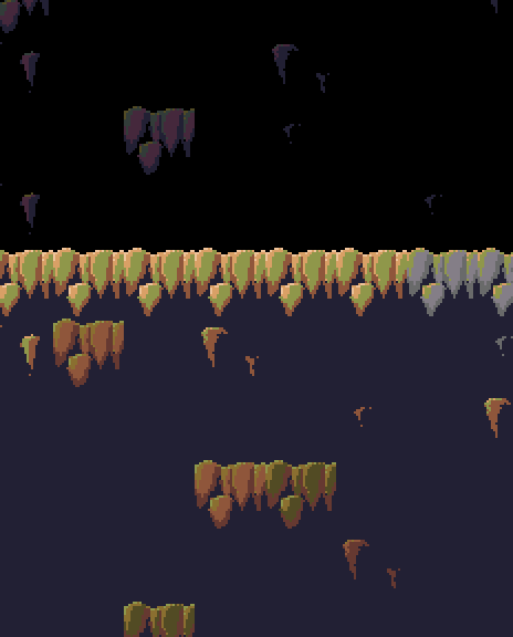
Not sure I like the bluish area. (Unless it's supposed to represent the outside sky?) I think it would look good to do something quite a bit darker.
I actually kind of like the blue myself, because it can give the impression that the cave is really, really large. It would probably be better to have some background detail tiles to go with the blue area (stalactites, stalagmites, etc). I tried making a blue version of the current background tile, but it didn't really work. For the cave to have the appearance of being really large, I think it'll need some special tiles meant to give that impression.
Something like this:
Aha! That's *exactly* what it needed. That's fantastic.
You can always make it look even lagrer if you use Parallax scrolling .