Tiny 16: Basic
Author:
Thursday, May 30, 2013 - 08:37
Art Type:
License(s):
Collections:
- 16x16
- 16x16 chibi rogue-like
- 16x16 for voxels
- 16x16 tilesets
- 2D - Complete Kit
- 2D - Tiles 16x16
- 2D Art
- 2D-Platformer Tilesets
- 2D::Tile::Orthogonal
- 8x8_cc0_oga-by_roguelike
- A Pool: Unsorted (GDN)
- Amazing Stuff
- Animals, Creatures, Critters, Mobs, and More!
- Antur Resources
- Art using DawnBringer palettes
- Assets for making DOS games or games like in DOS in the early 90's
- Asteria
- Awesome Game Art
- BackGround
- Best Orthogonal (rectangular) Tilesets for Tilemaps
- C-Dogs SDL art
- cc-by-3 possible game kits and gfx
- CF Inspiration
- Collected
- Complete art kits
- CSCIGameProbs
- CSCIGameRough
- CSS RMMV Roguelike
- DOS Ranger
- DWSG
- Fantasy
- Fodder 8x8
- GAME
- Game Art Packs
- Game Asset Kits
- gb conversion
- Generic Art Collection
- Goblin Adventure
- Heavy Is The Crown
- in space
- In Sprite of Myself
- Infinimon - Procedurally-Generated Pokemon- or Digimon-style Game Assets
- Library of 2D Game Art
- Libre VCMI
- Lost in the void potential assets
- Mini Adventure
- misc. CC-BY
- Must Use
- other games
- Pixel Art - JRPG
- Project "Jogurt's Greed"
- QuestTown prototype
- Ragnar's CC-BY 4.0 / OGA-BY 3/4 Bag of Holding
- Roguezeldalike
- rpg
- RPG Tiles
- rpg-tiny
- RTS assets
- Similar to Tiny 16
- snes-like world textures
- Sprites
- stardont
- Stranger TopView RPG LPC
- Test
- The 2D Collection
- TILE
- Tilesets
- Tilesets
- Tilesets and Backgrounds (PixelArt)
- top down 16x16 pixel art fantasy
- Top Down 2D JRPG 16x16 Art Collection
- Top Down Fantasy RPG for Commercial Use
- TopDown RPG
- window shopping
- WIP Collection
- World Gen 2D
- Zed: AM: Top-Down
- Zelda Like RPG
- Zelda style tilesets
Favorites:
445
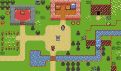
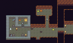
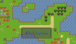
This is a simple set using 16x16 tiles and Dawnbringer's 16 color palette. I attempted to make this set very basic, using as few tiles as possible while still making it useable and pretty. Animations are 2 frames total, some ground pieces are made to be used as 8x8 corners. This should be everything you need to make a simple RPG although it is a little weak with characters and monsters at the moment. If there's anything you think is missing, let me know in the comments.
Edit: Updated! More tiles, more monsters, more animation!
Edit: Updated again! Added a couple tresure items and a few dead and sleeping characters.
Edit: Updated a third time! There are now a few bridges, new trees, and some shop signs in the basic tiles.
Attribution Instructions:
Please credit Lanea Zimmerman. The anti-DRM clause of CC-BY 3.0 is waved.
File(s):


Comments
maybe there's an issue with the DB, but fontsmall1.gif and fontsmall2.gif aren't showing up when you click the links.
thanks for the upload. these look good.
Probably because they're both white on transparent. I can upload a version with a black background if you'd like or I could make a few preview images so you don't have to download anything. What would you prefer?
Is it OK for me to add some monsters? I so, should I just upload it or something?
as in, what do I so with it? (sorry for double post)
Sweet stuff. I dig the use of the same tiles for in-level and overworld.
Nijma: You can post them in the comments or make your own submission. I won't be adding them to this set though, I'd like to keep it my own stuff. BTW, there's an edit button if you want to add more to a post you've already made.
Surt: Thanks! Wasn't sure that was going to work, but it seems to.
This is excellent! Should make for some decent temporary graphics while I build my game engine prototype.
This is very impressive!
Wow! I really love this set. Are you sure it only has 16 colors? (I kid; you're just amazing.)
Honestly, it's the pallet that's amazing. Dawnbringer worked really hard to make it flexible and useful and he did an excellent job with it.
True, the pallet is amazing, but it takes a great artist to use it to its fullest. Once again, great work!
Love this so much! Great work, a sign post would be a great addition.
Fantastic work! You've done a great job at pulling a lot of character out of a small space.
A sign is a good idea, I'll have to put one in when I update with more monsters.
Thanks for all the complements, everyone!
Remembering a lot of Dragon Warrior on Game Boy, but a lot better! Nice job!
I love these! your preview images really show how flexible this pack is. I'm using it to make a town right now for an RPG I'm attempting to make; I would love to see where this goes in the future!
Great set!
These looked so good that just for fun I made a little prime number memory game using them. It's available on the Google Play store and 100% free.
https://play.google.com/store/apps/details?id=com.jslgames.KnightFirst100Primes
That's a pretty fun little game there, twoeyedcyclops! Nice use of the art.
That's cool! Thanks for the heads up.
Thanks pennomi and sharm, you both made my day!
Hey Sharm I sent you a message, hope you check it out,
This is pretty much exactly what I've been looking for. Thanks for being awesome.
BTW everyone, it's been updated! All the monsters have 4 directions, there's a new monster, some of the items have animations and some new items, there's a few tile updates and some new tiles and extra frames of animation for the characters and the sign I promised to add!
I wish I could favorite this twice.
I noticed basictiles.png are in 16x16 format but the rest are 32x32. I decided to repack all of them together and make a 16x16 version as well as 32x32 version. Don't worry about credit for me since all the work was done by Sharm, all I did was repack.
EDIT
Organized differently so there's room for 3 more tiles close together. Also made the grass corners, fancy red carpet corners, and sand corners usable without modification.
EDIT AGAIN
See below for a better repack by Grimfist.
Oh shoot, I should have taken a bit longer to put it together, I'm very sorry. Thanks for the fix!
I love this collaborative effort; I want to do more stuff here on OGA! ^^
William: there's some messed up scaling in some of those tiles.
Sharm: awesome additions.
I've updated the newer stuff to be the same resolution. Sorry about that, it was an artifact of working on a version for RPG Maker.
Jaidyn: Collaborative? What do you mean?
Some people make assets or a tileset of some sort. Other people add onto the tileset or help out a bit by providing pre-packaged assets for a specific program and keep on extending off on it. LPC is probably the best example (although that was designed to be collaborative), but I've seen other assets being extended or repackaged by other people.
Sorry, I wasn't implying that the sprites above were made by multiple people. I just meant the idea of other people helping improve existing assets. I saw the repacks that Will did and that was helpful, and comments by other people offering suggestions to improve a certain part of an asset; that's collaboration as well (even if they didn't necessarily work directly together on it).
EDIT: Hmm, I thought I commented on this earlier. Sorry about that, I think that this tileset is great. I love all the variety I'm seeing on OGA. Nice work, Sharm!
Sharm, just wanted to add something else. I meant no disrespect or anything. I actually thought I commented earlier on this about how great of a job you did on the sprites and how useful it is having multiple styles of sprites for users to be able to choose from.
Then I saw a comment by Will where he made remarks about a way to improve it a bit and that's where I went and commented on how I enjoy the collaborative effort I keep seeing on OGA. Not everything is collaborative, but I have seen several things that are and the whole site itself could be considered a collaborative effort to provide assets for usage in games in general as well.
I later checked back, though, and noticed that I didn't actually post that first comment. I must've been thinking about a comment I made on another asset or perhaps I started writing a comment but forgot to. Sorry about that! You did a really great job on this and its appreciated. ^^
Aaah, okay. I thought you were implying that I hadn't drawn it all myself and I got confused. I love the collaboration here too, that's why so many of the things I've posted here are edits and extensions of other's stuff.
Sorry about that! I wasn't trying to imply that at all, that's why I went and added another reply to clarify. :P
Surt, you're hilarious. Thank you for pointing out the odd and funny looking sequence.
Did I stretch anything wrongly/incorrectly scale a tile somewhere? If so I'll fix it to reflect the awesome work Sharm produced. MS Paint doesn't always behave correctly.
JaidynReiman, I bundle things like this because I want to use them. Having several separate files to manage is more complicated than having everything in 1 sheet, especially with smaller tile sizes. The other to do is remove duplicates; some of the animated objects were present in the basic tiles. The other piece that gets me is sprite management; it's hard for me to justify including a separate file for death sprites when I have an entire other file for sprite animations. Putting everything in one place simplifies everything with small sets.
Thanks for these amazing tiles Sharm, and thanks for the 32x32 repack Will. I just noticed that your repack had some mistakes regarding the edging tiles (the red/yellow corners for the red carpet e.g.) and did a repack myself which is 100% compatible with Tiled so one can draw maps like in the preview images. I add my 32x32 repack here for you folks out there. Cheers Edit: I also repacked the character and monster graphics to always feature the standing frame at first, with the two walk animations frame following. ;)
Edit again: Removed the sprite sheet cause it did not fit correctly. See below for new repack.
Thanks for catching that Grimfist. I should have thought about how I inverted those red/yellow carpet tiles but it didn't click. It's probably better to remove the base sprite too since you're likely never to need it, smart move. Also a smart move to make the tree available in a 32x64 configuration too, that could be useful. Thanks for the criticism. Would you mind making a 16x16 version of your repack so I can take down mine?
EDIT
I made a mock image with your grass and sand tiles. At first they didn't seem to tile well. After playing with it for a moment they seem fine now. No corner pieces confused me. What do you think?
What if we remove the dialog stuff and arrange sand+grass in a different manner? Someone making a game would only need to load two sets of graphics and dialog would be separate from the rest (which makes sense usually). Plus, it gives us enough room to round sand+grass the way Sharm has in the previews (which looks really nice and makes sense).
Also, I think your complete set is missing the cup-shaped object in the original set ;)
He's another rendition that includes your color chart and some additional sand+grass tiles.
Hey Will, thanks for the follow up. Yeah I totally forgot the edging tiles for the sand and grass, these come in very handy. I also thought about ditching out the dialog stuff, cause I want to use a different either, therefore no need for it ;)
Replacing the red/yellow edges with full tiles is a good idea too, that saves some draws. The outer curve edges for sand and grass fit very good in Tiled, but the inner curve edges do not seem to look like in Sharms previews. I fiddle with that a bit, I have some ideas how to fix that. Maybe a negative mask from the outer curve edges, we'll see. Oh and when looking at the original preview, Sharm uses one tile wide dead ends for the sand tiles as well. I'll add them too.
Either way, good work man ;) Oh and the color chart is Dawnbringer's famous 16 Color Palette for Tile sprites, not mine :D And for the 16x16 version, I'll do it after we finished the 32x32 version, that saves some effort.
Cheers!
Edit: Ok, I finally managed to create inner curved edges for the sand that look like in the original preview. Did another repack of the spritesheet to fit all in. Here it is in 16x16 and 32x32. As you can see from my previews with the new repack you're able to recreate the original style of Sharm.
Happy tiling! :D
This sheet is awesome! Starting a new project using these, will let you know how it goes.
Thanks for sharing! Also thanks for waiving the DRM restriction!
Excellent... now my plans for world domination have come one step closer to completion... ehrm, I mean, excellent work!
This set is just amazing. Well done to all involved.
why are these tiles only 16x? they feel like they should be 16x tiles each, are they meant to be used 8x8?
I am super confused.
Also - I had another version of this dow nloaded, I deleted then redownloaded and it's a completely different version with less tiles, what's the deal?
I'm sorry you're confused. I'm not sure what you're asking. There are corner tiles that are meant to be divided up into 8x8 segments just because I didn't want to spend the time combining those corners with it's corresponding tile into every variation possible. Those are the only tiles mean to work that way, everything else is 16x16.
As for the version with more tiles, I don't know what you're talking about. When I add tiles I just put more on the same image that I uploaded before. Maybe it was the version in the comments above? There are more tiles but really it's just the same artwork with the 8x8 tiles turned into 16x16 tiles for you. That version doesn't have every possible combination but it has a lot. Or maybe it was a version where the characters weren't in their own image? Either way, I haven't removed any art, maybe reorganized it a bit but nothing got lost.
Hello!
I'm using some of your images here (scroll all the way to the bottom):
https://github.com/kittykatattack/ga
Hope that's OK?
Hey Sharm, any chance of a simple click animation in this style? The attached image is just circles that get smaller until they wink out of existence. I was thinking something like arrows that point inward. I had an idea to make something with click navigation and I wanted to show the user what tile they clicked but I'm having a hard time finding or fabricating a click animation that doesn't look awful.
This art is awesome- I'm using it to create a classic RPG, like Dragon Warrior, or Final Fantasy 1.
http://www.patreon.com/retropower
I am using these assets extensively for my project Mirage Realms, which is a cross platform online RPG, thank you very much for these!
If anyone is interested, it's http://www.miragerealms.com
Spent some time adding two different edge treatments to the brown rocks in this set.
One is for a traditional Zelda-ish faux top down style. The other is for a more literal 'top down mountain' type look.
Put a little green on the 1st set and it makes a decent base for a platformer, highlighting the wonderful utility of Sharm's work.
Well, of it looks good at all, it's just because Sharm's base is so awesome to begin with, but in the spirit of things, thought I should share it back.
thanks again Sharm!
btw
I guess my additions would be OGA-BY license, but you needn't credit me, just Sharm for the base set.
Awesome !! Thx for sharing ;D
Pages