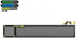
RPG (some GUI concepts)
Author:
Thursday, April 25, 2013 - 06:21
Art Type:
License(s):
Collections:
Favorites:
10
This is some GUI concepts I have for an upcoming game. Suggestions/Opinions? Thanks! (Btw, first from-scratch pixel art ever.) It is a VERY small picture, and I would like to resize it bigger; how?
File(s):


Comments
If you mean to resize it all (without much pain), you should use an integer scaling factor (e.g. 2x, 3x) with the nearest interpolation, to avoid blurry effects. You would probably have to add more detail, then...
If you meant, instead, to enlarge the rectangle without changing the borders, just move them slightly away and fill the blank spaces in between.
Also, my personal suggestion is to use .png along with .psd, for the latter can only be used by Windows users, whereas png is universal.
Aside from that, your GUI seems pretty well done...
Thank you! Was this good for a first time spriter? :P
It was. I'm looking at it closer right now and I do like the way the gray background of the fill bars looks.
Just a couple of usability suggestions:
keep the fill and the bar background separed, so that a programmer can adjust the fill through code directly; and leave a blank pixel between L and V in the level label for, as they are now, they look pretty much like 'W'. But I think that, if you enlarge this, you're pretty likely to remove that little imperfection (as well as the P of 'pack', which is not very clear) when adding some detail...
Well, actually, it is supposed to say Jack, and I am to remove it, it was only to see for myself how a name would like in there. cx
But, thanks for all your nice words. I will take them into consideration!
less gradients and less smoothing or not , dunno
Well. I've reduced the contrasts a little (since I find flashy colours not that pretty), and I've removed the EXP bar, I guess I'll just have some number indicator somewhere. (Like the Kingdom Hearts system), or maybe percentage. Any ideas? :/
I've also made some more consumeable items, and I've started making a palette.
Looks awsome!