Some graphical changes I made to FLARE
Friday, July 17, 2015 - 10:21
Hi,
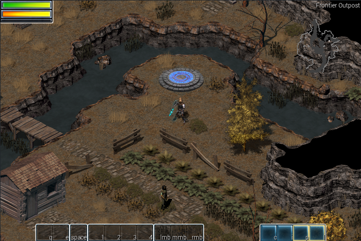
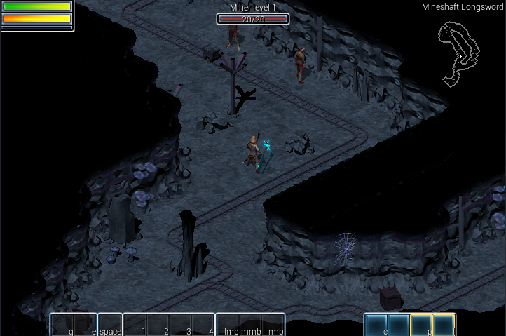
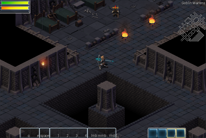
I was playing around with the FLARE tilesets one weekend, and made some changes to them. I tried giving the grasslands a more autumn feeling, and made the indoor tilesets gloomier.


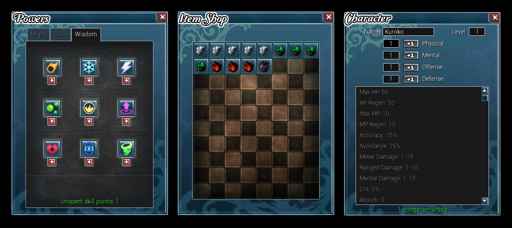
I also changed the UI. This is the beginning of a more extensive mod that I have planned that will replace the alpha_demo mod and the fantasycore mod. Here is a mockup:

Let me know what you think! Thanks!


I'm a sucker for autumn environments in games, so I'm really liking the changes to the grasslands tileset. The glow effects on the fires and greatstaff also look great.
I'm not sure if it's the rounded edges or the colors, but the HUD looks out of place to me. Seems too "bright and cheerful" for the atmosphere the tilesets have. That being said, the menus look very well done.
Hi Dorkster,
The menus are being done for my own mod, which will contain 100% original art assets. I'm still working on it and currently in a pre-production stage.
The changes I made to the existing tilesets isn't related to that at all, I just got bored one weekend and decided to mess around with it, lol.
___________________
My portfolio site
Flare Project thread
Oh, that makes more sense. I can't wait to see what your mod looks like, since you clearly have some artistic talent.
The health/magic bar in the upper corner looks out of place. The original tiles do not go with the tileset you made.
I love the mineshaft shot. The color of it is soothing to the eyes.